jdgreen92086
TPF Noob!
- Joined
- Dec 26, 2007
- Messages
- 65
- Reaction score
- 0
- Location
- Southern Indiana
- Can others edit my Photos
- Photos OK to edit
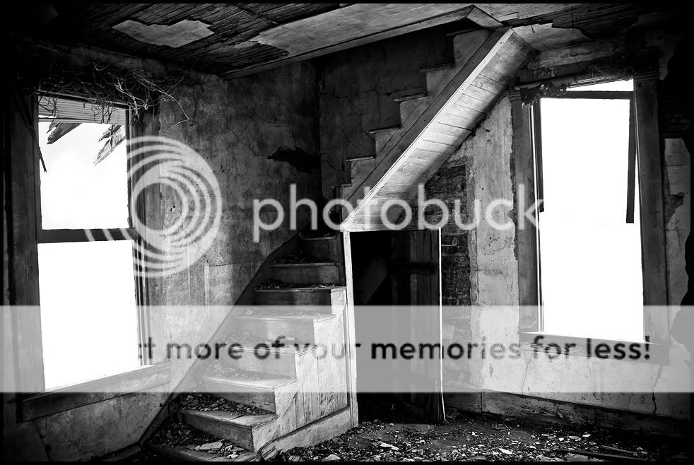
These are some pictures in January after I bought my camera in December. I was looking through old pictures and decided I liked these and wanted to do some post-process work. While looking through them I noticed the very first image, The Depression 1, does indeed look very much like the pictures we've all seen of the Great Depression in 1929(I think that's right). If you're wondering that's where I came up with the name.
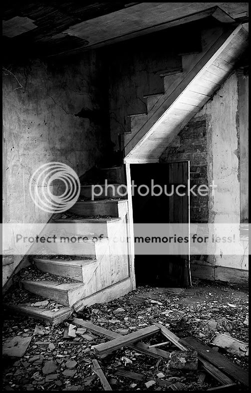
These were taken with a fully stock Canon 400D with manual settings and a tripod. Processed in 2 Adobe programs, Lightroom and Photoshop CS2.
I plan on returning to this house with my new lens when conditions are right.
Critique as harshly and as much as you'd like!
Note: Even though the blow outs weren't planned, I think they add a nice sense of isolation to photograph #3 and #5.
Thanks!
The Depression 1

The Depression 2
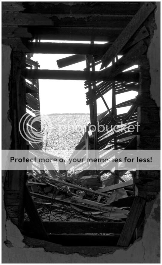
The Depression 3

The Depression 4
The Depression 5
These were taken with a fully stock Canon 400D with manual settings and a tripod. Processed in 2 Adobe programs, Lightroom and Photoshop CS2.
I plan on returning to this house with my new lens when conditions are right.
Critique as harshly and as much as you'd like!
Note: Even though the blow outs weren't planned, I think they add a nice sense of isolation to photograph #3 and #5.
Thanks!
The Depression 1
The Depression 2
The Depression 3
The Depression 4
The Depression 5
 Could that mean that maybe Photo 4 is the best of the series, after all?
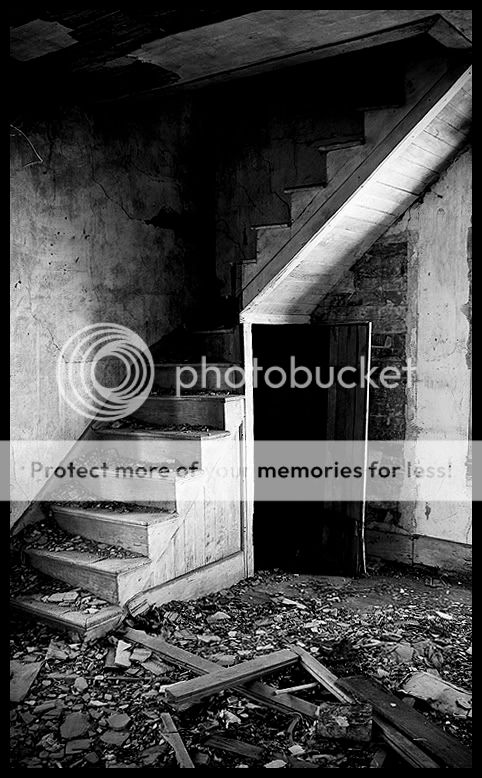


![[No title]](/data/xfmg/thumbnail/30/30871-c87f97bf2d9d493b4c08ba6482680038.jpg?1619734488)


![[No title]](/data/xfmg/thumbnail/42/42253-fef7e43227f484b1a95dd6d85c03bd40.jpg?1619740063)
![[No title]](/data/xfmg/thumbnail/30/30870-c7febc7c14dc6447653c2ae2355ffc61.jpg?1619734488)