
minicoop1985
Been spending a lot of time on here!
- Joined
- Sep 3, 2013
- Messages
- 5,520
- Reaction score
- 1,865
- Location
- Appleton, WI
- Can others edit my Photos
- Photos OK to edit
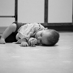
Hey guys. This is the result of my second family photoshoot. I'm normally doing products and commercial junk, so this is a bit out of my comfort zone. How did I do here? I very much appreciate your feedback.
1.
 Debbie Jesse-5 by longm1985, on Flickr
2.
 Debbie Jesse-4 by longm1985, on Flickr
3.
 Debbie Jesse-3 by longm1985, on Flickr
4.
 Debbie Jesse-1 by longm1985, on Flickr
1.
Debbie Jesse-5 by longm1985, on Flickr2.
Debbie Jesse-4 by longm1985, on Flickr3.
Debbie Jesse-3 by longm1985, on Flickr4.
Debbie Jesse-1 by longm1985, on Flickr")
 Debbie Jesse-1-2
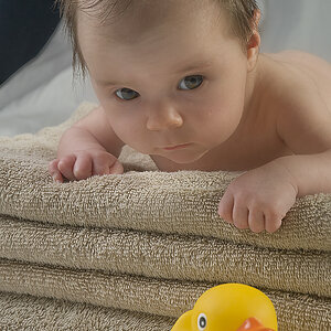
![[No title]](/data/xfmg/thumbnail/42/42359-17c2ddbbb8366896f948a571f6c09cac.jpg?1619740153)
![[No title]](/data/xfmg/thumbnail/36/36399-041c9ebc3a39e89ec8e39243c0d43528.jpg?1619737551)
![[No title]](/data/xfmg/thumbnail/32/32638-22cfef06fc91cb3aee39b7b55c36198d.jpg?1619735555)
![[No title]](/data/xfmg/thumbnail/33/33340-27d18dd642b5257e4b9a04a4c1feffd1.jpg?1619735910)
![[No title]](/data/xfmg/thumbnail/32/32637-865ab9beec7e00237b64e4fcb8fe947f.jpg?1619735555)