The ongoing debate: colour or black & white?

vonnagy

have kiwi, will travel...
Joined
Sep 8, 2003
Messages
3,759
Reaction score
30
Location
-36.855339, 174.762384
Website
www.vonnagy.com
Can others edit my Photos
Photos NOT OK to edit
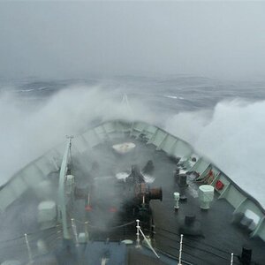
Digital sometimes gives us too many choices I think! I took these tonight and was really happy with colour. Then i switched them to b & w and they gave an entirely different mood:

tower1c.jpg

tower1.jpg


tower2c.jpg

tower2.jpg


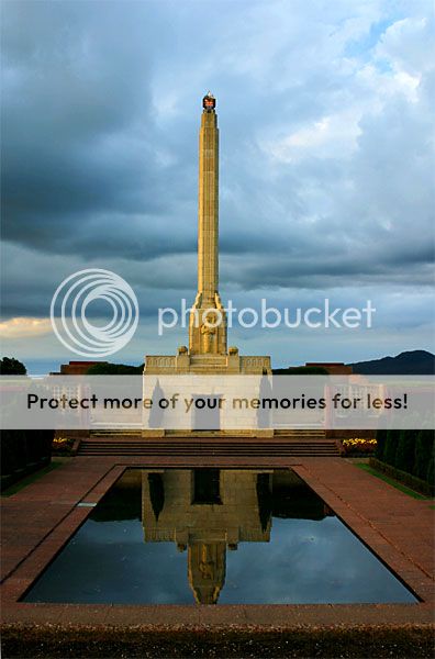
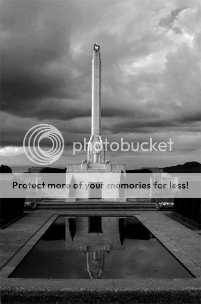
This last one i could never be satisfied with doing a black and white conversion, if you want to download it and see if you can get it to work in black in white, be my guest. I just thought I would include because its the fence behind the monument.
fence1.jpg


Comments/Criticisms/Suggestions welcome.

Any critique on compostion is more than welcome, but i am mainly looking for insights into the strengths and weaknesses of colour vs. black in these images. Look beyond your biases of colour or b&w and help me out here. Again, I am not looking to say if one is better than another, but just trying to gather how each impacts the viewers in different ways.
 
Oh, I want the last one as my computer's wallpaper!!! I LOVE it!!!

Of the first, I prefer the first over the second motif (that monument taken "Tadj Mahal"-style, if you understand?) in both ways, and although I do see where the mood changes dramatically - the sky's soooo much more brooding and dramatic in the b+w version), I prefer the colour version because of the colours. The light was special on the occasion and you had a chance to capture that low, yellow sun, which is why I am glad I get a chance to see it, too.

It is a matter of taste, too, I think. Fans of b+w will say they prefer the b+w variant. If you want to see the heavy clouds, THAT photo will give you those. If you want to see the special effect of a low sun against some heavy weather, the colour photo will do it for you.

But the fence... puleeeeeaaaaase! Let me have it as my wallpaper, hm??? (How large would it have to be?)
 
hi laphoto,

check your pm :)

If you want to see the heavy clouds, THAT photo will give you those. If you want to see the special effect of a low sun against some heavy weather, the colour photo will do it for you.

thanks, for that Laphoto, that is a good very point.. thats exactly the kind of information i looking for here :)

There are also very very subtle differences highlighted and deemphasized in b&w photos. Can any one see these differences? Do this differences impact on the final outcome?
 
OH my.... that last one.... Is great... it might be ever so slightly dark though. I would play with the levels and see.

Um.. the first one... while excellent color and black and white I'm not really sure I like it all that much. The reflection getting cut off disturbs me. :?

Second one. Gahh... I love both. I mean I was going to say that the black and white gave the clouds a really mean and evil storm feel but the color does also. The color one is gorgeous in it's color but the black and white brings out the excellent composition more. I just can't pick. :?
 
Vonn- how did you convert to BW in the middle set (flowers in foreground, tower in background)?

Let's see what each of the RGB channels looks like. It would be a good demonstration of using colored filters to affect tones and contrast for BW.

I really like the first one. The color version is very serene, while the BW version seems more dramatic and stormy.
 
Dude, mark that last image is incredible. That is definately my favorite image from you.

You're so damn lucky to have as much dramatic lighting and cloud formations. I really envy you. Of course, you know how to capture the image, and your composition is wonderful.
 
I can absolutly see the differencs from color and b&w in these. the b&w give it a spooky feel. I am currently frustrated with some pictures that I dont know if they should be color or b&w.

Im gona ride the fence here. Either way you go your going to have strong pictures with a lot of depth. You might want to mess with the contrast in the b&w pictures.
 
Thanks Matt,

The 'filtering' is exactly the subtle differences i've noticed in the pics:

1. Notice that there is a 'blue' tile next to the reflection pool in the colour pic. That is all but gone in the b&w image.

2. A couple things here. The most striking is the flower, you can see the veins in the flowers in the black n white one, but they are very difficult to tell in the colour one. Also the tip of the monument looks hollow, where the in the colour one it doesn't. I am not sure about why on this one.

I used the channel mixer to get these effects, i left it on 100% red, 10% green, -10% blue for my final one:
tower2.jpg


This one is emphasized the green channel: 100% green, 0% red, 0% blue
tower2g.jpg


This one emphasizes the blue channel: 100% blue, 0% green, 0% red.
tower2b.jpg


Personally i've never like anything with too much of a blue cast for some reason there seems to be alot of muddiness there... For those who are new to b&w channel mixing, check out voodoocats tutorial here: http://www.thephotoforum.com/forum/viewtopic.php?t=4048 Its tip # 3.

Thanks for feedback and suggestions!

The last one was a pleasant surprise for me... I was almost certain that it was going to be a tosser because in the camera screen the only thing you could see was the fence. It actually took minimal work in pshop to bring out the greens and the sky in that one.

I would play with the levels and see.

thanks Karissa, the more I play with levels the less i like it :( Though I can't give a technical reason why, levels can really nuke the the tonality of your pic. There are ways around this that are much better than levels that I will do a tutorial on someday. I am learning that levels are just a quick fix and should not be used for every situation to bring out details in the shadows.

Oh, thats not to say your observations aren't right here - the original picture was really dark!
 
vonnagy said:
thanks Karissa, the more I play with levels the less i like it :( Though I can't give a technical reason why, levels can really nuke the the tonality of your pic. There are ways around this that are much better than levels that I will do a tutorial on someday. I am learning that levels are just a quick fix and should not be used for every situation to bring out details in the shadows.

Oh, thats not to say your observations aren't right here - the original picture was really dark!

That’s ok man I understand. I never said I was anywhere near as good as you are with ps. I'm a baby still. I made the observation but didn't really know how to fix it. :? One of these days I'm going to check out the tutorials you guys are doing. I could really use some. :)
 
that’s ok man I understand. I never said I was anywhere near as good as you are with ps.

:lol:, i am no where as good as i think i am with photoshop!! We aren't here to compare are respective skills but here to learn from one another! :mrgreen:
 
vonnagy said:
that’s ok man I understand. I never said I was anywhere near as good as you are with ps.

:lol:, i am no where as good as i think i am with photoshop!! We aren't here to compare are respective skills but here to learn from one another! :mrgreen:

That being the reason we all love it here! :love: :hug: Thanks Vonnagy.
 
karissa said:
That being the reason we all love it here! :love: :hug: Thanks Vonnagy.

:) it is great place, eh?

I find that in some cases changeing a color to b&w can take away from a picture as in your first example. were I think it added to it in your second example.

I think know what you are getting at here, but do think you can explain how it takes away from the first and adds to the second? When you mention 'takes away' what does it take away aside from the colour? Also does 'taking away' have any negative or positive connotations?

Thanks for the comment, I'm just wanting know exactly what you see :D
 
Usually I prefer b/w, but with these - I can't choose - I like them all both ways.... very nice work.
 

Most reactions

New Topics

Back
Top