The Reader

Donde

TPF Supporters
Supporting Member
Joined
Jan 2, 2007
Messages
3,248
Reaction score
3,729
Location
Cali, Colombia
Can others edit my Photos
Photos NOT OK to edit
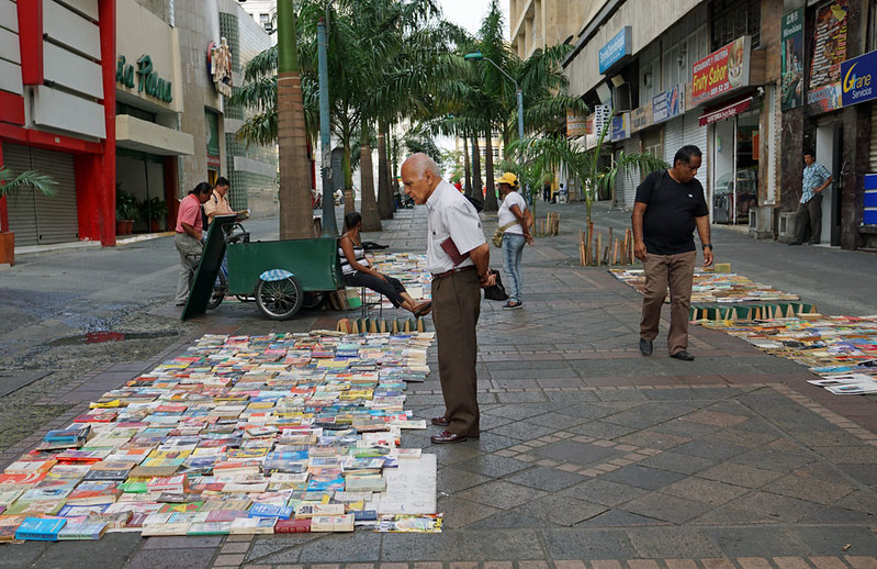
It was a holiday so the "El Centro" sector of Cali was pretty empty but there were still a few people about including this man looking at used books.
17337692215_f92e3c2bb0_c.jpg
 
Interesting shot that tells a story (sic).
 
I think that the viewer really needs to understand very quickly what the photographer is showing.
Typically the powerful places for a center of interest are at the thirds, not in the center.
In the original the largest center of interest is in the center with his back to the other potential center of interest the other man.
However there seems to be no reason for that and I start to wonder what I am supposed to be looking at here.
If it is the largest man, why is there so much unused space at the right?
Perhaps simplifying the picture and even converting to BW so that the colors in the background don't catch the eye.

readerorig.jpg


then the figure in the foreground becomes much more important and there is less distraction.

readerll.jpg
 
... NOT OK to edit o_O :icon_question:
 
The main subject is centred for sure and the photo would be more dynamic if he were slightly away from the middle. However, I would leave the man in the black T-shirt in and with either a 3X2 or 3x5 aspect intercept the woman wearing a yellow hat with the right-hand vertical thirds line. B&W works well and is not a bad idea since, as Lou mentioned, the distraction caused by colour in peripheral areas is eliminated; however, the books are a wonderful patchwork of colour themselves and I'd be inclined to stay with colour and live with the problem.

If you like I could post an example crop or two.
 
It is tilted a bit to the left...needs some minor rotation and a re-crop...lop off that lower left corner and edge. There is also too much space allocated to the top area of the frame...that just pulls the eye back, away from the books and the men looking at them. We 'get' the scene is urban...the building facades in the background distract.
 
Thanks I appreciate your effort but I am not in agreement. I really don't like the black and white at all and I think the edit is a less interesting image than the original. It eliminates the sense of place and space I intended to show. Personally I think black and white should be used sparingly and not willy nilly across the board and I don't think it improves my image a whit. There are colors all over the photo and the eye can be led around through the image by them. They add interest in my opinion and not distraction. There are no hard and fast rules about composition and there is nothing wrong with placing the center of interest in the center of the image if one so chooses. It simply produces a symmetrical rather than asymmetrical result. A classic example is the Birth of Venus by Sandro Botticelli.
 
Last edited:

Most reactions

Back
Top