The Restmore Building - East Vancouver

mcopan

TPF Noob!
Joined
May 1, 2010
Messages
95
Reaction score
0
Location
Burnaby, BC, Canada
Website
www.triumphentertainment.ca
Can others edit my Photos
Photos NOT OK to edit
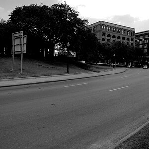
i was roaming around East Vancouver the other day and came across the neat building. The outside looks like nothing has changed since it was built but all the interior and structure has been modernized. I though it was neat and hope others here do too.

If there is any suggestions let me know. Enjoy.

DSC_00181.jpg
 
Nice even shades of gray.
Looks flat.

+1

How can you be so right yet use so few words? :lmao:


To the OP: Was this intended as a B&W or was it a case of the color version was boring? You need to think in B&W when you shoot FOR B&W.

This photo is a hell of a mess which I would like if it was controlled mess. It is not.

I have a feeling that if you had shot this building straight on but a little closer so as to get rid of the sky (or maybe just 99% of it) and the grass, you would have had a very nice shot to work with, a beautiful mess. :D

I say "I have a feeling" because it is always hard to imagine how things could have been. And I could be totally wrong.
 
If you shoot straight on, the surrounding buildings don't get into the equation.

And the oncoming train will pass. Just wait a few minutes.
 
If I may suggest, try it again with the same lens first, Just so you can see the difference between what you did last time and what you are doing now.

Then, go crazy with your new lens :thumbup:
 
I am open to suggestions. I will always be learning and would like to become better progressively. I like to stop and think before I take a shot about the shot especially focusing on being different since there are so many other photographers out there.

Any who, I will shoot with the same lens and switch to the prime lens I want to try out.
Thanks.
 
I went down to re-shoot this and didn't get much time before I was usher off CN Rail property by Vancouver's Finest in Blue. I was planning on taking another shot from "strait on" because of suggestions but decided against it. It looked weird.

So I got home after and started playing around with the contrasts and various settings to see what I could to with the original shot. I have update the photo above with the newly work photo in the hopes of losing the "flat" in the photo.

Still open to suggestions and ideas. For those who already helped thanks.
 
Still very midtone rich.
Not very visually stimulating.


Gah, I hate pointless watermarks.
Particularly one that is oxymoronic.
 

Most reactions

Back
Top