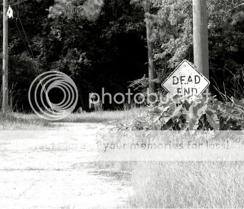
It's a nice picture. For a black and white picture, your lighting must have been very nice to get such a nicely detailed photo. I particularly like the way grass shows up.
You obviously follow the rule of thirds to place the "dead end" sign.
Yet I feel that your picture is missing the "oomph factor". The "dead end" sign blends in with the rest. I want it to somehow jump out at me. Maybe you should have stood closer to it or with right part of it getting cropped out or something. You could experiment with it. In summary, the sign should not be in harmony with the rest of the picture and it needs to stand out.
The foreground is overexposed and it's very distracting. A double exposure would've solved the problem.
Though it would be clever if you are implying you are straying from the light, and only darkness lies ahead, that is the "dead end". Then there's a reason to not incorporate rules of third, to overexpose the foreground. But this relationship is not consistent in your photo, light is splattered across the image and heavily concentrated in the foreground. And that can imply so many themes. So in the end you have a confusing image.
That's why I hate abstract arts that doesn't appeal to me as beautiful, they rely on confusion for attention. [/rant]
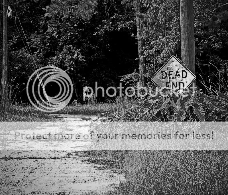
I just took it into adobe lightroom and messed with levels until I started to get texture back into the blown out highlight areas. Now that I look at it again though, you could bump the highlights up a little bit in the one I edited to add a little more contrast.

") )
)


![[No title]](/data/xfmg/thumbnail/32/32699-3434a76363cb383404e00a3cd5ed5728.jpg?1619735601)