- Joined
- Aug 2, 2015
- Messages
- 2,174
- Reaction score
- 1,785
- Can others edit my Photos
- Photos NOT OK to edit
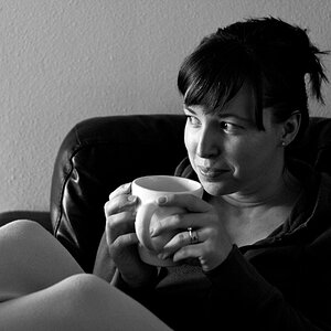
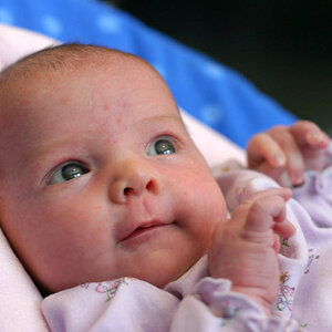
D850
f/2.8
ISO 500
1/100 Sec.
24 - 70 mm - f/2.8G
32 mm
(Natural Light)
(Processed In LR & Color Efex Pro 4)

Thanks For Looking Any Comments/Criticism Will Be Appreciated.
Enezdez
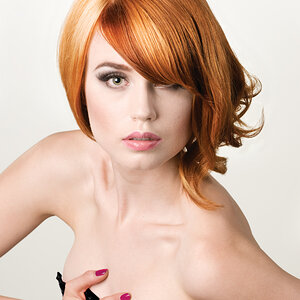
f/2.8
ISO 500
1/100 Sec.
24 - 70 mm - f/2.8G
32 mm
(Natural Light)
(Processed In LR & Color Efex Pro 4)
Thanks For Looking Any Comments/Criticism Will Be Appreciated.
Enezdez


![[No title]](/data/xfmg/thumbnail/34/34124-fcd12598382b4477643ef3dde2d6751d.jpg?1619736294)