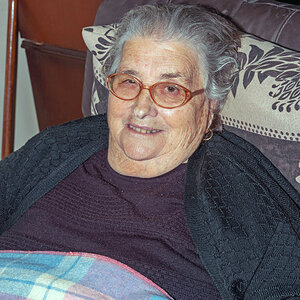
I'd have to agree with Jonmikal. I personally think if there wasn't a reflection in her eyes, it would make a better shot.. the whiteness in her corneas is distracting. Doesn't take away from those beautiful eyes though.
I disagree with the reflection. I think it's a nice effect. Makes the viewer wonder what she's lookin at. It also gives it that sparkle quality, and to me it just tops the pic! Nice job!
I disagree with the reflection. I think it's a nice effect. Makes the viewer wonder what she's lookin at. It also gives it that sparkle quality, and to me it just tops the pic! Nice job!
I like the image a lot more than I like the emphatic statement. The photo would be enhanced by losing the exclamation point. There's really no need to shout.
I like the image a lot more than I like the emphatic statement. The photo would be enhanced by losing the exclamation point. There's really no need to shout.
I like the image a lot more than I like the emphatic statement. The photo would be enhanced by losing the exclamation point. There's really no need to shout.
I never regard the signatures--one way or the other. Only the images interrest me. But since you mentioned the signature, I like the exclamation point. I think it even adds emphasis to the eyes (WHICH ARE ALWAYS REFERRED TO AS THE WINDOWS TO THE SOUL)
I take the view that the complete image or work should be evaluated as presented. In a gallery, the choice of frame can destroy a print, and in photography, a description or title, when provided, influences how the image is interpreted.
canonrebel said:
But since you mentioned the signature, I like the exclamation point. I think it even adds emphasis to the eyes (WHICH ARE ALWAYS REFERRED TO AS THE WINDOWS TO THE SOUL)
I do like that better, as it really concentrates the image. She has stunning eyes, and the photo conveys your message clearly. I'm thinking "Wow" in a way that I wasn't before. The aspect ratio, hair, and angle are all excellent. I want to see the rest of her, but can't, and instead am transfixed by her eyes. Excellent work.
I don't think that the idea of the border and statement are without merit, though. If you like it, keep it, but it needs to be carefully done so that it doesn't overwhelm the photo. I feel like I'm seeing it for the first time.
I really like this photo. The cropping was extremely well done, it can be hard to determine where to crop to get the eyes but not make the nose feel cut off. Only think I would suggest is just a tad more light on her left (as you look at the photo) eye. I like the border on the second, and as someone suggested perhapes light grey text would compliment this well.
I take the view that the complete image or work should be evaluated as presented. In a gallery, the choice of frame can destroy a print, and in photography, a description or title, when provided, influences how the image is interpreted.
canonrebel said:
But since you mentioned the signature, I like the exclamation point. I think it even adds emphasis to the eyes (WHICH ARE ALWAYS REFERRED TO AS THE WINDOWS TO THE SOUL)
Matthew, After just having viewed the image without the border and without the signature, I totally agree with everything you've mentioned. You may have changed my method of looking. Thanks


")


![[No title]](/data/xfmg/thumbnail/37/37540-73002ccb910b97978bc38658622a34d3.jpg?1619738133)

![[No title]](/data/xfmg/thumbnail/35/35265-c9ea3efd2c618a57ea136e63ad106880.jpg?1619736970)