Navigation
Install the app
How to install the app on iOS
Follow along with the video below to see how to install our site as a web app on your home screen.

Note: This feature currently requires accessing the site using the built-in Safari browser.
More options
You are using an out of date browser. It may not display this or other websites correctly.
You should upgrade or use an alternative browser.
You should upgrade or use an alternative browser.
The Witching Hour - c&c please
- Thread starter CorrieMichael
- Start date
OP
OP
CorrieMichael
No longer a newbie, moving up!
- Joined
- Sep 28, 2012
- Messages
- 447
- Reaction score
- 166
- Location
- Canada
- Can others edit my Photos
- Photos OK to edit
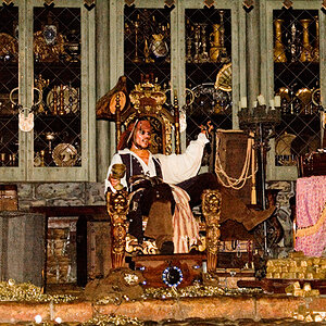
#1. Move your watermark to a corner and reduce the opacity a bit so nobody b*tches about its location. I understand why it's there. But it is annoying where you've got it.
#2. Straighten the darn thing up. Whatever she's sitting on is leaning and it's driving me batty. And I would have liked to see the bottom of whatever it is (i.e. back away from her a bit) but that doesn't ruin this shot for me.
#3 - Straightened, and crops I feel improve the shot.
Off center:
Square:
As vertical as I could get it:
I like it, I like the concept a lot. The only thing I mentioned above that I *have to have* to call it a winner is straightening it, and maybe that's just me since nobody else mentioned it.


I actually did straighten it when editing....then the model looks off kilter for me..........then I did a composition and straightened it.....................lol.............and went back to the original because well because it's a witch in a forest and I kinda liked the feel of it being a bit off kilter better than perfected......but yeah i totally straightened it and didn't like it at least in my crop. And I know this might sound pompous but I am not going to change the crop......I did it intentionally and LOVE LOVE LOVE it like that but I so appreciate all of the feedback. Thank you so much for spending the time on my image and playing with it.
") <3
<3
OP
OP
CorrieMichael
No longer a newbie, moving up!
- Joined
- Sep 28, 2012
- Messages
- 447
- Reaction score
- 166
- Location
- Canada
- Can others edit my Photos
- Photos OK to edit
Lol I see 80's Cyndi Lauper rather than a witch but I will go with it.
I'm not from that era
- Joined
- Oct 16, 2012
- Messages
- 14,632
- Reaction score
- 7,562
- Can others edit my Photos
- Photos OK to edit
Lol I see 80's Cyndi Lauper rather than a witch but I will go with it.
I'm not from that era
Hey I am only 33!
LCLimages
No longer a newbie, moving up!
- Joined
- Mar 27, 2014
- Messages
- 354
- Reaction score
- 311
- Location
- Missouri
- Can others edit my Photos
- Photos OK to edit
#1. Move your watermark to a corner and reduce the opacity a bit so nobody b*tches about its location. I understand why it's there. But it is annoying where you've got it.
#2. Straighten the darn thing up. Whatever she's sitting on is leaning and it's driving me batty. And I would have liked to see the bottom of whatever it is (i.e. back away from her a bit) but that doesn't ruin this shot for me.
#3 - Straightened, and crops I feel improve the shot.
Off center:
Square:
As vertical as I could get it:
I like it, I like the concept a lot. The only thing I mentioned above that I *have to have* to call it a winner is straightening it, and maybe that's just me since nobody else mentioned it.
I actually did straighten it when editing....then the model looks off kilter for me..........then I did a composition and straightened it.....................lol.............and went back to the original because well because it's a witch in a forest and I kinda liked the feel of it being a bit off kilter better than perfected......but yeah i totally straightened it and didn't like it at least in my crop. And I know this might sound pompous but I am not going to change the crop......I did it intentionally and LOVE LOVE LOVE it like that but I so appreciate all of the feedback. Thank you so much for spending the time on my image and playing with it.
To my eyes, it's way more bothersome to have a horizontal line running so close to the bottom of the image that is slanted, than it is to view a model who is practically imperceptibly leaning to the viewer's left.
Obviously you love this image the way you shot it, so I have to ask - why ask for critique? If you love it and see nothing to potentially change or improve on, what's the point? I'm not trying to sound rude or offensive, but you've been given the same critique(s) by multiple photographers. We ALL have shots we love, regardless if others agree or pick them apart. Photographers and their clients can easily get emotionally attached to their images, I have many myself. And really, if your model/client loves it, that's the end of the line. However, my opinion is if you're not going to consider the suggestions given, don't ask for them. It may cause hesitation to provide feedback or critique in the future.
Do not get me wrong - overall this is a strong shot and a nice use of light and DOF. The negative space, IMO, does not tell a story, it distracts from the subject of the shot. Perhaps if there was a series from this session, there would be more of a story to understand.
- Joined
- Jun 2, 2013
- Messages
- 4,493
- Reaction score
- 4,141
If she loves it, and it IS a good image the way she has it, there is no reason for her to change it just because a few photographers suggested she change it. She even just said that she changed it and did not like it that way.#1. Move your watermark to a corner and reduce the opacity a bit so nobody b*tches about its location. I understand why it's there. But it is annoying where you've got it.
#2. Straighten the darn thing up. Whatever she's sitting on is leaning and it's driving me batty. And I would have liked to see the bottom of whatever it is (i.e. back away from her a bit) but that doesn't ruin this shot for me.
#3 - Straightened, and crops I feel improve the shot.
Off center:
Square:
As vertical as I could get it:
I like it, I like the concept a lot. The only thing I mentioned above that I *have to have* to call it a winner is straightening it, and maybe that's just me since nobody else mentioned it.
I actually did straighten it when editing....then the model looks off kilter for me..........then I did a composition and straightened it.....................lol.............and went back to the original because well because it's a witch in a forest and I kinda liked the feel of it being a bit off kilter better than perfected......but yeah i totally straightened it and didn't like it at least in my crop. And I know this might sound pompous but I am not going to change the crop......I did it intentionally and LOVE LOVE LOVE it like that but I so appreciate all of the feedback. Thank you so much for spending the time on my image and playing with it.
To my eyes, it's way more bothersome to have a horizontal line running so close to the bottom of the image that is slanted, than it is to view a model who is practically imperceptibly leaning to the viewer's left.
Obviously you love this image the way you shot it, so I have to ask - why ask for critique? If you love it and see nothing to potentially change or improve on, what's the point? I'm not trying to sound rude or offensive, but you've been given the same critique(s) by multiple photographers. We ALL have shots we love, regardless if others agree or pick them apart. Photographers and their clients can easily get emotionally attached to their images, I have many myself. And really, if your model/client loves it, that's the end of the line. However, my opinion is if you're not going to consider the suggestions given, don't ask for them. It may cause hesitation to provide feedback or critique in the future.
Do not get me wrong - overall this is a strong shot and a nice use of light and DOF. The negative space, IMO, does not tell a story, it distracts from the subject of the shot. Perhaps if there was a series from this session, there would be more of a story to understand.
As for asking for critique, you can still get good feedback and not have to submit to what everyone else says, otherwise it would no longer be her own, especially if she doesn't like the way it looks after taking those suggestions.
Asking for critique does not mean in any way that you are required to agree with said critique.
Last edited:
Forkie
Been spending a lot of time on here!
- Joined
- Feb 14, 2011
- Messages
- 2,292
- Reaction score
- 920
- Location
- Chiswick, London, UK
- Website
- www.ianforknall.com
- Can others edit my Photos
- Photos NOT OK to edit
#1. Move your watermark to a corner and reduce the opacity a bit so nobody b*tches about its location. I understand why it's there. But it is annoying where you've got it.
#2. Straighten the darn thing up. Whatever she's sitting on is leaning and it's driving me batty. And I would have liked to see the bottom of whatever it is (i.e. back away from her a bit) but that doesn't ruin this shot for me.
#3 - Straightened, and crops I feel improve the shot.
Off center:
Square:
As vertical as I could get it:
I like it, I like the concept a lot. The only thing I mentioned above that I *have to have* to call it a winner is straightening it, and maybe that's just me since nobody else mentioned it.
I actually did straighten it when editing....then the model looks off kilter for me..........then I did a composition and straightened it.....................lol.............and went back to the original because well because it's a witch in a forest and I kinda liked the feel of it being a bit off kilter better than perfected......but yeah i totally straightened it and didn't like it at least in my crop. And I know this might sound pompous but I am not going to change the crop......I did it intentionally and LOVE LOVE LOVE it like that but I so appreciate all of the feedback. Thank you so much for spending the time on my image and playing with it.
To my eyes, it's way more bothersome to have a horizontal line running so close to the bottom of the image that is slanted, than it is to view a model who is practically imperceptibly leaning to the viewer's left.
Obviously you love this image the way you shot it, so I have to ask - why ask for critique? If you love it and see nothing to potentially change or improve on, what's the point? I'm not trying to sound rude or offensive, but you've been given the same critique(s) by multiple photographers. We ALL have shots we love, regardless if others agree or pick them apart. Photographers and their clients can easily get emotionally attached to their images, I have many myself. And really, if your model/client loves it, that's the end of the line. However, my opinion is if you're not going to consider the suggestions given, don't ask for them. It may cause hesitation to provide feedback or critique in the future.
Do not get me wrong - overall this is a strong shot and a nice use of light and DOF. The negative space, IMO, does not tell a story, it distracts from the subject of the shot. Perhaps if there was a series from this session, there would be more of a story to understand.
I find it odd that people think photos should tell a story. Stories generally have a beginning, a middle and an end. A photo is a fraction of a second and can't possibly tell a story in the sense of a sequence of events.
A photo is (generally) required to be visually and compositionally balanced with regards to subject placement, colour palette, geometry, and the balance between light and dark and positive and negative space with the goal of drawing the eye of the viewer on a path to the subject.
The negative space of this shot draws the eye to focus on the main subject, the witch. I think it is a good example of the use of negative space to draw the eye where it should end up. The [negative space of the] field is purely a carriage to get you to the witch.
LCLimages
No longer a newbie, moving up!
- Joined
- Mar 27, 2014
- Messages
- 354
- Reaction score
- 311
- Location
- Missouri
- Can others edit my Photos
- Photos OK to edit
#1. Move your watermark to a corner and reduce the opacity a bit so nobody b*tches about its location. I understand why it's there. But it is annoying where you've got it.
#2. Straighten the darn thing up. Whatever she's sitting on is leaning and it's driving me batty. And I would have liked to see the bottom of whatever it is (i.e. back away from her a bit) but that doesn't ruin this shot for me.
#3 - Straightened, and crops I feel improve the shot.
Off center:
Square:
As vertical as I could get it:
I like it, I like the concept a lot. The only thing I mentioned above that I *have to have* to call it a winner is straightening it, and maybe that's just me since nobody else mentioned it.
I actually did straighten it when editing....then the model looks off kilter for me..........then I did a composition and straightened it.....................lol.............and went back to the original because well because it's a witch in a forest and I kinda liked the feel of it being a bit off kilter better than perfected......but yeah i totally straightened it and didn't like it at least in my crop. And I know this might sound pompous but I am not going to change the crop......I did it intentionally and LOVE LOVE LOVE it like that but I so appreciate all of the feedback. Thank you so much for spending the time on my image and playing with it.
To my eyes, it's way more bothersome to have a horizontal line running so close to the bottom of the image that is slanted, than it is to view a model who is practically imperceptibly leaning to the viewer's left.
Obviously you love this image the way you shot it, so I have to ask - why ask for critique? If you love it and see nothing to potentially change or improve on, what's the point? I'm not trying to sound rude or offensive, but you've been given the same critique(s) by multiple photographers. We ALL have shots we love, regardless if others agree or pick them apart. Photographers and their clients can easily get emotionally attached to their images, I have many myself. And really, if your model/client loves it, that's the end of the line. However, my opinion is if you're not going to consider the suggestions given, don't ask for them. It may cause hesitation to provide feedback or critique in the future.
Do not get me wrong - overall this is a strong shot and a nice use of light and DOF. The negative space, IMO, does not tell a story, it distracts from the subject of the shot. Perhaps if there was a series from this session, there would be more of a story to understand.
I find it odd that people think photos should tell a story. Stories generally have a beginning, a middle and an end. A photo is a fraction of a second and can't possibly tell a story in the sense of a sequence of events.
A photo is (generally) required to be visually and compositionally balanced with regards to subject placement, colour palette, geometry, and the balance between light and dark and positive and negative space with the goal of drawing the eye of the viewer on a path to the subject.
The negative space of this shot draws the eye to focus on the main subject, the witch. I think it is a good example of the use of negative space to draw the eye where it should end up. The [negative space of the] field is purely a carriage to get you to the witch.
She's the one who said it told a story as is, not me. All I did was say that to me, as is, it does not tell a story. I don't "get" the story it's supposedly telling.
To each their own. I'm genuinely not trying to be rude. I suppose myself, when offered critique I don't necessarily agree with, try to look at it from that point of view instead of instantly defending my shot. Especially if offered the same critique multiple times. If I have a shot I know there is nothing I will consider changing about it no-way-no-how I love it as is, then I don't post it for critique and suggestions. That is all
 I still think it is a great shot, and I didn't say she HAD to change it. I was just pointing out the reasons why I offered the suggestions I did.
Now, everybody happy happy happy! (duck dynasty... probably just me)...
Forkie
Been spending a lot of time on here!
- Joined
- Feb 14, 2011
- Messages
- 2,292
- Reaction score
- 920
- Location
- Chiswick, London, UK
- Website
- www.ianforknall.com
- Can others edit my Photos
- Photos NOT OK to edit
Oooh, did I quote the wrong post? Sorry!!
I wasn't having a dig or anything. I do often see things in their literal sense - I'm not very good at attaching stories and sentiments to photos - I often just see them as a "design" in a rectangle, so my views on people's photos can seem a little cold sometimes!
We're all good!
I wasn't having a dig or anything. I do often see things in their literal sense - I'm not very good at attaching stories and sentiments to photos - I often just see them as a "design" in a rectangle, so my views on people's photos can seem a little cold sometimes!
We're all good!
- Joined
- Jun 2, 2013
- Messages
- 4,493
- Reaction score
- 4,141
To be fair, she did actually say that she tried the suggestions and didn't like the results. I think it's safe to say she considered other points to see it from.#1. Move your watermark to a corner and reduce the opacity a bit so nobody b*tches about its location. I understand why it's there. But it is annoying where you've got it.
#2. Straighten the darn thing up. Whatever she's sitting on is leaning and it's driving me batty. And I would have liked to see the bottom of whatever it is (i.e. back away from her a bit) but that doesn't ruin this shot for me.
#3 - Straightened, and crops I feel improve the shot.
Off center:
Square:
As vertical as I could get it:
I like it, I like the concept a lot. The only thing I mentioned above that I *have to have* to call it a winner is straightening it, and maybe that's just me since nobody else mentioned it.
I actually did straighten it when editing....then the model looks off kilter for me..........then I did a composition and straightened it.....................lol.............and went back to the original because well because it's a witch in a forest and I kinda liked the feel of it being a bit off kilter better than perfected......but yeah i totally straightened it and didn't like it at least in my crop. And I know this might sound pompous but I am not going to change the crop......I did it intentionally and LOVE LOVE LOVE it like that but I so appreciate all of the feedback. Thank you so much for spending the time on my image and playing with it.
To my eyes, it's way more bothersome to have a horizontal line running so close to the bottom of the image that is slanted, than it is to view a model who is practically imperceptibly leaning to the viewer's left.
Obviously you love this image the way you shot it, so I have to ask - why ask for critique? If you love it and see nothing to potentially change or improve on, what's the point? I'm not trying to sound rude or offensive, but you've been given the same critique(s) by multiple photographers. We ALL have shots we love, regardless if others agree or pick them apart. Photographers and their clients can easily get emotionally attached to their images, I have many myself. And really, if your model/client loves it, that's the end of the line. However, my opinion is if you're not going to consider the suggestions given, don't ask for them. It may cause hesitation to provide feedback or critique in the future.
Do not get me wrong - overall this is a strong shot and a nice use of light and DOF. The negative space, IMO, does not tell a story, it distracts from the subject of the shot. Perhaps if there was a series from this session, there would be more of a story to understand.
I find it odd that people think photos should tell a story. Stories generally have a beginning, a middle and an end. A photo is a fraction of a second and can't possibly tell a story in the sense of a sequence of events.
A photo is (generally) required to be visually and compositionally balanced with regards to subject placement, colour palette, geometry, and the balance between light and dark and positive and negative space with the goal of drawing the eye of the viewer on a path to the subject.
The negative space of this shot draws the eye to focus on the main subject, the witch. I think it is a good example of the use of negative space to draw the eye where it should end up. The [negative space of the] field is purely a carriage to get you to the witch.
She's the one who said it told a story as is, not me. All I did was say that to me, as is, it does not tell a story. I don't "get" the story it's supposedly telling.
To each their own. I'm genuinely not trying to be rude. I suppose myself, when offered critique I don't necessarily agree with, try to look at it from that point of view instead of instantly defending my shot. Especially if offered the same critique multiple times. If I have a shot I know there is nothing I will consider changing about it no-way-no-how I love it as is, then I don't post it for critique and suggestions. That is all
Now, everybody happy happy happy! (duck dynasty... probably just me)...
OP
OP
CorrieMichael
No longer a newbie, moving up!
- Joined
- Sep 28, 2012
- Messages
- 447
- Reaction score
- 166
- Location
- Canada
- Can others edit my Photos
- Photos OK to edit
Lol I see 80's Cyndi Lauper rather than a witch but I will go with it.
I'm not from that era
Hey I am only 33!
Ha! I was just joking I actually used to love Cindy Lauper! "Girls Just wanna have fun!"
OP
OP
CorrieMichael
No longer a newbie, moving up!
- Joined
- Sep 28, 2012
- Messages
- 447
- Reaction score
- 166
- Location
- Canada
- Can others edit my Photos
- Photos OK to edit
#1. Move your watermark to a corner and reduce the opacity a bit so nobody b*tches about its location. I understand why it's there. But it is annoying where you've got it.
#2. Straighten the darn thing up. Whatever she's sitting on is leaning and it's driving me batty. And I would have liked to see the bottom of whatever it is (i.e. back away from her a bit) but that doesn't ruin this shot for me.
#3 - Straightened, and crops I feel improve the shot.
Off center:
Square:
As vertical as I could get it:
I like it, I like the concept a lot. The only thing I mentioned above that I *have to have* to call it a winner is straightening it, and maybe that's just me since nobody else mentioned it.
I actually did straighten it when editing....then the model looks off kilter for me..........then I did a composition and straightened it.....................lol.............and went back to the original because well because it's a witch in a forest and I kinda liked the feel of it being a bit off kilter better than perfected......but yeah i totally straightened it and didn't like it at least in my crop. And I know this might sound pompous but I am not going to change the crop......I did it intentionally and LOVE LOVE LOVE it like that but I so appreciate all of the feedback. Thank you so much for spending the time on my image and playing with it.
To my eyes, it's way more bothersome to have a horizontal line running so close to the bottom of the image that is slanted, than it is to view a model who is practically imperceptibly leaning to the viewer's left.
Obviously you love this image the way you shot it, so I have to ask - why ask for critique? If you love it and see nothing to potentially change or improve on, what's the point? I'm not trying to sound rude or offensive, but you've been given the same critique(s) by multiple photographers. We ALL have shots we love, regardless if others agree or pick them apart. Photographers and their clients can easily get emotionally attached to their images, I have many myself. And really, if your model/client loves it, that's the end of the line. However, my opinion is if you're not going to consider the suggestions given, don't ask for them. It may cause hesitation to provide feedback or critique in the future.
Do not get me wrong - overall this is a strong shot and a nice use of light and DOF. The negative space, IMO, does not tell a story, it distracts from the subject of the shot. Perhaps if there was a series from this session, there would be more of a story to understand.
Well I have gotten some great feedback to consider. There was a lot of feedback on the watermark which has nothing to do with the image......cropping......and a few other suggestions. I tried them and didn't like the result. I want feedback to consider, I also wanted to see if there were any other criticism on some other things with the image that maybe i missed or didn't consider
I love feedback and having other eyes on my image to make sure I didn't miss anything. This image went into a photo competition and wanted to make sure there wasn't anything I missed before entering. Again thanks for your input and comments. Although just because someone tells me to do it doesn't mean I have to do it, in the same hand I do love to hear suggestions because you never know when it could make the world of difference for you Most reactions
-
 402
402 -
 310
310 -
 274
274 -
 270
270 -
 265
265 -
 215
215 -
 195
195 -
 181
181 -
 166
166 -
 153
153 -
 139
139 -
 139
139 -
 134
134 -
 122
122 -
 104
104