The Wood for the Trees

Tim Tucker

No longer a newbie, moving up!
Joined
Mar 23, 2015
Messages
660
Reaction score
579
Can others edit my Photos
Photos NOT OK to edit
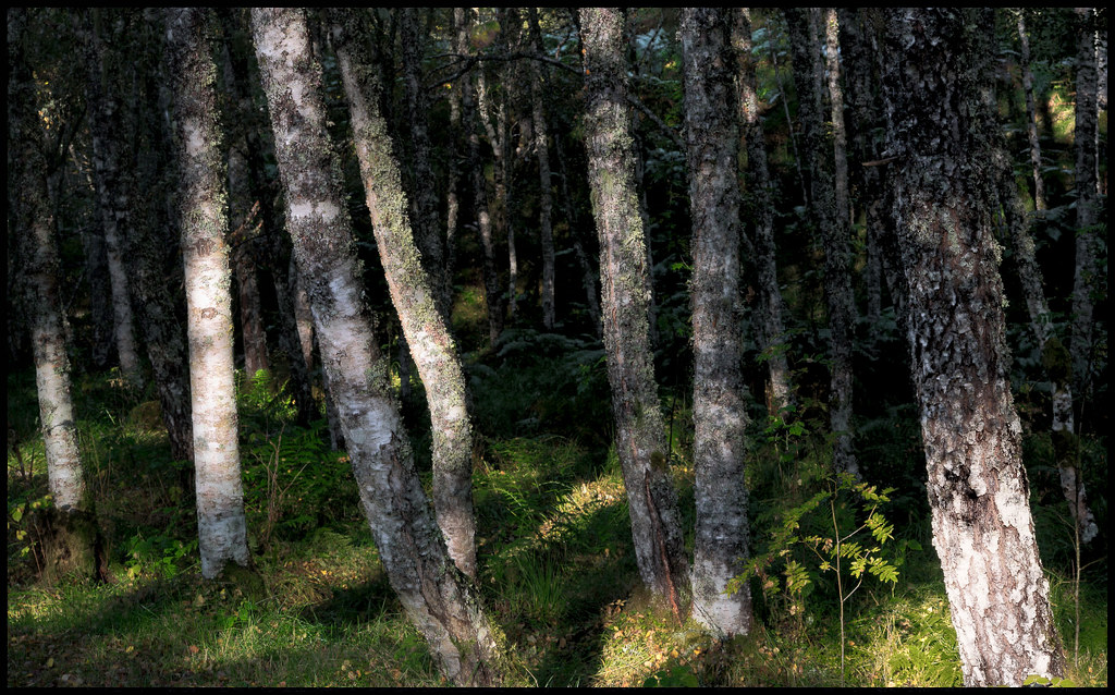
It's a theme I'm continually drawn to, though not original, the rhythmic quality of tree trunks in a wood. I was particularly drawn to these, but I might be going a little mad from spending too much time among them... :confused:

View attachment 128245
 
Last edited:
This one is for you! :clap:

 
I like it too, although I can't help wondering whether it would have more impact if the foreground vegetation and shadows were darker.
 
I'm not sure I'm feeling this one so much. While I love the dappled light and the textures of the individual trees, I'm not really getting a rhythm from the overall image. No gestalt. Perhaps a lower angle? More isolated contrast to highlight the verticals? Maybe black and white? Or the shadows like Ken suggested?
 
@KenC and @limr comments taken on board, but I'm struggling with this. B&W doesn't work because it makes the grass bright and removes the separation by colour. Darkening the foreground convincingly is difficult. the best I could come up with is a combination of de-saturation with a reduction in the green/yellow brightness:

View attachment 128335

I was also aiming for an element of confusion regarding depth with the trees. I can't really make it work (as you've both noticed). But I'm learning and next try might be better. ;)
 
Last edited:
I woodint chamge a thong
 
I sent you a conversation and hope I did it correctly as I would not publicly edit as per your request unless invited to do so.
 
I sent you a conversation and hope I did it correctly as I would not publicly edit as per your request unless invited to do so.

Post it, no worries. :)
 
I think what might have happened in your post processing is that you were so worried about the foreground standing out against the BG, you lost a bit of the middle ground. I did most of this edit simply using color range selections with a selection of curve or levels adjustments for contrast. I softened some of the brighter greens with a warm color adjustment layer on a color selection.

30081491696_fa09b32a3d_b_d.jpg

Yep, that's the problem I was having!
 

Most reactions

New Topics

Back
Top