Thinking of blowing this picture up - thoughts?

BrettG

TPF Noob!
Joined
Jun 25, 2004
Messages
111
Reaction score
0
greatview.jpg


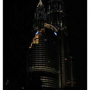
I'm finally getting around to blowing up some pictures from my trip to Alaska back in August. I was looking through all of my pictures and came across one that I never really cared for much at first, but I love now. There's a part of a tree on the right side that I'd either like to have gotten more or less of when I snapped the picture, and it's too bad the sky was so hazy. Other than that (and the rather poor quality, but that's what you get when you goto a CVS for prints!), I thought it was a great picture. Just wanted to get some other thoughts.
 
If the sky wasn't as hazy, it would be much better. Try increasing saturation in Photoshop or another editor. It also seems a bit too bright/colorless towards the top and a bit blurry at the bottom. Other than that, I like the composition :) - I am a landscape fan.
 
Yeah, if you can't tell, I'm a photo newbie. I figure I'm not gonna get a chance to visit someplace so beautiful for awhile, so I let my camera autofocus (auto everything for that matter). I think it focused on the land rather than the trees. I've learned not to trust my camera since then :wink:

It was extremely hazy when I went. There were forest fires all over (especially as we got to this spot), creating a lot of smoke. Most of the white you see in the sky is probably from that, and not so much from clouds.

I'm glad you like the composition, that's the main thing every photographer needs to have a good grasp of. Other things can be learned as you go along (and I learned a lot from the pictures I took that trip), composition isn't as easy.
 
I do, but I think it's a trial version that wont work anymore. I'll have to give it a shot and see what I can do.
 
I like the composition, not real exciting, but beautiful country. I fooled around with it in PS for a few minutes, but with the amount of haze in the sky, it is difficult to get a (IMO) great looking sky. If you do PS it, try to separate the mountains and sky from the foothills and trees, the haze effects the former more than the latter.
 
Brett, I played with the image for a minute, if you would like, I could post what I got and tell you what I did. Just wanted to make sure first since some people dont like thier work posted by other people. :0)
 
BrettG said:
I'm finally getting around to blowing up some pictures from my trip to Alaska back in August.

Sounds like a great idea but make sure that you stand well back. We don't want any injuries. :wink: :lol: :lol:

Seriously though, I like the feeling of space. Unfortunately the quality of the print is, as you say, rather low. On balance, the picture doesn't do an awful lot for me, however if you like it then that's the most important thing.

T
 
KABOOOOOOOOOOOOM :p

i'd say, if you think you want it on your wall... go for it. if it means something to you and you want to see a large version of it, then why not?

I personally would rather see something with "motion and emotion" on my wall... something that makes people need to really look at it to see what its all about. but thats me, i've never been much of a landscape person.
 
GerryDavid said:
Brett, I played with the image for a minute, if you would like, I could post what I got and tell you what I did. Just wanted to make sure first since some people dont like thier work posted by other people. :0)
Not a problem whatsoever! If I ever post a picture I wouldn't mind anyone posting a photoshop of it, even if I bought the full version I doubt I'd be very good with fooling around with it. Please post!
 
I've tried editing the photo, but it didn't turn out that good. I can't delete this reply, though.
 
medium.jpg

http://www.pbase.com/image/36977769/original.jpg

I went into curves and played with it a bit to darken the sky and brighten the ground. Then went into the blue channel and reduced the amount of blue in the ground and increased it in the sky, or something like that, which brought out a bit more cloud detail. Then I played with the green curve a bit, maybe a bit to much. And I cropped the areas on both sides due to the tree's. :0)

It looked better at the time, the more detail in the clouds. Im not really sure I like the green of the forest, not sure how natural lookin that is.
 
Just a tip, never use the contrast/brightness tool, it ruins the picture apperanlty, taking detail out of the picture. Same is said about levels but its not as bad. Curves is the way to go. At least according to my ps teacher. :0) Once you get the hang of it, its pretty easy to do and you get more control over the image.
 

Most reactions

New Topics

Back
Top