Here's my take on them. I'm no expert, so take my opinion with a grain of salt.
1. Cool looking van, and the fact that it's parked in a no parking zone is a nice capture, but to me, it's just a snap shot.
2. I'm no expert at portrait photography, but I think that is nicely done, and the pose doesn't look to bad. Only issue I've got is the fact that her hair blends into the background, so it looks like the very top of her hair is cut off, but I can't tell for sure on that.
3. Just looks like a field of flowers. I'm a fan of seeing them up close.
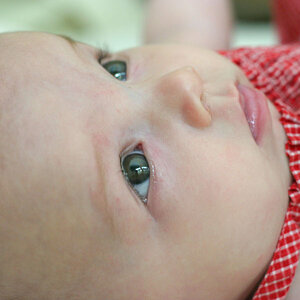
4. Very cute pose. Myself, I think it's a little overexposed. I think a little bit of PP on this one, and it would be very nice.
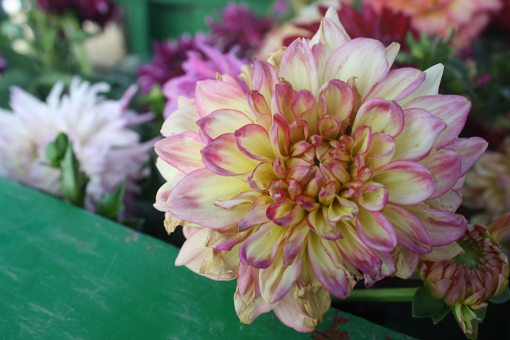
5. Nice close up, shame that green board got in the way. Myself I would have tried to find another one without the green board.
I don't have a calibrated monitor, so some of my observations could be off.
The light for the portrait is very harsh and makes every pore of her skin show. I am not sure a woman is overly happy with this. Women love to be lighted in a manner that they look smooth and without any blemishes at all (not that SHE has "blemishes" of any sort). Also the direct (in-camera?) flash blows out parts of her skin ... and the entire left side of the photo is just black, featureless black, which makes me wonder "Why did he not rotate the camera into a vertical position for a portrait?"
The girl is cute, just a little overexposed, but not too badly, so I think that can be "healed". For once, I like the view down on her, as her hair goes so well with the flowers (can't be dandelions, too large for those - actually, those flowers are ENORMOUS!!!).
The car's a car - with some interesting paintwork. If it hadn't been for a comment, I would not have noticed it's parked in a no-parking zone...
The flower field is nicely colourful.
The flower is a flower... little to say about those.


![[No title]](/data/xfmg/thumbnail/33/33361-f56184027ce743b2b7ba9d378a8bb426.jpg?1619735925)


![[No title]](/data/xfmg/thumbnail/33/33362-84aacb865117bf8cba89104b89e9b36c.jpg?1619735927)


![[No title]](/data/xfmg/thumbnail/33/33360-ff0b69685c94740bde3f53b6d7aa9af1.jpg?1619735924)