invisible
Been spending a lot of time on here!
- Joined
- Mar 10, 2007
- Messages
- 5,213
- Reaction score
- 983
- Location
- Canada
- Website
- www.federicobuchbinder.com
- Can others edit my Photos
- Photos NOT OK to edit
Old paint it is.
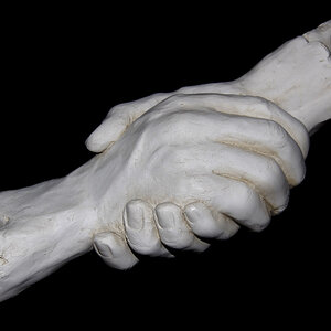
I know that the only image here with some aesthetic value (at least for me) is the first one, but I still decided to share all of them.
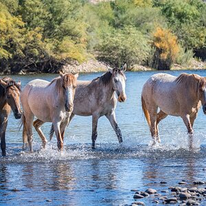
1.
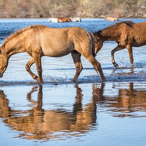
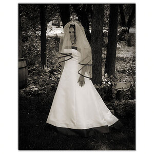
2.
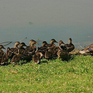
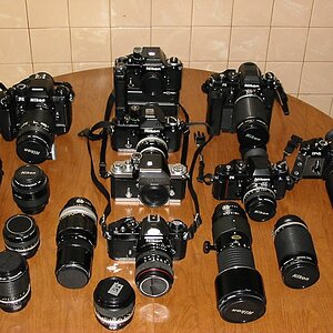
3.
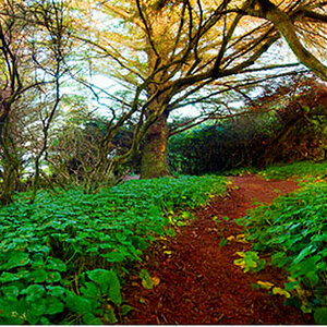
4.
Thanks for taking a look...
I know that the only image here with some aesthetic value (at least for me) is the first one, but I still decided to share all of them.
1.
2.
3.
4.
Thanks for taking a look...
Last edited:
")

![[No title]](/data/xfmg/thumbnail/30/30859-ec099dbef074432d32832fceb25cf539.jpg?1619734479)

![[No title]](/data/xfmg/thumbnail/38/38264-552eb428d8a704186dcc43400f417d0f.jpg?1619738548)