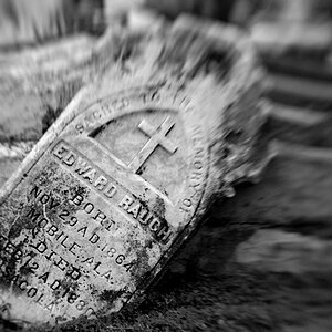
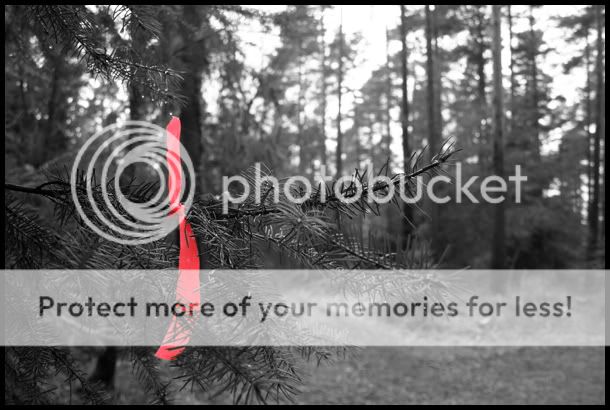
I am not too keen on selective colouring and I don't know much about Photoshop (if that is what you used) but I like the idea and it looks like hard work to properly select the ribbon and I think you've done it well. On my screen (not calibrated) the red is not red enough for my liking and the B&W part looks a bit grey. Maybe a bit more satuation for the red and better contrast on the rest of the picture would help.


![[No title]](/data/xfmg/thumbnail/30/30859-ec099dbef074432d32832fceb25cf539.jpg?1619734479)
![[No title]](/data/xfmg/thumbnail/38/38261-db20f6f92ee8f0d4c5cf1536e308638b.jpg?1619738546)
![[No title]](/data/xfmg/thumbnail/30/30858-42113a4c092a5983afa30e5c35cce4d0.jpg?1619734478)