Tony From Louise's Restaurant (C&C please)

kdthomas

No longer a newbie, moving up!
Joined
Aug 9, 2014
Messages
1,117
Reaction score
474
Location
Denton, TX
Can others edit my Photos
Photos NOT OK to edit
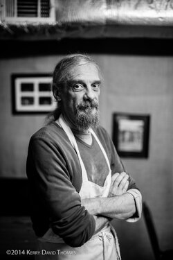
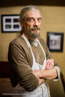
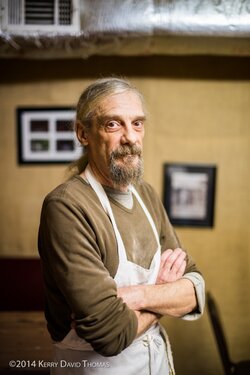
This gentleman has led an interesting life ... he's played with rock bands in the 70's, travelled the world and now cooks the highly addictive chow at Louise's Restaurant at the base of Kennesaw Mountain in Marietta, GA ... he's also a hell of a nice guy. Say hello to Tony Corrente, and if you're ever in Marietta (may-RETT-ah) ... stop in here and see a little place that is full of character(s) ...

And as always to my friends here, thanks in advance for the C&C, helping me to get a little better each day at capturing some of the beauty in this world ... happy holidays! :)
TonyFromLouises (1 of 2).jpg TonyFromLouises (2 of 2).jpg
 
I like these. If I could make a suggestion based on personal preference, I would bring the exposure down a little bit; the highlights seem hot to me. The color one may look better if you cool the temperature down a little bit too.
 
Very nice. If ever.....
 
Nice, and a nice story.
 
Nice! I might think about cropping away that bit of the top with the window or whatever it is in it.
 
Agree with all above. Cropping away that silver stuff makes the image cleaner, but robs it of any space above his head. So it is a matter of taste, if you want to concentrate on the character with a clean bkgrnd , then you need to lose the upper silver stuff with the window (and probably extend the wall in pp, if at all possible). If you want an environmental portrait then leave it as it is. Sadly, for a proper environmental portrait there are no other kitchen attributes around, just the apron. But I do like the man and especially his eyes.
 
I love the light here! Really nice. I agree about cropping though.
 
In full size I'd keep it in colour but if it was a tighter shot It would be stronger in b&w because it draws more the atention to him than the one in colour that makes you focus on the place also
 
I agree. As someone who loves a good environmental portrait, I really want to like these. However, that cooling unit-thing really draws my eye away from him. It detracts and doesn't add. It's just sort of encroaching in on a photo of an otherwise interesting guy.

Crop that down a bit and I think it would really improve the photo.
 
Last edited:
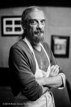
OK, here are the crops:

I tried to clone the wall and bring it all the way up ... but I couldn't get it it to look right. Think I'll just compose better next time :)

TonyFromLouises (1 of 2).jpg TonyFromLouises (2 of 2).jpg
 
Global changes won't do it here because the issues aren't global.

According to the picture frame the image isn't vertical
That big bright thing attracts my eye no matter how dark it is
The wall is brighter than his lower face.
His forehead, cheekbones, nose are almost blown out.
His hands, arms and the apron are brighter than his face.

Editing all that to a good relationship with his lower face makes everything more substantial.

TonyFromLouisesdip.jpg
 
Global changes won't do it here because the issues aren't global.

According to the picture frame the image isn't vertical
That big bright thing attracts my eye no matter how dark it is
The wall is brighter than his lower face.
His forehead, cheekbones, nose are almost blown out.
His hands, arms and the apron are brighter than his face.

Editing all that to a good relationship with his lower face makes everything more substantial.

View attachment 91826

Nice edits!

OP: Love the photo, love the story! I also like the B&W...finding myself drawn more and more to B&W images, not sure why...
 
sorry, forgot this.
perhaps a bit harsh (and oversharpened) but you get the idea that adjustments need to be made before conversion

TonyFromLouises-bw.jpg
 

Most reactions

New Topics

Back
Top