Trip to Scotland

RH Photography

TPF Noob!
Joined
Jul 8, 2015
Messages
6
Reaction score
1
Can others edit my Photos
Photos OK to edit
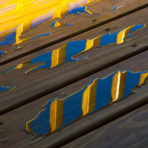
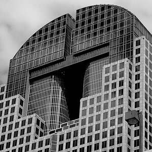
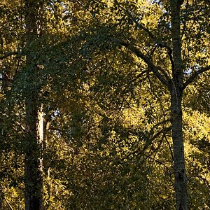
Hi, new to the forum and just returned from a trip to Scotland. I think I got my best shots yet and in addition to just sharing the images, feel free to ask where the locations are, I would also like some critiques on editing.

Here is the gallery:

500px Robby Haugh Scotland
 
A very nice set. I actually like the processing (some will say its a bit strong)
 
Thanks. I always struggle with what is just right but noticed I have a tendency to punch the colors.
 
Nice set, but a word about colour. Nature nearly always presents colours that go together, call it natural selection because in many ways it is as we are not the only animals on the planet that perceive and react to colour in the same way.
Now a word about saturation. Saturation by contrast and the 'saturation slider' reduces the shades tints and tones because saturated colours are colours that have a narrower wavelength, a high vibrancy in relation to their brightness. Increasing the saturation of colours that are lit by diffuse light can be effective because it's difficult to go too far as the slider only slides so far, but when you do it in backlit sunlight and sunlight shots you are removing the shades, tints, and tones that go together and replacing them with single colours that don't really go together and therefore look un-natural. In a lot of your shots you are introducing, through saturation the reduced wavelengths of colours that don't go together and are not seen in nature. In your "Three Sisters of Glencoe" you are introducing a sky that's never that saturated blue, (deep-sky-blue is green and blue), and grass that's never that green, (usually far more yellow in it). To me the colours are mis-matched and frankly 'yuk'.
Again with your "To Glen Etive", the colours are never the ones portrayed by nature and thus look un-natural together. Also in increasing the brightness of the foreground and the mountains relative to the sky you have made it lighter than what is normal against the brightness of the sky. Again it has an un-natural look.
We look and see each and every day and what we look at and see has been imprinted in our brains as natural. We expect scenes to look a certain way and that is very much expressed in the relative values of contrast and colour, never underestimate this as it is closely linked to the way we see and perceive. If you mess with those relative values as you have you can end up with visual mush, which is a shame.
I know the locations of many of your shots intimately, I know the weather and how they look because I visit them regularly being only a couple of hours away, see my smugmug gallery. I'm also not against processing, but in order to push it successfully you must learn about relative values and the importance of preserving them in your image. I prefer a more natural look, which is subjective, but even so you'd be surprised by just how much some of my images have been altered. It's the preservation of relative values that makes them look believable and natural. You can equally make them surreal and believable with the same understanding.
Your telephoto shot "The Old Man Of Storr Awakens" is a stunning shot, but what's happened to the colour? Where is the yellow in the grass and the subtle shades, tints and tones as the background recedes into the mist. The 3D effect on this if you understand the receding colours that occur so naturally in nature combined with subtle tints and shades with low contrast in the softer background contrasted with the natural rich colours and higher contrast of the foreground could make this a stand out shot for life. It really could be that good.
Read this, it's short, simple, and should give you a better understanding of how we really percieve not only the world around us but also images:
Color Wheels are wrong How color vision actually works ASmartBear - WP Engine
You may think you're adding punch, but be aware most people don't like being punched.
Excuse my being honest, this is my honest criticism and is offered only as help and not meant to offend.
 
Well you've a good eye and the framing and composition of most of your shots is excellent. This one Loch Etive in Glen Coe by Robby Haugh 500px is a little too low for my taste as the frame is divided a bit much but its otherwise a good shot.

I have to totally agree with Tim though, you've pushed the colours way too far and as another who has also spent quite a bit of time in those locations its far removed from the colour pallette I'm used to seeing there. Dial the saturation back a bit and you will have some excellent shots indeed!

@Tim Tucker - very informative post mate and thats a good article on colour, thanks for posting it.
 
Appreciate the critique.

How about this:

Photo by Robby Haugh - Google Photos

Here is something I wrote for a post on a different forum that you may find interesting:

There are two very basic and over-riding principles about the way we see that are both fully understood by artists and completely ignored by many photographers:

We only see relative values.

The eye and brain auto-correct.


When you are in the rarified air of your editing suite with the light dimmed and the brightness of your monitor turned up your eye and brain try to interpret what you see as a full range of tones and colours. So as you are processing the colour out of your images your brain is trying to add it back in. It does this with both physical processes and by referencing to your vast visual memory, i.e. what you have seen before in the countless hours you spend with your eyes open. This is the same for everybody, but only you have the visual memory of both the original scene and the original raw files. Everybody else perceives your image entirely by the visual clues you've left coupled with their own visual memory and reference bank.

How this works is simple. If you move your contrast slider and compare the before and after then you will always find that to your eyes the version with more contrast has more impact simply because of the way you will always see it relative to the before version with less contrast. What you're not doing is printing the image and hanging it on the wall next to a bookshelf full of things with normal colour and contrast. By not understanding how the brain 'auto-corrects' an image when you look at it in isolation it is very easy to loose sight of how the rest of us actually see it in the normal world. A very good trick I always do is to have another image that I know is well balanced open in a simple image viewer. This allows me to contrast whatever I am doing with a'normal' image, a visual reference point.

The image you post is small so it's difficult to assess, but I think I can see the effects of contrast and burning/dodging? (I'm not sure which is which these days as it seems to be the opposite of when I was burning and dodging B&W prints). Contrast via the slider is adding black to your image, you do the same when you darken the sky. Now as values are relative you can achieve contrast by lightening the highlights as it is the difference in brightness that's important and not the absolute value. By playing around with ideas like this and referencing them to a 'visual calibration' image you can see the effects of just subtle shifts in the way you process and in doing so learn a lot.

You can also produce brighter images with the more apparent contrast without adding so much black. Your edit:
Old Man of Storr Edit 2.jpg

A little brighter, and less black:
Old Man of Storr Edit 3.jpg


Hope the above is of some help.

Thanks WeePete, I'm all for keeping Scotland beautiful. ;)
 
Last edited:
I like the OP's original edit as is.
 
Shadows create and enhance texture. Tim's edit removed the texture created by the shadows and sucked some of the life out of the image to me.
 
I also prefer the original image. The edit is too yellow for me. The sky and the grass are just too yellow and bright.
 

Most reactions

Back
Top