matt62485
TPF Noob!
- Joined
- Mar 20, 2009
- Messages
- 553
- Reaction score
- 7
- Location
- Wilmington, NC
- Can others edit my Photos
- Photos OK to edit
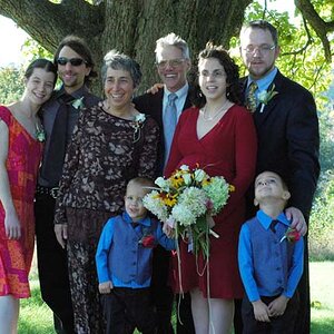
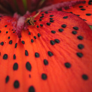
Ok don't be afraid to let me have it. Trying a few new things, and going outside of the box on a few of these. Not sure if I totally like them or not. #1 I do like though.
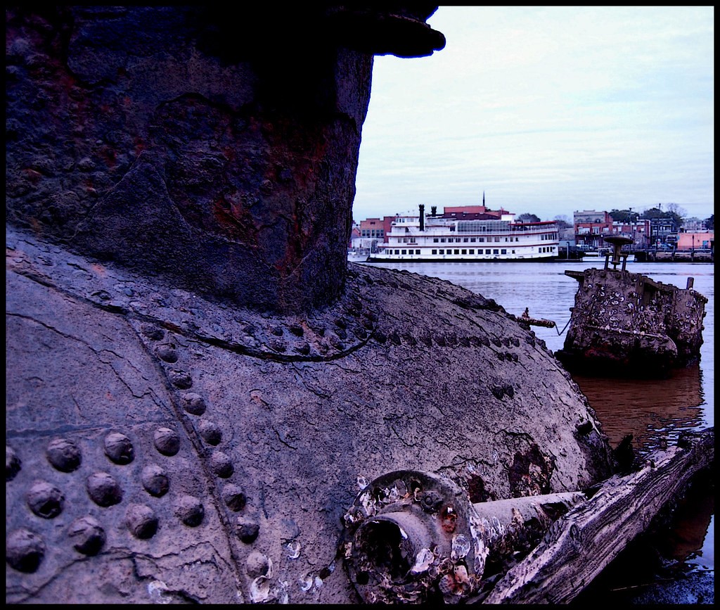
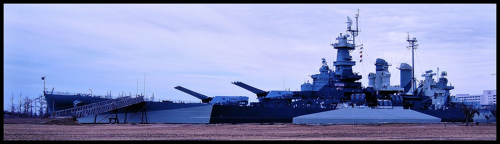
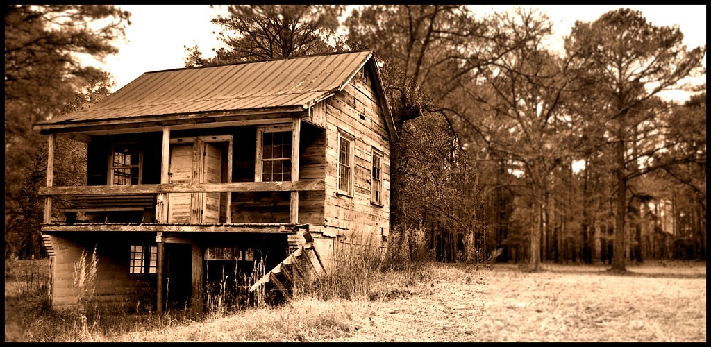
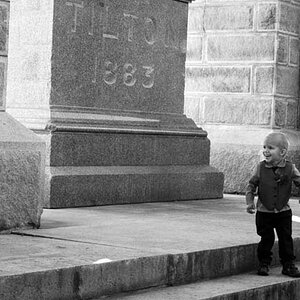
Stopped at a spot on the way home from work I thought looked interesting and took a few
1.
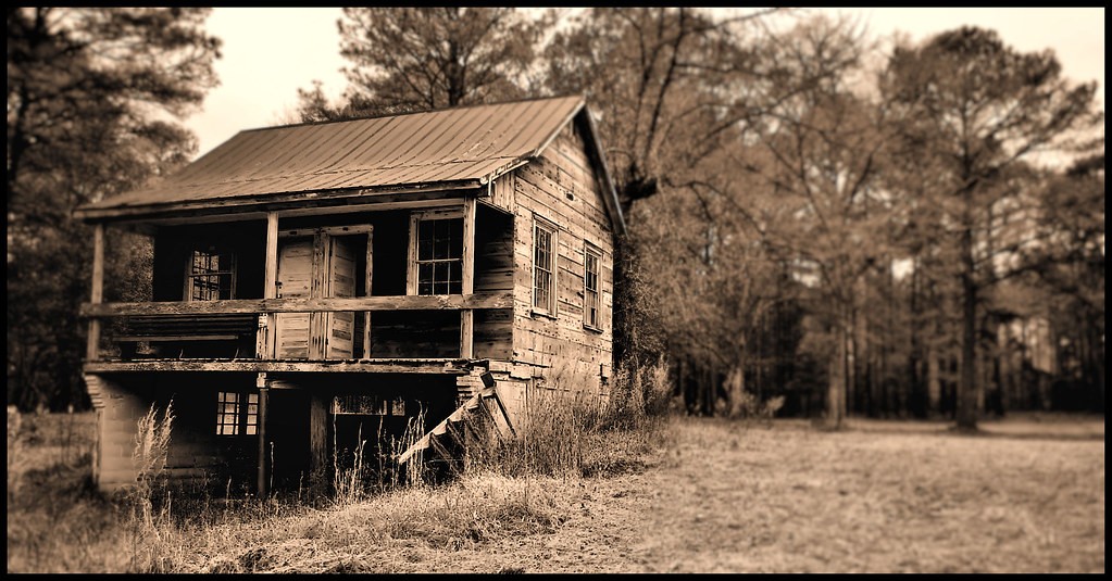
2.
3.
4.
5.
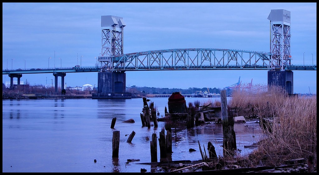
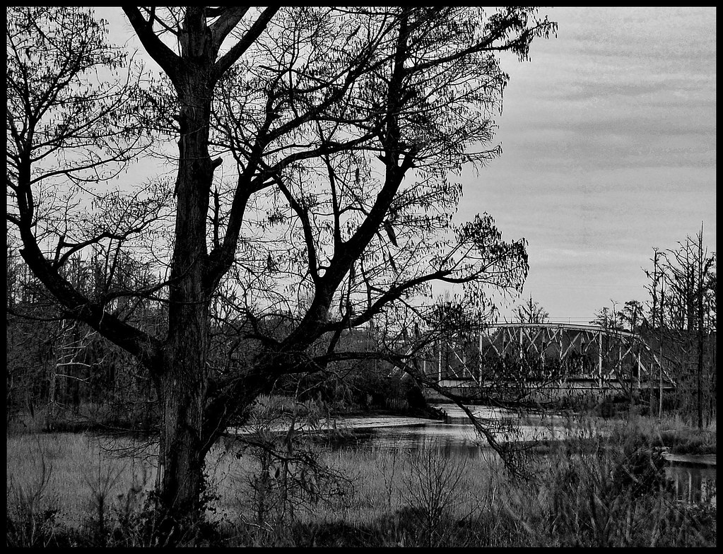
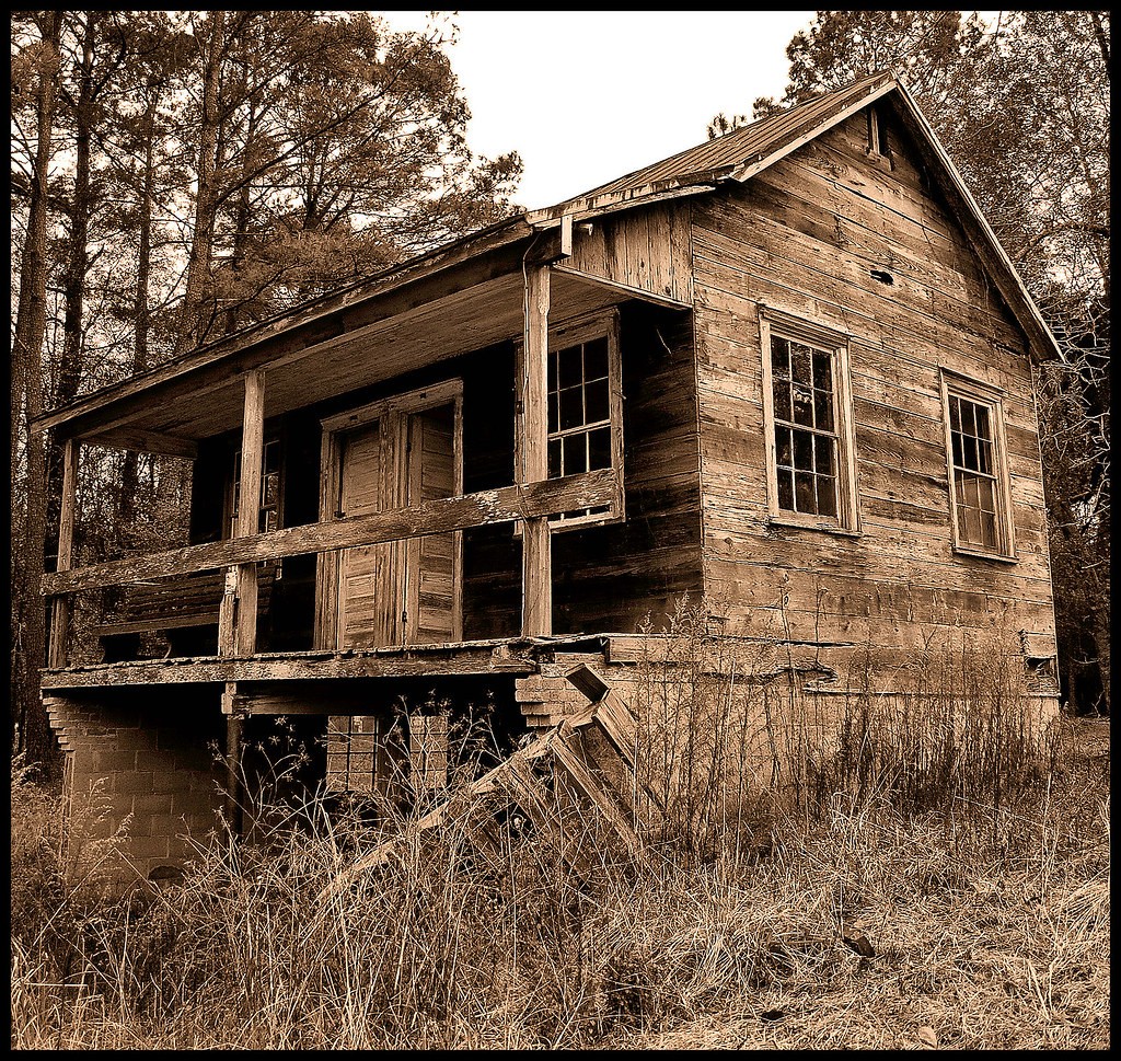
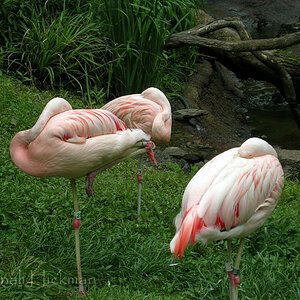
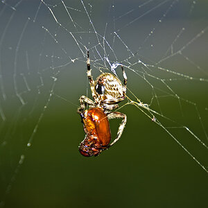
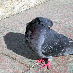
Stopped at a spot on the way home from work I thought looked interesting and took a few
1.
2.
3.
4.
5.


![[No title]](/data/xfmg/thumbnail/41/41781-7dcfd2ee71d4a453b4ad9fb5c7e723f1.jpg?1619739890)
![[No title]](/data/xfmg/thumbnail/42/42466-109a1021e2f0f132abfd74e1a6e39444.jpg?1619740192)
![[No title]](/data/xfmg/thumbnail/33/33440-0778f3522902634844facab43c5a29fa.jpg?1619735969)
![[No title]](/data/xfmg/thumbnail/42/42467-e93a2a1ecfbab434ac7d27c9d0dd0a02.jpg?1619740193)
![[No title]](/data/xfmg/thumbnail/41/41780-5efe87aed04575de7c09b065d70763ae.jpg?1619739890)
![[No title]](/data/xfmg/thumbnail/40/40288-4d5d7a8aa74ddfceb5fb82062d9b21be.jpg?1619739409)