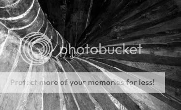
two architectural shots

cactus waltz

TPF Noob!
Joined
Oct 20, 2004
Messages
170
Reaction score
0
Feedback appreciated!


spiral.jpg


takpannor2.jpg
 
I like the first one.... it's almost an abstract.
The second one... it seems too dark for me.... But if you up the brightness/contrast I think it would do good.... :D
 
LittleMan said:
I like the first one.... it's almost an abstract.
The second one... it seems too dark for me.... But if you up the brightness/contrast I think it would do good.... :D

Stop me if i'm wrong, but that wouldn't that just make the picture darker, in a way? The lighter areas would get lighter for sure, but the darker areas already dominate the picture.
 
cactus waltz said:
LittleMan said:
I like the first one.... it's almost an abstract.
The second one... it seems too dark for me.... But if you up the brightness/contrast I think it would do good.... :D

Stop me if i'm wrong, but that wouldn't that just make the picture darker, in a way? The lighter areas would get lighter for sure, but the darker areas already dominate the picture.

It depends how you do it - there are some highlights in the tiles already, so if you increase the brightness it will being these out, then it you up the conrtast it will further increase them.

You'd probably have to layer it to mask out the sky while you did it - that's bright enough already IMO
 
In regards to the first one I would like to see some of the hot spots burned out a little. Its got great tonal range most of the way down except for at the top nearest the camra wheren I'm guessing your flash created the hotspots.

The second needs some white. Your leaning to the dark side of things and some white would help things out.
 

Most reactions

Back
Top