Alpha
Troll Extraordinaire
- Joined
- Mar 15, 2005
- Messages
- 5,451
- Reaction score
- 41
- Location
- San Francisco
- Can others edit my Photos
- Photos NOT OK to edit
Really fabulous work, Brit. #1 is just wonderful.
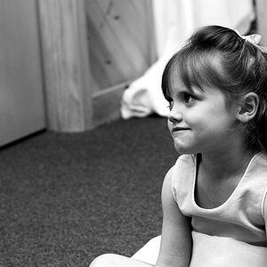
#7 is my only gripe. Flawless skin is wonderful, but I feel like her face needs just a tad bit more dimension. I wouldn't be afraid to go back in and burn the faint shadows on the cheek-bones and jaw line.
#7 is my only gripe. Flawless skin is wonderful, but I feel like her face needs just a tad bit more dimension. I wouldn't be afraid to go back in and burn the faint shadows on the cheek-bones and jaw line.


 . The 'sheen' or lightness on the building is from the sun. So the gradient of light to dark is 'natural'. I added a multiply layer and masked most of them and the interior of the phone booth out, that was what really popped the phonebooth colour as well as livened up the wall (it is more blah minty in the original). On almost all of these I am certain I added a bit of a vignette, not your typical gaudy black vignette though. I use the marquee tool at 250 pixels and selection maybe 10% in from each side, then you have to right click and say 'select inverse' (I believe that is the right wordage). Then I create a duplicate layer (Ctrl/Command-J) and using curves (Ctrl/Command-M) just pull it down a bit in the midtones (and therefore a bit in the shadows and highlights as well) and wa-la, a more natural looking vignette
![[No title]](/data/xfmg/thumbnail/37/37929-d9f744e40945eb18b68bb10eb79dbbbc.jpg?1619738401)

![[No title]](/data/xfmg/thumbnail/38/38262-10a9668da9a2b36a92cddde57caf87bc.jpg?1619738547)
![[No title]](/data/xfmg/thumbnail/35/35869-2e4166624c383d0d2dec81e5b0f6e5dd.jpg?1619737196)
![[No title]](/data/xfmg/thumbnail/35/35868-15d995e4052bf05e2038e8b2a545a08f.jpg?1619737195)
