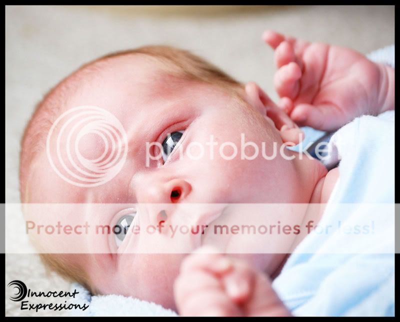
Please? I can ask specifically what I want... Is the lighting too flat? Are his expressions too funny? The blanket is a little bit blown, but I kind of like that. Do you, or should I burn it a bit more? Should I do any skin smoothing? How's my pp on the eyes??
Was that enough to get someone to post? Or they just awful?
The first one, those catchlights are HUGE.. I'd try cloning that striking blue a little bit to make them smaller... but still nice, do you know what I mean?
And as I said in the post above, a tighter crop, but I hsould have said elimated some of the space at the top instead.
Thanks, Kelly. The catchlights are really big aren't they? We were at my grandmother's and she has huge floor to ceiling windows.
The crop... I've been playing with this image. I burnt the background and then did a bunch of burning on the pot in the upper left which i think gives it more depth. I'll expirament with the crop too.
Thanks again for critiquing.
Thanks, Sarah. Yes, he was red. Only 3 weeks so it's just how he looks. hehe. I have not gotten any of him sleeping. I took these literally in about a ten minute space on Mother's day. It was completely spur of the moment. I am hoping to get out to his house next week to do a more formal shoot. Thanks again!
I absolutely love the first one - the expression, and the little hands in there. Really great.
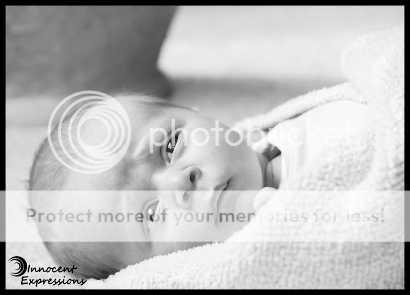
The second, I like the crop you did, and personally, I'd burn in a little in the top right corner.
But, I'm certainly no portrait-ist.
The black and white I think is better cause of the skin of the baby. He looks splotchy, which he's supposed to being such a little one, but at the same time the black and white takes away his skin tones and complexion, and really lets you focus on him and what he's thinking...
Of course, that's just my opinion, I could be wrong.
I absolutely love the first one - the expression, and the little hands in there. Really great.
The second, I like the crop you did, and personally, I'd burn in a little in the top right corner.
But, I'm certainly no portrait-ist.

") Hope you don't mind!
Hope you don't mind!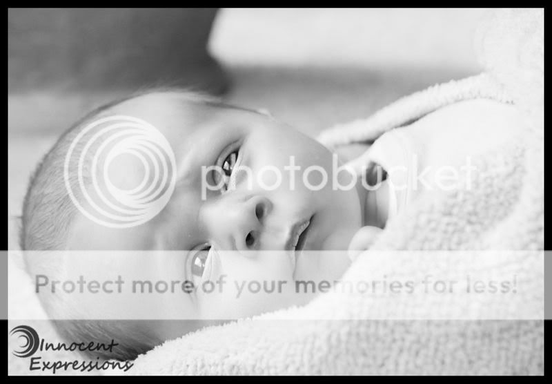

![[No title]](/data/xfmg/thumbnail/37/37413-e579e9da185db973d8cb34300b9f0eb9.jpg?1619738059)

![[No title]](/data/xfmg/thumbnail/42/42465-64dd69400e2bfaf59e558c3d8c934271.jpg?1619740192)
![[No title]](/data/xfmg/thumbnail/33/33026-d1cc9c60c2164adb92d7186eedb0673d.jpg?1619735840)

![[No title]](/data/xfmg/thumbnail/33/33028-42917987307dfd2eb37ddccec6dcb655.jpg?1619735842)