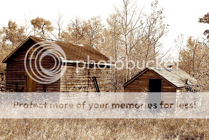
I think as is...I like number 2, but if you desaturate #1 almost down to black and white...with just a little color...I think I might like that more.... I dunno....
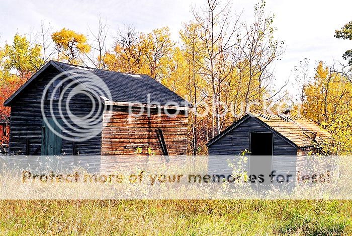
Like them both, but I have to go with #2. Reason being the picture has good textures, which is what i find most outstanding in the picture, the color distracts from the texture, while #2 focuses the texture and tones, making it more uniform and at the same time causing the old buildings to stand out more. Because the picture was shoot on a bright day it casts a shadow on the front of the building which lacks the color, on the 2nd picture the front becomes another tone..
I do not think you would have gotten the same effect in #2 if the grass and trees where green, while fall colors are nice and common, going with #2 makes the picture a more unusual shot
I really like the photo! I have an affinity for the old buildings that have been forgotten, neglected or just plain used. I agree that the texture and fall color are great.
This next observation may be due to the brightness of my monitor or some other quirk in my computer set-up as I often feel this way about bw and sepia images that have been posted on-line. I don't think it's related to the resizing of the images as I am aware of it in my own full size images. I have even mistaken bw film scans for conversions.............so if it's something I need to adjust let me know.
I like the feel of the second photo, but there is something missing. I can't identify it, because I've been trying to get color images to monotone while achieving the pizzaz of black and white film and I can't do it.
I agree, I haven't had much luck learning to convert images to b&w or sepia etc. I just followed the tutorial for this one. Adjusted the mid tones, red up and blue down.
The colours are quite amazing on #1 but I find them a bit too jaring. I like the textures on the second one so personally I would go with that. Maybe desaturating #1 a bit might help?

")


![[No title]](/data/xfmg/thumbnail/36/36665-7c494bf98537fba5ac87ac5ad6bda658.jpg?1619737676)