Unable to define what I am missing in my pictures

k.udhay

TPF Noob!
Joined
Mar 6, 2013
Messages
130
Reaction score
9
Location
India
Can others edit my Photos
Photos OK to edit
I shot my friend in his room using a flash bounced against ceiling. I got a decent pic. and my friend is also happy at it:
https://i.imgur.com/8eEGqoA.jpg

Instagram post by Vivek A • Oct 3, 2017 at 11:33am UTC
Camera : Nikon D3200 (cropper sensor)
f/1.8, 1/200, ISO 200 & 50 mm prime lens

That said, when I compare with some pictures (eg. Instagram post by Photraits • Sep 29, 2017 at 7:26am UTC) of my favourite photographers, I feel I am missing something. I see the faces of their subjects to be very clear and less distractive. Sad part is I am unable to define the difference "technically".

Possible things I could guess are

1. My lighting is not adequately powerful.

2. Post production.

3. Make up of my subject is poor.

Request your opinions here.

Edit - Instagram link for my pic. inserted
 
Last edited:
can you attach your photo here? I can't access imgur at work...
 
The lighting in your picture is very flat - it has virtually no direction, meaning there are little highlights or shadows on the subject's face. In the photo you linked to, the lighting is definitely directional: the man has pale highlights on his cheek and deep shadows around his mouth. The same applies to the woman but with less highlights and paler shadows.
 
ying_yang.jpg


Any more like what you're after? I raised the contrast, increased the brightness, darkened the left side and made a minor color adjustment.

Joe
 
based on the above, I think the lighting itself is close. but what youre missing is the leading line. The OOF foreground adds a really cool element in the shot and visually draws your eye inward.

the above photo, you have two very competing elements.
 
can you attach your photo here? I can't access imgur at work...
Attached instagram link now.

Though I buy that my pic. lacks an OOF foreground, my post here is of different problem. In the benchmark pic., I see the couple's faces very clean and bright (right term?). My pic., on the other hand, though having a clear focus does not give me a clean look at the face. Is any local adjustment needed or should I focus on more make up of my subject?
 
View attachment 147630

Any more like what you're after? I raised the contrast, increased the brightness, darkened the left side and made a minor color adjustment.

Joe

Thanks Joe. I still don't get the same smoothness and sharpness at face that I find in my benchmark photo.
 
It looks like the photographer bounced the light forward into the corner to light the faces directly...
 
It looks like the photographer bounced the light forward into the corner to light the faces directly...
Thanks for this. Will try this out!
 
The lighting in your picture seems not appropriate as it is very flat which is why there is no direction in the very first image. Then after adjusting the lights, the picture is bit good and better than before.

Nice try and you will surely capture good ones in near future. All the best!
 
Many people are afraid of Shadows although shadows in the right place can make the picture.

Lots of people fear higher ISO although higher ISO helps you to utilize the light you have got with you better.

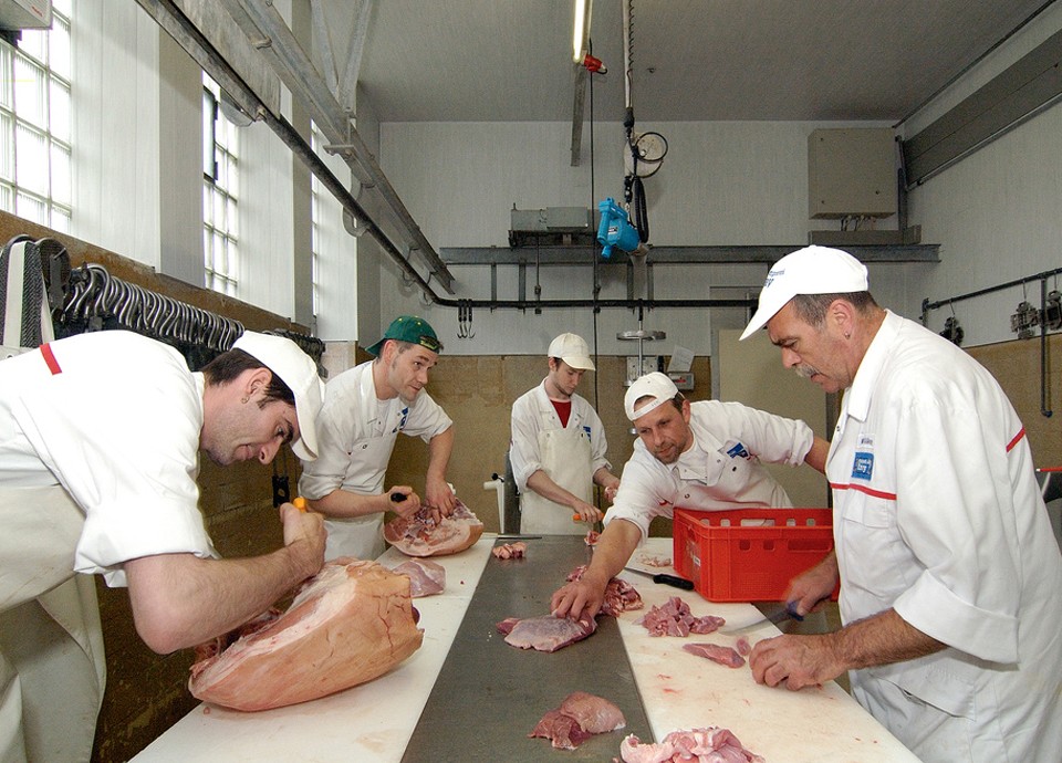
Here is a shot I took with a D70S and a halfways bounced, halfways direct flash:

Mitarbeiterfoto_selbst_schlachtende_zerlegende_und_herstellende_Metzger_stellen_die_besseren_Produkte_her_Hier_das_Produktionsteam_der_Metzgerei_Giray_im_Allgaeu.jpg
 
I generally avoid photographing a subject against a wall unless there is something particularly interesting about that wall (normally I want a bit of separation between subject and background.)

As for you photo, I'll offer a few comments, but I'll also show an example of what I did with post processing on it.

First, the image:

8eEGqoA.jpg


A few things to note...

Straight away there was something just barely on the left edge of your original. It was a distraction, so I cropped it out. Also, for your half-shot (waist-up photo) I thought there was a bit too much room above his head, so I cropped in a bit there as well. And... since you've got a background wall with a hue shift at the corner, I put the hue shift at one third and your subject at the other third. This puts your subject within a square which is within a rectangle.

As for the adjustments... I noticed the contrast of your original was a bit gray (it looks foggy) so I stretched the histogram by setting the white point and the black point. In Lightroom, a great way to do this is by holding the "alt/option" key on your keyboard while making the adjustment.

Whites: Hold down the "alt" or "option" key on the keyboard while dragging the "Whites" slider. When you do this, the entire frame will go black EXCEPT for anything that might clip (and it will show up in the color of whatever color channel is starting to clip. For example, in this photo, I get a black frame and as I adjust the "Whites" slider, the green color channel will just start to appear on the lamp in the left side of the frame. When that happens, I back off just slightly. I've now maximized the histogram toward the white side without actually blowing anything (it's actually ok if you just barely clip something).

Blacks: Do the same for the blacks... hold down alt/option and drag the "Blacks" slider. This time the whole frame will go "white" except for anything start to clip on the left side of the histogram. Then back-off just slightly.

You've now stretched the histogram across the range so that your dark tones are as dark as possible without clipping and your light tones are as bright as possible without clipping. This will immediately improve the contrast.

Next I grab the tone curve adjustment. Usually I take the highlights side (about 1/4 of the way from the right side) put my mouse on the diagonal line of the tone curve and give it a very very gentle nudge upward while looking at the photo. This will brighten the highlights (not the "whites" ... just the highlights ... slightly less bright than the "whites"). Then I go to the left quarter and give it a slight drag down. This deepens the dark tones.

Basically what we're doing is further stretching the middle section of the histogram without actually adjusting the left or right extreme edges (nothing will clip).

Now the image no longer looks foggy and your subject begins to pop a bit more. This also has a side effect of looking like we've boosted the "saturation" (I did not actually touch the color saturation ... all of this was achieved merely by improving contrast.)

Next, I zoomed in on his head and tweaked the sharpening to tighten things up a bit. Once I'm happy with the sharpening, I grab the "masking" slider (in the sharpening section) and, once again... hold the alt/option key while dragging the masking slider. When the masking slider is at 0, the image will be completely white (while holding the alt/option key). As you nudge it upward, you'll notice the image starts going black... but will remain white anywhere it notices contrast differences. What I want to do is get the software to NOT apply sharpening to the wall... I mostly just want sharpening on your subject's face so I'm pushing up the masking so that I can see the sharpening (white areas) will be applied around all edges of detail near his face but NOT on the flat areas such as the wall. In this case that masking level made it to about 55. This is because if you globally sharpen you will also introduce noise (which we don't want). So by applying "masking" to the sharpening, we can get the software to only boost sharpening in the areas with detail we care about, but not apply any sharpening on areas that are flat don't require any sharpening (like the plain surface of the wall.)

I did put a very very gentle vignette adjustment (it's slightly darkens the corners and edges so that the brighter area of the image will be near center.

That's most of what I did in Lightroom. There is one more tweak I did ... I'll bring it up later.

It might have needed a white balance adjustment but that's difficult to tell because the room is dominated by gold hues.

As for the shot itself...

I mentioned the wall already - I normally don't put my subject against a wall unless there's something of interest on the wall... or if the wall creates "leading lines" in a direction that I want, etc. This wall is fairly featureless except for the tone transition.

When you bounce a light at close distance the ceiling (which should be white - don't bounce off a colored ceiling or the light will take on a color cast based on the color of the ceiling surface) the ceiling will act as a scattering source and light will scatter downward like a rain of light from above. But since it is from "above", you can get shadows in any recessed areas ... notably eye-sockets (the "raccoon" look). To reduce this problem, some flashes have a "bounce card" that slides up and some light will reflect off that white card and kick forward (while most light will shine up and scatter back down). T'his bounce card can help reduce the dark shadows (it usually wont completely eliminate them... but they wont be as strong). If your flash doesn't have a built-in bounce card you can buy a commercial card (my favorite is the Rogue "Flashbender" in the LARGE size... and that's after trying a LOT of products) but in a pinch... any piece of plain white card-stock (such as a white 3x6 card) and a rubber band to hold it to the top/back of the flash so that any light hitting it will scatter forward.

In this particular case, the light is scattering from a broad enough angle that I don't see a strong shadow in the eye-sockets ... I'm just pointing this out as something to watch for when bouncing. Also, you could certainly go into Lightroom and apply a brushed-on adjustment to increase the light in the eyes in post.

So remember that "one more tweak" I did in Lightroom? I slightly increased the exposure level using a "brushed in" adjustment on the eye-socket of his "dominant" eye (the eye nearest the camera). The light was just a tiny bit too dark... so I brought it up just slightly. I still want it to look like a shadow... just not a strong shadow.

Tension: Another compositional element here is something called 'tension'.

Notice that your subject is looking away from the center of the frame -- looking "out" instead of looking "in". This is a compositional technique often used to convey an emotional element such as disagreement or even despair -- caused by looking "away" from center.

This isn't a hard rule -- just something to be aware of. Sometimes you actually want to create the tension.

The other photo you referenced is using several other techniques... they're using a shallow depth of field to blur the foreground put put crisp focus on the image in the mirror. They're also using the mirror to create a "frames within frames" composition.

You may want to pick up a good book on lighting (e.g. "Light Science & Magic" is frequently recommended).
You may want to pick up a good book on composition (e.g. "The Photographer's Eye - Composition & Design for Better Digital Photographs" is frequently recommended.)
 

Most reactions

Back
Top