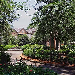
This looks pretty good to me. good composition. i deff like the big tree.
For some reason though i feel it just too much green. Maybe it just me but some areas just flow/blur together when i look at it. Maybe i need new glasses tho lol.
Besides that personal view its really good. Maybe it would look good with some fall colors. Looks like mostly pine thos.
I find the image to be very busy with a lack of focal point. While it seems you tried to use the bigger tree as a focal point, having so many other things in the image is distracting. The comment of the above poster of green on green is the same thing I thought of as well...its linked to having too many things in the image of a similar colour that just blend together, your eye doesn't know where one ends and the other starts
I also feel the image is way over sharpened (or maybe its just my monitor?)
The colours are very nice.
I would of tried to move in closer and capture that bigger tree alone against the blue sky.
Or use that bench on the right hand side with the path.
You have many great subjects in here, just too many for 1 photo.
Nice subject matter, but it does appear to be over sharpened (grass, bushes and some trees are very glisteny/sparkly) on my monitor as well. If you did sharpen a lot that might be why the colors are so punchy. If you PP this one can you post the original?
I think the first image posted just has the saturations unnaturally high. The sky is just too blue, the greens too green, etc... It's not horrible, it's just a bit over the edge. The edit really brings out a bunch of white pinpoints as well. I find them distracting.
In terms of composition, you have a lot of things leading the eye toward the center of the frame -- the road winds around toward the center, the tree leans in ot the center, the eye gets to the center and there's... nothing. I think this is why it lends itself to being criticized as busy, primarily because it doesn't have stuff going on where it should.


")

![[No title]](/data/xfmg/thumbnail/33/33491-46949ced4f9729f095cb48c6c61633db.jpg?1619736003)

![[No title]](/data/xfmg/thumbnail/39/39271-04ff6ce1fbcda2b0d41ad7ee08cff91a.jpg?1619738950)
![[No title]](/data/xfmg/thumbnail/33/33490-cbbf9df0a1c31291ee7a3759afe943cc.jpg?1619736003)