Vine CC please

Abby Rose

TPF Noob!
Joined
Feb 17, 2010
Messages
642
Reaction score
2
Location
Michigan!
Can others edit my Photos
Photos OK to edit
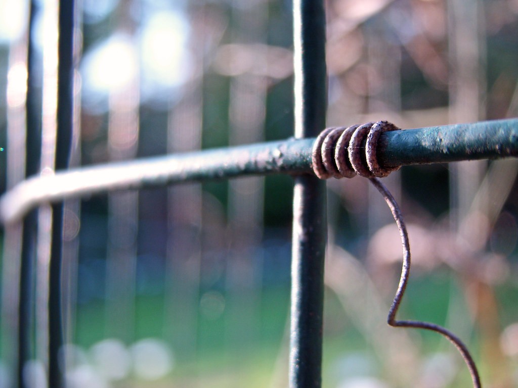
Other then that further-away part of the vine and part of the curlicue on the bottom right not being in focus, how'd I do? I was playing with depth of field, seeing how much I could get and still keep that winding part of the vine in focus, but I went overboard as you can see. :)

4544673074_5658598473_b.jpg
 
Abbey
I hate to say it, but I do not see any of this shot in focus. It may be my screen, but it is what I see.


**I also believe that is an electrical conductor - Type TW - :mrgreen: sort of my field of interest outside of this forum....
 
It looks kind of abstract to me. In that sense I can appreciate what you were trying to do.

As far as focus maybe a tad to shallow. But I would say in my opinion the focus point to me looks to be the very first coil whish is actually pretty amazing in my book. a little less shallow DOF a little more forgiving on the focus. ;)

Kinda makes me wonder where the vine came from which is good and the vine did pull my focus. Other then that I am not seeing too much of a story.
 
Well. I for one think it's great. I'll tell you why.

The color is awesome. There's like a rainbow of color in the background, yellow up to green, blue, purple... wow what a spectrum of color. Very awesome especially if it wasn't done in post.

The lines work well. Vertical vertical vertical... one after another. Then you get this sweeping horizontal/diagonal which cuts across them all. The coil of vine and the 'tail' are a great accent. Or the lines are a good accent to the vine, whichever you prefer.

On the negative side, I wish I could see the other coils more clearly. Also the blur on the rod (?) to the right of the coiled vine is a little distracting... looks almost like chromatic aberration - what was your setup?
 
don't listen to the first two. It's a great shot, you've simplified your subject and drew attention to it, both with the lines and the selective focus. I found it interesting to look at.
 
don't listen to the first two. It's a great shot, you've simplified your subject and drew attention to it, both with the lines and the selective focus. I found it interesting to look at.

Some find a pile of dog poo interesting to look at as well, but that doesn't mean they should ignore advice from a respected member of the community about a photograph of it.

No, I'm not comparing the OP's photo to a pile of dog poo...just using it as an extreme example.

Flat out saying to ignore C&C given (the same by several people) is absurd.

A specific question was asked about focus and DoF and specific answers were given, in addition to general C&C. Nothing to ignore, IMO.

Anyway, I agree, it's a bit OOF and there isn't much contrast in colors. Nothing really pops out, it's dull brown and green with an overexposed background blur that attracts attention away from the "subject". Swing and a miss, I'd say. But if you're just "playing" with DoF, then it's a good example of what you can get and it's limitations.
 
Some find a pile of dog poo interesting to look at as well, but that doesn't mean they should ignore advice from a respected member of the community about a photograph of it.

No, I'm not comparing the OP's photo to a pile of dog poo...just using it as an extreme example.

Flat out saying to ignore C&C given (the same by several people) is absurd.

A specific question was asked about focus and DoF and specific answers were given, in addition to general C&C. Nothing to ignore, IMO.

Yep, exactly my thinking. Saying"I don't agree with the first two" is fine, but saying "ignore them" is just plain rude and counter-intuitive. Great first post too....
 
Don't worry, none of the advice was ignored! :)

reznap, I think you're talking about that light, beige-colored blur, right? Thats more of the vine, there was a big snarl of it over there. My "setup" was me and my camera. Which probably explains the of-out-focus-ness, probably a tripiod or something could have helped. But then I probably couldn't gotten as close. I was leaned up against the trellis thing that the vine was wound around.

Thanks everyone! :)
 
I think the shot has potential. The depth of field is way too narrow, though. How close to the subject were you? What was the aperture? You might be able to achieve a similar effect but with the aperture stopped down to 5.6 or maybe even 8.

It does seem like the background is overexposed a little. Those two white spots compete for my attention.

I think this could be a really good photo, though. Good lines and blur. Go back and reshoot.
 
Aperture: f/3.2. Pretty close, though I cant say exactly but I know the lens was about an inch or two away from the vine.
 
Yeah, try a smaller aperture next time. You'll still get narrow depth of field because you're close to the subject, but you'll get most of the coil sharp.

Give f/8 a try.
 
You know, I think a few simple tricks would help this shot a lot. First of all use a filter on a layer and pump the color. Secondly do another layer select and choose the vine. Then hit it with an edge sharpener.
 
Personally, I would crop off the left side with the blown sky, and go for portrait crop.
I can't offer any credentials to back up my opinion. Sorry.

The best you could do is to try and see for yourself.
 

Most reactions

New Topics

Back
Top