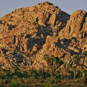
both shot works in BW, and color,but color looks better as the BW needs more contrast... how did you get to BW...IMAGE>MODE>GREYSCALE... try this instead... http://www.northlight-images.co.uk/bwfromcol.html
on the first picture i like it better in black and white
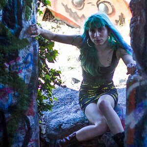
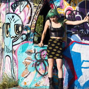
on the second i like it in colour becouse i like the colours in it and when its black and white..... well you cant see the colours....... YOU KNOW WHAT I MEAN
Cool, I was thinking the same thing. And I do agree, the B&W's need a bit more contrast; I wanted to really bad, but I go on kicks where I do too much post-processing, and to me it looks cool, but I feel like I might over-do it sometimes. This time, Iwent with straight B&W conversion, and a "tiny" bump in contrast on both. To add to that, I also agree with going with the grayscale conversion. I was gettin' tired and went with just desaturating it. I got lazy...
and Blitz, for some reason I like the colors too in the second one. I actually think the b&w one is pretty weak in hindsight. But I like the simplicity of it. And the color of the stairwell shot, I think doesnt work best. I'm b&w all the way. But I like to think about it and get others' ideas too.Thanks.
Anyway, cool, thanks for the comments and I'll give those B&W's a little true grayscale, and bust out my contrast machine.


![[No title]](/data/xfmg/thumbnail/42/42016-4e3a2f053aa7a987a0b51e5a0fe85262.jpg?1619739978)
![[No title]](/data/xfmg/thumbnail/38/38749-a4ef503184d13a9c7592221cb44ac5e8.jpg?1619738704)
![[No title]](/data/xfmg/thumbnail/31/31046-f1d28c614676726741e90ce5b420a03e.jpg?1619734586)
![[No title]](/data/xfmg/thumbnail/38/38746-205d04e58b9f6c2f0e464742d3372d19.jpg?1619738704)
![[No title]](/data/xfmg/thumbnail/37/37603-739c5d9b541a083a12f2f30e45ca2b7b.jpg?1619738147)
