1. the horizon in hte background is not level
2. the sky is very blown out (but my monitor is set quite bright)
Other than that i like the idea behind this. The black and white lends itself well to the chromey viewfinder. Another thought is to turn the back of the view finder towards the audience, as if subtley enticing them to take a closer look. just a thought
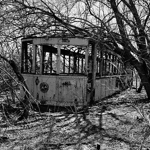
I'd say the black and white works better when there are more shadows in the pictures. Like #4.
It'd be pretty sweet to see some color on these though. Blue sky and green trees go together rather well.


")


![[No title]](/data/xfmg/thumbnail/42/42470-d80cbcbbacb42bbe46ac0a0f6fcb20e0.jpg?1619740193)