You wanna set your camera to manual, set the aperture to the desired setting and make the exposure centered...if your shutter speed isnt slow enough just bump down your aperture...hope this makes sense...good luck and thanks for the comments!!!
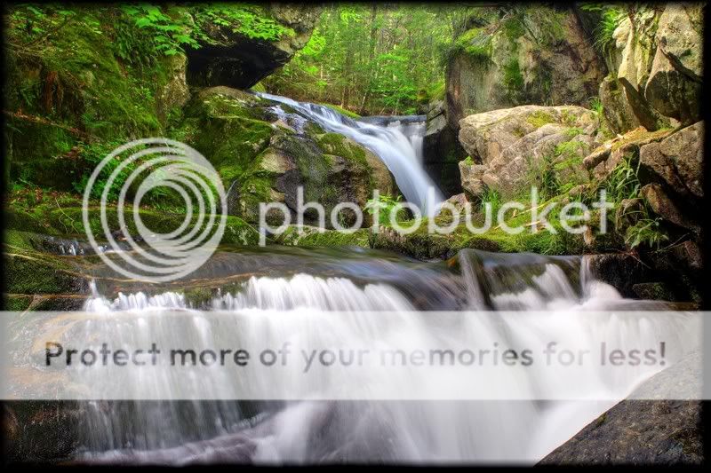
The first is definately stronger. It is "roomy" and your eye follows the flow of the water. The colors in both are really well done.
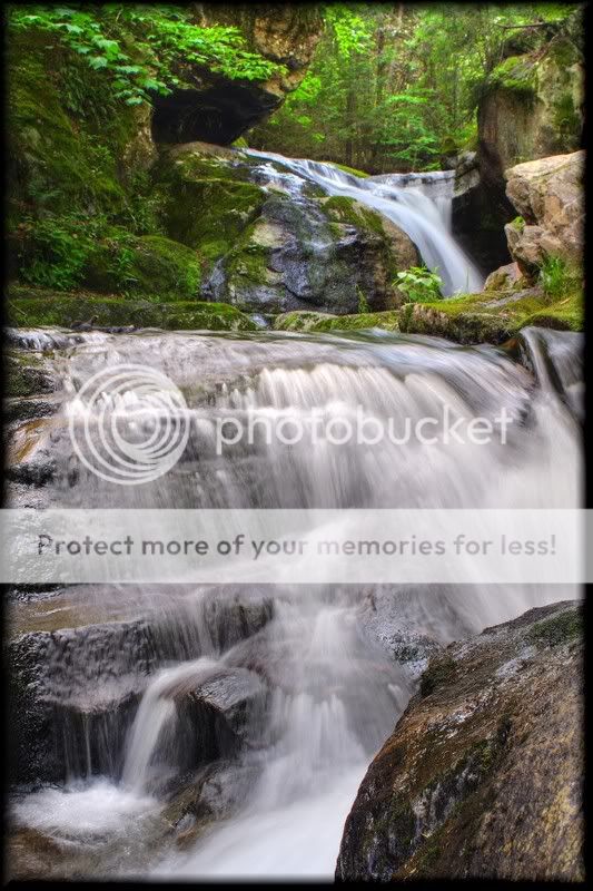
The second seems confined, the flow of water almost dammed up. While it's still a nice photograph, given the choice I believe the first is much stronger.
Thanks for sharing.
Here's my take on these two images. I think that the second is actually the stronger of the two images. The more prominent rock in the foreground does a better job of establishing the fore/mid/background relationship. The small waterfall in the lower left of the frame is mirror of the larger one in the upper right. This creates a diagonal between the two corners that enhances a sense of movement. The biggest problem with this image is the light colored rocks to the right of the upper falls. The falls should be the focus of the background area. The rocks compete with the falls for attention and draw the eye out of the picture. I masked the rocks in PS 7 and adjusted the brightness so they blended better with the darker rocks. The masking was done quickly so there is room for improvement especially around the plants at the base but you'll get the idea. I also did a little sharpening and contrast enhancement to the entire image to give it a little "pop".
both of the shots you posted are not very sharp, and are lacking in contrast or something. with the way it was exposed the water feels a little muddy, but at the same time. one thing to consider about these kinds of shots is how much time is spent in post usually, and how much care is taken on individual areas of the photograph. the improvments that can be made by putting in that effort is evident by the edited edition of your shot that was posted.
they both have a nice kind of diagonal flow to them, which i almost always like, and like it here.
overall they seem crowded, with alot of water in them, and that competes with the rocks and other stuff in the frame, maybe if you had backed up or gotten closer they could be better.
All of that aside i think they both have potential and are not bad! your on the right track compositionally, and with more careful post work that they can both be improved. more importantly with more interesting light, or more dramatic focus, or something - a shot like either one of these can be GREAT.
careful max you might get stamped, I might for this post :greenpbl::greenpbl::greenpbl:
Anyway, the landscape version is the one I'd go for, it doesn't seem as claustrophobic as the portrait, plus the top waterfall seems to be in better and sharper focus in that version as well.
newrmdmike, thanks for you comments...Im not the greatest with PS and also dont have a great eye for contrast and sharpness...I do my best and make it look as good as I can in my eyes...This forum helps me alot with these things...thanks
Maxbloom, I take pictures that I like!! If it doesnt push your buttons, Im sorry...I do this for fun and as a hobby...I dont feel as though my pictures have to be artistic GOLD...thanks for your comments!
Peniole...thanks!! another one for the landscape version...


![[No title]](/data/xfmg/thumbnail/31/31509-b8abaec96e6e375688e269bc89f47652.jpg?1619734858)
![[No title]](/data/xfmg/thumbnail/41/41783-314fbf7e0c66dfa41b2a2d535aa3a9cd.jpg?1619739891)

![[No title]](/data/xfmg/thumbnail/39/39471-60497f63216ffba784d91a339e9e917e.jpg?1619739043)