Waterfall pics C&C please!

sweetreddancer

TPF Noob!
Joined
Jan 22, 2010
Messages
10
Reaction score
0
Location
Northern Wisconsin
Can others edit my Photos
Photos OK to edit
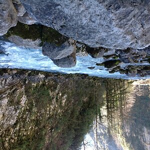
So a month or so ago I jobshadowed the photographer for the local newspaper. We went out to a state park and I was able to take some of my first waterfall pictures (let me tell you now, I'm pretty new to this so I still need to work on this a bit :D)


am1.jpg


am3.jpg


am2.jpg


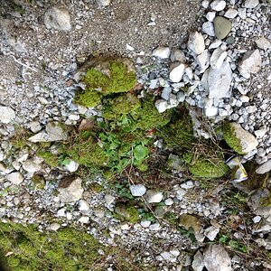
This is just part of a branch covered in moss

am5.jpg


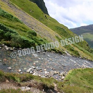
and a picture of part of the landscape


am6.jpg


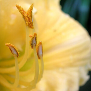
Can I get some feedback and tips please? Thanks!
 
I really like 1 & 3.
2. looks like there is a little to much going on around the image drawing eyes away from the waterfalls
4. & 5. just don't do anything for me.

It would be nicer to have them a little bigger to get a better look at.
 
I think 1, 2 and 3 are well done. :) IMO 3 may need a bit more contrast...

4 Doesn't do anything for me...

5... Well I don't know what I'm supposed to look at...

I am a fan of black and white... so I converted one of your images to see what it would look like.

am1BW.jpg
 
I'm loving number 2. I find that when you see too much water falling at such a steepness, the motion blur looks a little weird.
 
Actually I think that #1 is very nice but that the colors, particularly the rusty red's a bit distracting. It looks almost like noise instead of foliage. Going to black and white was a lovely idea in this case. It really popped the waterfall and took away all that distracted. If you are going to leave them in color I'd tone down the saturation on the reds a bit. Normally I'm just the opposite. I like the reds in most color pics up a bit, but in this case it's actually working against the coolness of the water. A cooling filter would be very nice here.
 
are these 'micro' water falls? I just cant get my head around what im looking at... looks like it rained heavily and these are 2 ft high ledges with water coming off them?

nice capture of the water flow in number 1 though.
 
Thanks everyone!

Einstein, yeah these are the smaller falls of the park. The park is really big and the falls all vary in size. I did take pictures of the larger ones but we went around noon so the sun was really a disadvantage. This was one of the only places where the light wasn't very intense due to the trees all around.
 
Ok cool my eyes were playing tricks on me!

I like the first one, technically good and good capture of the flowing water. I like the B&W edit as well.

#2 also good capture of the water, but i do find the leafs in the foreground distracting and the composition could be improved IMO. Its always good to try different angles of the same shot to get a composition you might not see right away. The largest of the 3 falls is hidden behind the leafs and partially cut out of frame.

#4 Good use of DOF but lacks interest and subject matter.

#5 no real subject or point of focus for the viewer. I see allot of cool stuff in the frame you could have zoomed on to get a cool shot. Maybe try some close ups of the ferns for example. Just think of the viewer, what am i looking at here, what are you seeing thats interesting enough to take a pic of and show others?
 
Thanks everyone! I have to agree, #5 really does have a lack of subject and purpose. Hopefully I can post some more pictures from the park soon!
 
#1 is the pick of the bunch for me, though I would have preferred to see it so the water isn't flowing right out of the frame at bottom, if you know what I mean.
 
i like 1 ,2, 3 and i totally agree that 5 lacks purpose but nice work.
 
I agree with everyone on 5.

Great pictures! I always find waterfalls refreshing. Excellent job on upping the exposure as well, gives that nice soft effect. :)
 

Most reactions

Back
Top