what photo is better?

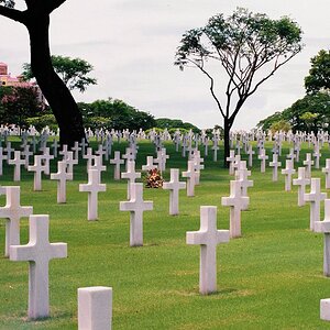
Hmm I am totally agree with you 'itsme123'. I prefered the first b/w better than the colour one. Yes, indeed it give that creepyness feeling to it. Perhaps just contrast the sky a bit more.

Same with the posting form 'cedew'. I like the b/w version. More classic.. like a timeless piece of photo.

Hmm does that make sense.. sorry first time commenting on other people's work
 
I too like the b&w versions. The white border certainly does make it stand out more.. I feel pictures tend to be more.. blah on forums without them. With frames I can better imagine it on a wall or something.

This is a birch tree I believe, we have acres of them around here. They are very cool trees, especially when the bark starts to peel and it looks like paper.

For next time I would maybe suggest getting lower. Try getting as close to the ground as possible and looking up the whole length of the tree.
The cropping makes me feel as though something is missing and leaves me wanting to see more.

Good job so far.
And there is absolutley nothing wrong with just shooting whatever your little heart desires. I've read in a number of books that this helps when you're feeling uncreative. Digital is useful for this as you can critique it right away and shoot from different angles till you're satisifed.
Keep shooting!!!!!!!!!!!!
And posting!!!!!!!!!!!!!!
 
More classic.. like a timeless piece of photo.

Hmm does that make sense..

"Timeless piece of photo" has a nice ring to it. I wasn't sure why, so I ran a google search for that combination of words, and then it hit me: this could be the first time anyone has ever used those words in that order.

397401176_8e5d8a805e_o.jpg
 
Shouldn't the have included whether either of these pictures is good and why?
Or
What do we think of these pictures?
--------------------------------------------------------
 
this thread is surreal
 
Shouldn't the have included whether either of these pictures is good and why?
Or
What do we think of these pictures?
--------------------------------------------------------

Absolutely! At least, that's the constructive thing to do.

But I think we all should remember... when you offer an image up for critique, especially in this forum (photo critique), you should presume that this sort of feedback is possible.

When I first competed (PPofA), I offered a portrait of a girl from my client base. One judge said although the portrait was technically good, the model wasn't pretty enough. He said if a photo was meant to depict beauty, then I should only submit prints of beautiful people. Wow. I'm can't say he was right, but it really made me see my work in a different light.

Now... back to the image. I like the original color image best... the one not cropped and saturated. One thought that may have helped is, with all these lines leading to the top of the frame, maybe they could lead the eye to.... something... some sort of subject. The cropped version first posted has a lot of lines formed by the branches just ending. I think that's why I like the version with both trees.

I hope this helps.

Pete
 
Folks, I didn't think articsilber323 was asking for help, advise, suggestions, or critique. I thought the question put forth was which of the two submissions was more pleasing. Is the color version more appealing than the b&w version?

I also think that the image doesn't belong in the critique section. This is the section which affords a lot of training and development by having others indentify and point out the weaknesses in a poster's endeavors. This isn't the section for submitting images merely for the 'slap on the back' or the 'atta boy' type comments.

Since the image has been submitted into the critique section, I'll assume that honest, subjective, and sterle opinions (not necessarily mean ) were sought after.

I spend a lot of time looking at other peoples images on these forums and then relating the feedback the images receive from everyone (both experts and novices). The feedback has been a huge instrument in the development of and the enjoyment my own camera experience.

In this particular image as viewed on my humble monitors, I see a smartly colored image. That's good--I'm a freak for color. I don't recognize any particular statement or any unique element of focus upon which to identify any specific structure or composition. The subject and/or its presentation just doesn't speak to me. I do see a beautiful blue sky (which I like very much) contrasted by an under exposed tree. There is little or no detail in the shadowed side of the tree.

I assume from your own admission
i have only had my camera for 2 months so i am still completly learning
that you haven't had a whole lot of exposure to the "rules' of composition. It's ok to break these rules occaisionaly but only if you make it apparent which rules are being broken. Here are some terms which you can do a 'google' search on and gain some really solid tips and tricks......

Rule of Thirds Composition
Golden Means composition
Triangle Composition
Rembrandt Lighting
Short lighting
Broad lighting
Paramount lighting
Side Lighting for Texture

I personally am looking forward to seeing a lot of your work in the future. I hope we can keep your interrest here on this forum. It'll be extremely enjoyable watching you develop. You already have great sensitivity for photography (exibited by your current submissions and explaination of how you relate to them).

Cheers,
MJ
 

Most reactions

Back
Top