it is probably well done in that way that you achieved what you or she wanted.
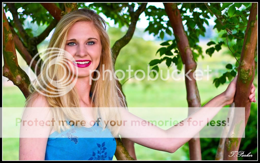
But this super flat skin to me looks like .. plastic I am afraid (to follow The Traveler with the wording). If you had done the same effect, but just 60 to 80% of what we see now, it would be much more human and not so android-ish. But I have to admit this is just a comment coming from my personal taste.
She still has to learn how to apply lipstick properly I am afraid ... not that I am any better at it though
Much better. You lose a lot with the first attempt. Subtle wrinkles and lines in the face are no longer gone. Wrinkles don't always mean old and sometimes they should be there regardless of age. The skin looks much more natural and truthfully, looks much smoother. The first attempt has weird shades blended where they shouldn't be.
You also lose lighting detail with the blur. Shadows are now properly defined instead of looking like smudges like the do in the first picture.
I can see a difference between #1 and #2, and I definitely like the second version better. It looks nice and clean, but no longer shiny and "plastic" (since that's the word we're using).
But really, it's up to what the client likes. Like others, I am curious to know what she thought of these, because I think a senior would be pretty happy with something like this.
I completely disagree. The one on the right has matched skin tone of the face with the rest of the exposed skin. The one on the left looks .... mmm.... the song Sweet Painted Lady comes to mind.
She had acne on her checks/nose. Had to do that to overcome it. I personally thought it didn't look to bad as far as the PP goes, I've seen worse done when softening a face. I also like a colorful picture. Are you on an LCD monitor? Could be the case there too if you haven't calibrated it.
I am on an LCD, uncalibrated, and it is notorious for making things seem over saturated... Knowing this, in hindsight, I probably shouldn't have said anything... Oops. Sorry?
However, I still feel it's a bit too plasticky, but it is a personal-taste thing. I prefer to see pores, some wrinkles and stuff, rather than the impossibly-perfect skin that (I feel) is obviously photoshopped. Maybe I'm just jealous?
Maybe it is just how she is - I find the lipstick to be too much, or probably just not my taste.
I think the original (aka the one on the left) looks better to me.
Or, rather, something in between the one on the left and the one on the right, would look better to me. If the red was taken down JUST slightly (maybe in lightness and not saturation) I think I would like it alot.
As it is, I think she would like the original too. Funny, I never see this kind of comentary on pictures like elsaspet. Her brides, while the color isn't the question, resemble mannequins all the time. I tryed to link to one of her recent threads specifically but it looks like she took the photos down.

")

![[No title]](/data/xfmg/thumbnail/36/36399-041c9ebc3a39e89ec8e39243c0d43528.jpg?1619737551)


![[No title]](/data/xfmg/thumbnail/39/39191-629bf2c0bb5afb4619be296cd91b9517.jpg?1619738907)


![[No title]](/data/xfmg/thumbnail/37/37130-15360a524d273bc7dcd0beda3e9299ee.jpg?1619737884)