Whatcom Falls, C&C Please!

Palyriot

TPF Noob!
Joined
Apr 16, 2008
Messages
102
Reaction score
0
Can others edit my Photos
Photos OK to edit
I took some photos today at Whatcom Falls. I don't really like how any of them turned out, but I would love some C&C. I kind of feel like the falls are a little weird to shoot.

1.)
DSC_0010.jpg


I had some fun playing with the shutter speed on the falls. It feels like there is too much going on in the picture, but I couldn't get my camera anywhere else. Also, I realize there are some highlights. The branch in front of the waterfall is probably very distracting. I really wanted to cut that bastard down.

2.)
DSC_0011.jpg


Still a little busy, but less highlights.

3.)
DSC_0016.jpg


Tried zooming in a little bit so it was less noisy, but then am cutting off the sides of the waterfall.

4.)
DSC_0026.jpg


Walked to the side of the waterfall for a different aspect.
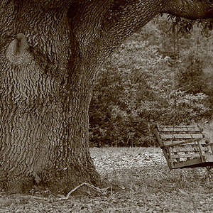
5.)
DSC_0031.jpg


May not be interesting, but was just practicing technique. Tried to keep half of the rules of thirds with the camera on the right third line. I got the focus wrong I'd say with the focus on the left side of the bench. Maybe it would have been better with the focus on the right side.

6.)
DSC_0039.jpg


Dirty water.

7.)
DSC_0040.jpg


Still dirty.

8.)
DSC_0059.jpg


Caught it cleaning itself.
 
Ok not sure about the rest but I'll C&C the first 2. For me, what's missing is the bottom of the fall. I think the moving water leads the eye down through the frame and it feels incomplete because you can't see where the water goes.

Another piece of advice, when asking for C&C you shouldn't point out the things wrong the pics. It draws attention to what you feel is wrong, even if it's not that big of a deal to other viewers.
 
I think the falls shots are alright... well composed... i don't find them busy as you suggest... good exposure... i'm not drawn to the highlight clipping you mention... the branch is dealbreaker distraction but like you said these are practise shots...

damn branches... there always seems to be something like that to wrestle with..

i don't agree with rmh159 with respect to not mentioning what you already know is wrong.... disclosing what you know to be wrong saves people from correcting you on an area that you are aware of..

the rest of the shots are .... meh...
 
Ok not sure about the rest but I'll C&C the first 2. For me, what's missing is the bottom of the fall. I think the moving water leads the eye down through the frame and it feels incomplete because you can't see where the water goes.

Another piece of advice, when asking for C&C you shouldn't point out the things wrong the pics. It draws attention to what you feel is wrong, even if it's not that big of a deal to other viewers.

I agree. I really wanted to include the bottom of the waterfall, but the edge of the bridge was right there. Unfortunately, the falls are only like 20-30 feet away from the bridge I was standing on. About your second piece of advice, I'm not really looking for people to say that they love my photos, so I'm not worried about people realizing what I don't like about them.

I think the falls shots are alright... well composed... i don't find them busy as you suggest... good exposure... i'm not drawn to the highlight clipping you mention... the branch is dealbreaker distraction but like you said these are practise shots...

damn branches... there always seems to be something like that to wrestle with..

i don't agree with rmh159 with respect to not mentioning what you already know is wrong.... disclosing what you know to be wrong saves people from correcting you on an area that you are aware of..

the rest of the shots are .... meh...

I guess the highlights aren't too bad because the rest of the falls are pretty white. I really wish the branch was gone.


Thanks to both of you for your advice! :D
 
biggity bump
 
Hi Palyriot - I've moved your thread from the Beginner's forum to the General Gallery. Please post all images into one of our Gallery forums, so we can keep the Beginner's Place open more for Q&A and general discussion.

Thank you!
 
Hi Palyriot - I've moved your thread from the Beginner's forum to the General Gallery. Please post all images into one of our Gallery forums, so we can keep the Beginner's Place open more for Q&A and general discussion.

Thank you!

Sorry about that. I wasn't very sure where to put my photos for C&C. I've seen a lot of C&C requests in the Beginner's Forum, so I assumed it was a good place. I'll make sure to post in the General Gallery from now on.

Thank you
 
#2 works for me.

Yeah, it would have been nice to see where the water actually lands on the rocks below.

Call me a contrarian, but I think the branch on the right balances the heaviness of the stones on the left and acts as a nice framing component. Plus, the delicacy and light green color of those new leaves really places the image in "spring."
 
You have pulled off the "water-in-motion"-effect better than I have ever been able to do myself.
And Sandspur, may I be a contrarian with you? For also I like that branch and find it adds depth to the photo, furthermore it adds the most beautiful colour ever to it :)biggrin: - Palyriot, once you know me a bit better, you will know that I cannot NOT say this)!

The goose photos are quite centred, which unfortunately lends some kind of "meh"-ness to most photos, and the bench ... ah well...
 
#2 works for me.

Yeah, it would have been nice to see where the water actually lands on the rocks below.

Call me a contrarian, but I think the branch on the right balances the heaviness of the stones on the left and acts as a nice framing component. Plus, the delicacy and light green color of those new leaves really places the image in "spring."

Thanks, I kind of thought that the portrait photo of the waterfall was my best. Now that I've gotten away from the photos and glanced back at them I am starting to like the first few more. The bench and ducks are still pretty bad. I guess I'm being too critical with my photos. Thank you for giving me some feedback.

You have pulled off the "water-in-motion"-effect better than I have ever been able to do myself.
And Sandspur, may I be a contrarian with you? For also I like that branch and find it adds depth to the photo, furthermore it adds the most beautiful colour ever to it :)biggrin: - Palyriot, once you know me a bit better, you will know that I cannot NOT say this)!

The goose photos are quite centred, which unfortunately lends some kind of "meh"-ness to most photos, and the bench ... ah well...

Thank you for the comment on the "water-in-motion" effect. I tried the falls anywhere from 1/1000" to 1". I found the 1/40 looked the coolest, but the ones I posted are mostly around 1/3".

I tried to use thirds on the ducks, but those shots still looked lame. I think the dirty water made it look bad, plus me being much higher than the ducks. They also seemed a little bit soft.

Thank you for your critique!
 

Most reactions

Back
Top