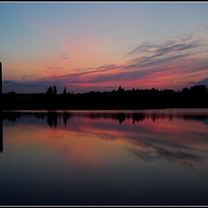
Is this better? Its another shot, which I still had stored on the memory card. It was much wider, so I had to crop it quite a bit; compared the the first one where it was only cropped a little. The color is really off compared to the TIFF on my computer but this was just a quick webedit.
#2 is the better one. There really doesn't seem to be a point to putting that much red sign in #1. The red attracts the eye enough as it is, no need to put more emphasis on it by giving it as much area as the background.
EDIT: Ooop, didn't see the new post, yeah that's way better.
Is this better? Its another shot, which I still had stored on the memory card. It was much wider, so I had to crop it quite a bit; compared the the first one where it was only cropped a little. The color is really off compared to the TIFF on my computer but this was just a quick webedit.


")

![[No title]](/data/xfmg/thumbnail/35/35962-c0d3c2e7c3fd7f9bd7e12c21f955f4f0.jpg?1619737278)
![[No title]](/data/xfmg/thumbnail/35/35963-4809c92024a0e6355dd194caf9297701.jpg?1619737279)