adstudio3d
TPF Noob!
- Joined
- Jun 19, 2007
- Messages
- 22
- Reaction score
- 0
- Can others edit my Photos
- Photos NOT OK to edit
Hey was just going through the thread...
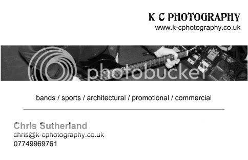
Not to step on anyone's toes, but a logo is a visual representation of your company, not an advertisement of your product or skill...
It is used so that when someone sees it, they remember it.
Look at some of the most successful logos around like Nike or McDonald's.
They are very simple, but EVERYTIME you see just the arches or that little swoosh, you remember what it stands for. This is why companies do not use photographs because they are not as memorable as a "Logo". Your goal in creating a logo should be to make it easy for people to remember who you are through your logo. Use it on all of your photos, business cards, letter head, anything you create or send out, and on any advertisements along with your photos. This is how you will build "brand awareness".
Well... I think I wrote enough.
I was going to ask, I have a few minutes of free time would it be ok if I edited your logo a little bit, it would be much easier to just show you than describe what I think.

") a nice healthy debate with lots of valid comments, and lots of people clubbing together to offer advice
a nice healthy debate with lots of valid comments, and lots of people clubbing together to offer advice