Which of these do you like best?

Which shot do you like best?

  • Pic 1

    Votes: 7 38.9%
  • Pic 2

    Votes: 2 11.1%
  • Pic 3

    Votes: 9 50.0%

  • Total voters
    18

CraniumDesigns

TPF Noob!
Joined
Dec 1, 2008
Messages
477
Reaction score
2
Location
San Francisco Bay, CA
Website
www.stevendavisphoto.com
Can others edit my Photos
Photos OK to edit
Hey Folks,

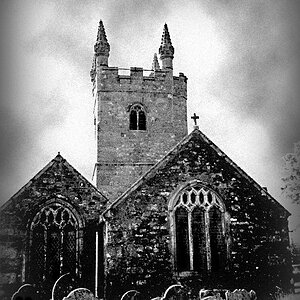
I recently did a little trip to Mono Lake and Bodie Ghost Town. I did these 3 HDR's, and I can't decide which one to put in my portfolio. Which one do you like best? 1? 2? or 3?

3890938588_a2dbb7847d.jpg


3891330526_cc5bd01897.jpg


3890608663_b3bf80e73d.jpg
 
I like #1 the most I think. #2 has a halo around the house that bugs me. #3 has the lump of twisted steel that distracts me from the house. I like the simplicity of #1.

What is your editing method? Since I see the halo in #2 I'm assuming you're doing an HDR then converting it to B&W. I like the look.

thanks. i am using photomatix pro to combine 3 exposures, and converting it to grayscale. seems to have more impact since everything's got that "old" feel. the halo is evident in #1 too, but i think i may re-process them. in #3 that "lump of twisted metal" is an old car. looks cool in a bigger size. i'm torn between 1 and 2, but i like 1 for the impact it has, and it actually looks good centered.
 
Now that you mention it, I do see the halo on #1. I just changed my vote to #3. :D
 
What kind of portfolio are we talking about? For a gallery, I would assume.

If that is the case, I vote to fix them and put all three in.
 
i like 1

i don't like 3 cuz you can't even tell that it's a car.. just looks like a cpl of rusty oil drums to me...

2... i dunno... doesn't have the impact the first one does to me
 
Now that you mention it, I do see the halo on #1. I just changed my vote to #3. :D

well, what if i fixed the halo? which one COMPOSITIONALLY do u like best?
For me it would be #1. I like the simplicity of the structure and the perspective. It's the first one to grab me and sucked me in.
 
well, i dont wanna spam people with 3 variations of similiar images. i also wanna sell prints, so i wanna pick one.

Not sure what the "spam" thing means :lol: but every show I have been in, either solo or group, had a theme. Thus my comment.
My second show was about Rte 1 and it was photos similar to those. Abandoned buildings, hunks of metal, etc so that I would not be shocked to see all 3 of yours in one portfolio.

But, you are the artist.
 
i like #1 the best, but there are things about it i dont like.. like the halo..
 
I like the formal balance of #1 the most. I think the processing on all three of these is just a wee bit over the top,however.

"Bodie....it looks like my kooky neighbor's place!"
 
I like 1, 2 is out for me, lighting looks funny, and even though I like 3 I think the car in front is hard to make out, therefore distracting from the main subject, which to me, it looks like it would be the house.

Great pictures and looks by the way!
 
#1 for me, sans halo. I'd like to see the house a little lower in the picture, not so much in the middle. But maybe that's just me.
 

Most reactions

New Topics

Back
Top