If I am forced to choose one that I like, I'd go with the first one.
Main reason is that I really do not like the lens flare in the second and I prefer how the mountain looks bigger in the first.
But in all honesty, there are issues that I dont like with either image
#1 Seems somewhat tilted. Might be an effect of the horizon / landscape, but its the impression I got. I also find there is a lack of contrast in both images, things seem more grey than anything else (if that was the intent, then good for achieving that look).
I do prefer the clouds in this image, they are nice, and as said, I like how the mountain looks bigger and is more imposing in the image. I'm all for foreground subject, but don't like the branches. I think its because they are cut off and not complete.
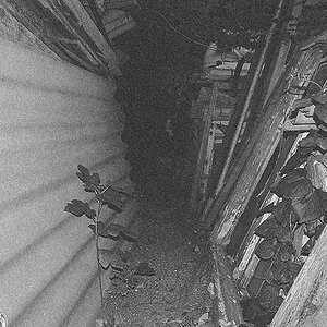
I like how I get the feeling of impending doom from this one..
#2 Same issues with tilt/slant and with lack of contrast as in #1.
I find there are too many distracting lines and shapes in the front (all the trees) and my eye just bounces everywhere, not settling on anything.
Thanks for the feedback; I really appreciate it. The angle of the horizon is accurate to the actual landscape (give or a take a degree or two) but I can see why it might seem off. Regarding the lack of contrast, I think you're right. I had a tricky time upping the contrast without blowing out the highlights or blackening the shadows, (plus the atmosphere was pretty thick at the time,) though I know some ways to work around this. Regarding the framing in #1, I was trying to avoid this huge unattractive office building directly beneath the bottom of where the picture ended up being framed (part of the frustration in trying to take landscapes in a semi-urbanized environment.) I think in the future I need to get on the road more and travel to where every single shot isn't marred by a parking garage, or mall, or telephone/power lines, or freeway, trailer park, golf course, apartment complex, or what-have-you. I agree with the critique about the lack of differentiation/contrast in #2, particularly between the fore and mid-ground.
Do you think this color version of #1 (don't have one of #2) is any better?
Odd, I would of expected the things further back to me more detailed... but that could just be the atmospheric conditions at the time you shot or maybe an HDR processing issue
IMO, the color one is amazing, i didnt care much for the first two, didn't find them appealing, but the different pictures in the color are stupendous.
Really Like the Color Shot.. I'd really like to see what you could do with this in photoshop and a selective color layer adjustment.. The possibilities are endless..
I would second the contrast issue. I think some playing with the levels in PS could make a huge difference in the color but even more so in the B&W. Great location for a shot though :thumbup:


![[No title]](/data/xfmg/thumbnail/42/42454-2589290b654fa7e0ffdd794aaa5cbd86.jpg?1619740190)
![[No title]](/data/xfmg/thumbnail/42/42458-8274869c9294d2f0655f80c8f0e6048c.jpg?1619740191)

![[No title]](/data/xfmg/thumbnail/42/42397-30faa170de7ed9be38adf00b9b26a220.jpg?1619740167)