White Christmas at Home - Critique me please!

ypperin

TPF Noob!
Joined
Nov 20, 2008
Messages
138
Reaction score
0
Can others edit my Photos
Photos OK to edit
Well for xmas I got a Sony A350 so I figured I'd play around and take a few shots......
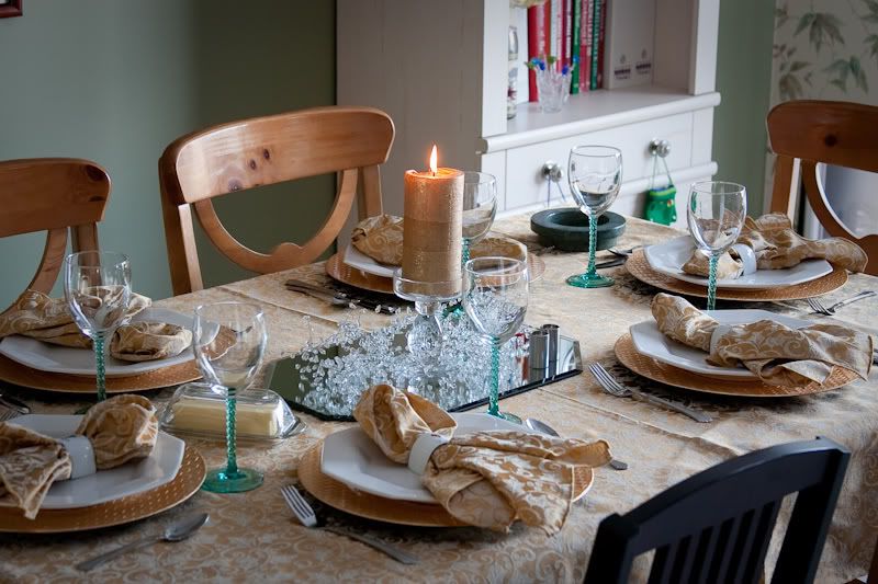
Christmas Table:

1
DSC00138.jpg


2
DSC00139.jpg


Wish I had thought to move the glass in the front of this one :(

3
DSC00146.jpg


Learning from his Grandfather:

4
DSC00207.jpg


And a true xmas shot.... yes they were meant to be dark..... I love the look of the first, wish I had managed to get the hustle and bustle of the second behind him in that one....

5
DSC00289.jpg


6
DSC00291.jpg
 
any comments at all? are they that horrendous?
 
Tell us why you think #1 & #2 as well as #5 & #6 are worthy of C&C? Yes, I realize it has not been requested, but they have been posted which makes them food for the fodder.

What are you looking for?
 
i like the wineglass and the apparent father and son on the computer.

some of them could be composed a little differently.

example - no. 3 it feels cluttered. if you would have moved slightly to your left, the statue-ette wouldn't be covered up by a wine glass.
 
Thanks so much for the comments.

Why do I think they deserve CC? Well, that's one way we learn, and what better way to learn than from others with an eye :)

For number three I couldn't move around the object, though I should have removed it (DOH) Unfortunately I had 3 kiddos in the midst of a fight right before sitting down at the table, so it was a quick grab LOL.

The "father and son" is one of my faves, I was in the other room when my mother grabbed me to see what my father and my son were doing LOL! It was something special :)


Thank you so much though for the comments, I really appreciate the time members take to put in a thought or two :D
 
I took a picture of a table setting on Christmas too...

IMG_1528.jpg


Not sure if I like it or not... kind of generic.

I like the DOF in your plate pic.
 
I don't like any of the wine glass shots because they are empty, in the end it is just a glass on a table not much more to say get outside where there is some natural light and shoot some shots
 
Nice table shot :)

As for getting outside we were literally snowed in so that wasn't a possibility but ty for the 3 second remark :)
 
for the OP's pictures - except father and son shot, the rest to me feel - like "I need to take a pic of something because I have a camera in my hands" - I don't see much planning of composition or even a worthy subject.

the father and son pic - I like the subject and the scene, but don't care about framing - I would like to see it framed differently and I would love to know what they were looking at. Also it seems OOF and blown out a bit
 
For good C&C, limit it to a max of 3 photos (or less). More people will take the time.

1 - The table set up is nice, but the window is so blown out (over exposed) that it hurts to look at it. Like the reflection in the knife - maybe you could have used this more somehow???

2 - I don't see much here. Everything in focus is cut off - plate, knife. Also needs straightening.

3 - "Wish I had thought to move the glass..." or moved the S&P shakers and centered the glass under the reindeer as if it were 'contained'.??? Don't like the background - clutter and a blown out window.

4 - This is good and certain to be a treasured memory. As a photo, get all of the grandfather and all of the painting in the shot. It's crooked. The skin appears to be a little over exposed. Do something about the reflections in the mirror - especially that window.

5-6 - I get what you were after, but it doesn't work for me.

If some replies seem a little 'short', don't worry about it. Everybody has bad days. If you listen to what is being said by those critiquing and keep trying to get better, there will be those who try to help (no guarantees that I can actually help). Posting 1 or 2 of your best and asking for C&C, is the fastest way to learn next to a classroom.

TF

I honestly can't tell you how much I appreciate your input!! I can see exactly what you are talking about, and will also take your advice and cut back the number of shots I post in the future to make things a little more expedient :) Again thanks so much!

That's another good reason to get outside and shoot

LOL if only!! With three kiddos there with me, one autistic and unable to tell his body temperature, and an 18 mos old, I'm afraid going out in -20 celcius was just not an option..... of course I did try to venture out yesterday and forgot the camera battery (DOH).

To be completely honest, I don't find anything interesting about snow for the most part. In fact, I find most pictures of "winter wonderland" type shots as well as all aspects of what you find around outside in the snow, mundane at best. Not that I don't appreciate the shots that others take out there, I've just been around it my whole life, so it's all a little meh to me LOL!
 
OldClicker said what I was thinking mostly.

I think your best is #4. There is a real connection in that photo. Could use a slight tilt adjustment CW by .25-.50%.
 
IMHO, i dont really think any of these photos are creative. Theyre just normal pictures proabably taken on auto and they may just look cool because the background are blurred. the last one was proabably on manual because auto would have used a flash.

but its a start!
 
IMHO, i dont really think any of these photos are creative. Theyre just normal pictures proabably taken on auto and they may just look cool because the background are blurred. the last one was proabably on manual because auto would have used a flash.

but its a start!

Though I appreciate your opinion, none of these shots were taken on auto but at various settings EXCEPT for the last two in which case I turned off the flash. :lol:
 

Most reactions

Back
Top