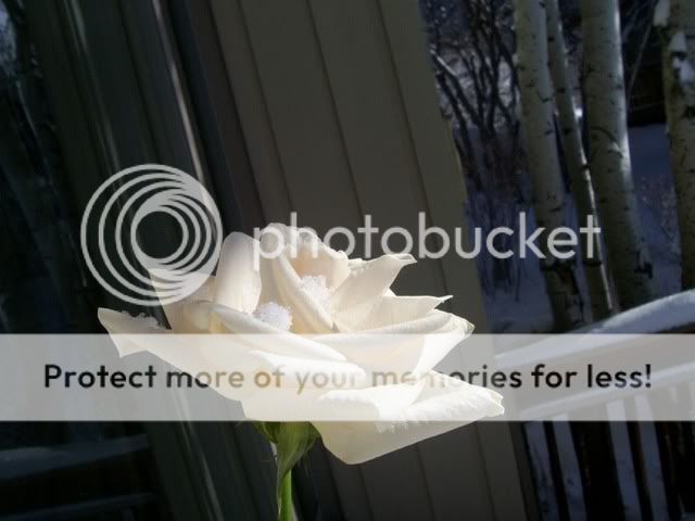
I deliberately softened the flower. I really didn't like it sharp, mainly because it was too bright from the sunlight. What you see on the edges isn't actually background color, I used the magnetic lasso on Photoshop Elements so the cut was right to the border. What that is is highlighting....unfortunately I can't manually add that....or if I can, I have no idea how, I'm really new to PSE. (If anyone has any idea how to do that I'd love to learn...I spent a few hours on that and just couldn't get it to do what I wanted it to.) So it places it on the edges of that particular layer automatically. I'll try to remove that and see what happens.
Call me a Philistine but I love the original.
The contrast of the absolute purity of the white rose against the dim, dark snow is great. And the slant helps the composition.
The original really???? I'll be honest...when I did it, the intention was to get rid of the original background, so I haven't even really looked at it as a complete picture. Thank you so much for that perspective, I didn't even see it that way.
I'm so surprised! I'm still having trouble seeing it....with the original background it still looks very snap-shot-y to me. I need to look at it for a little while. Thanks so much!
the contrast is high enough to separate the rose from the background.....of couse not the best...but the original does look better than the modified version....with CS2....you can also darken the shadow and lighting the highlights....make the contrast even higher...not sure if you can do that with PSE...
I wouldn't be either, it looks very snapshoty to me as well. You're first image reflects elegance. A longer stem would help the image, and the crop(removing the rose from background) looks like it needs a little help. Other than that, fine job.
even tho your intentions are to soften the edges... the rest of the edge doesnt match. i think tahts why everyone is picking on it. the bottome edge is sharp, as the top would be too fuzzy. not a bad photo tho. i agree with most the people that said the original is better. great pattern in the bg.
Given that I couldn't manually place the highlight...what might be the best way to make it more uniform? I don't like the original and won't be using it for anything. My goal is to make the edited version as uniform and objectively appealing as I can. There's always going to be something that someone doesn't like and that's totally okay, but I could go days with folks over what everyone thinks is the better version. I really would like tips on PS Elements...how to make that technique more uniform, you know, advice on skill.
Thanks!


![[No title]](/data/xfmg/thumbnail/39/39544-f587cf14279888b81e3b51750534ae22.jpg?1619739080)

![[No title]](/data/xfmg/thumbnail/39/39543-dfebd471118eabdc8c41e2088dca98f3.jpg?1619739079)