Working on my "people shooting".

MGriff240

TPF Noob!
Joined
Feb 10, 2010
Messages
185
Reaction score
0
Location
Horsham, PA
Can others edit my Photos
Photos OK to edit
Well I'm going to start shooting people more often now (which sounds terrible. :lol:), so I want some C & C on these first shots.

These first two are from way back of a friend.

1.
4456489055_a73a980ee5.jpg

2.
4456489061_64b92474f0.jpg


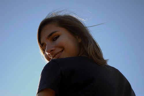
These are new ones from a little shoot I did with my girlfriend.

3.
4457243280_51eb69e9cd.jpg

4.
4448939193_19acf5ec0a.jpg

5.
4448960413_5c0eb6cedd.jpg

6.
4448968065_f8e6953a3d.jpg

7.
4449749696_659375ce7b.jpg
 
This is really not my area... buuut:

Shot 1: I really would have liked to see a tiny bit of flash to just fill her in for this shot. Just so that she is not in total shadow and that we can see a little detail in her eye (inest of it being dark and bleeding into her eyelashes). You exposed the shot well to keep the sky in check which is a good thing, now you need a bit more light on the subject. You could even have used a reflector to just redirect some light.

Shot 2: I see where you are going with this shot, but I feel that it doesn't work because of the background areas. It's a contemplative pose and the framing is one which brings the background areas very much into the viewers attention - thus we need something better for the subject to look out over rather than just grass and a rising fence - the fence is not all that interesting and it rising up out of the landscape rather puts a wall like feeling to the shot. I would have wanted a scene without the fence at least and idealy with a background showing some landscape/aspects further off that would be able to hold a little interest.

Shots 3-7: I see again where you are going with these, darker and trying for some mood, but again I feel that your subject is just in too much shadow for good presentation. Further her face is often one of the darker areas of the shot, rather than a reletive brighter patch which means that our attention is not drawn there first. By the last shot you have started to get a better overall presentation - her face is brighter so we are drawn to pay attention and the background appears slightly better chosen.

Shot 4: The foreground distractions are just too distracting for my taste, they obstruct our view and appear more like a mistake than the delibrate move you were making and the image you are trying to create. Again her face is very shadowed and dark.


I do like the compositions you are experimenting with in these shots, but you need to work on your lighting and pay attention a bit more to your background areas. Some offcamera lighting setups (flash or simple reflectors) would be a great asset for you to look into for this kind of work.
 

Most reactions

New Topics

Back
Top