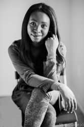
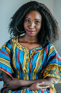
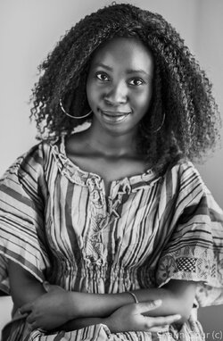
Overall I think the shot is pretty good.
A few things that I would do differently (this is my opinion) are:
- Not have the corner as the background, tried to get more of the flat wall. This is really a minor one since it's really not too noticeable.
- clothing issues, stained wrist sleeve on arm camera right, couple of stray hard on camera right on the legs.
- if I had noticed the shine on the skin I would see if she has shine control oder or and matte powder foundation.
- still looking at the colour. almost seems like the saturation is a little high for my taste.
Her forehead looks like it might have been overexposed and then had the highlights pulled back, and the same with the one hand, and that there's some loss of proper tone response in those recovered highlights. Her one hand looks a bit too large, as if the focal length is too short and the camera was too close to her. The lighting pattern is a bit odd, with bright lights hitting both sides of the face. her eyes do seem to be in decent focus to me.
I would have turned her more towards the light source. I think it's too harsh, and like Derrel mentioned, the light placement is a bit off, drawing attention to the shadowed cheek area. If she was turned more towards the light, it would spill over and light that area better.
Your DOF is very thin, which seems to be a "thing" these days. I don't know why.
Pose is good, the tilt of the chair is disconcerting. I will assume you wanted to straighten the model in the frame, but now the chair is tilted. Oh, well.
I agree with @zombiesniper regarding the saturation- especially since the shade of blouse and the shade of the lipstick seem (to me) to be fighting each other- I would pull back the saturation just a touch. Now that @Designer points it out- she does look like she's about to fall out of the chair!
Lovely model and nice smile. Had no issues whatsoever with the focus.
Thank you! It's supposed to look like Portra 800, hence the high saturation. Shallow depth of field is really cool for portraiture in my opinion. But it was also a necessity as I was shooting in her appartment and there wasn't much light.
Shallow depth of field is really cool for portraiture in my opinion. But it was also a necessity as I was shooting in her appartment and there wasn't much light.
I find the highly-patterned clothing to be very distracting since it makes up like 75% of the picture,and it's way out of focus.The clothing is quite jarring to me.


![[No title]](/data/xfmg/thumbnail/31/31753-281132967af6a422c89bcc0d6f16499a.jpg?1619734991)

![[No title]](/data/xfmg/thumbnail/31/31754-af76ae89cc75bd1855937374ff359efe.jpg?1619734992)
![[No title]](/data/xfmg/thumbnail/31/31755-9bffabfa76f6307bcd78f535b2421cb5.jpg?1619734993)