would you be interested??

Christina

TPF Noob!
Joined
Jul 19, 2007
Messages
947
Reaction score
0
Location
jacksonville, fl
Website
www.myspace.com
Can others edit my Photos
Photos OK to edit
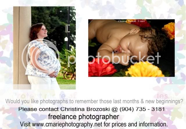
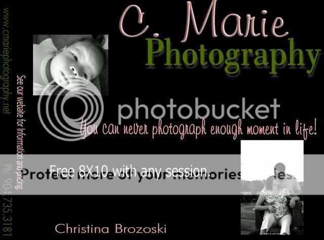
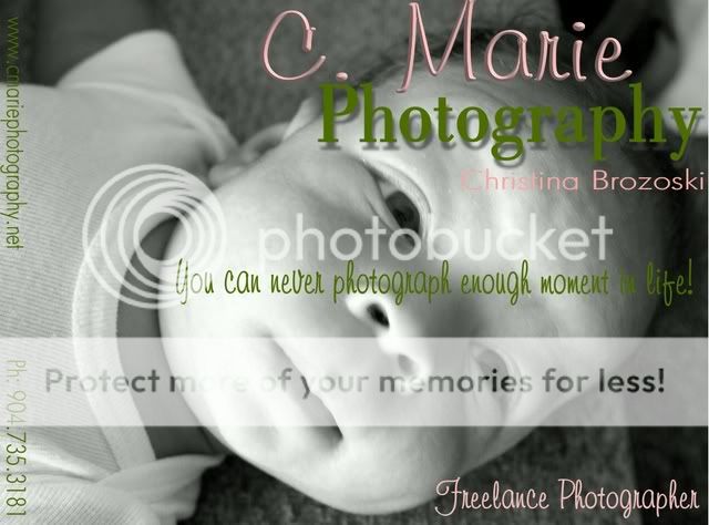
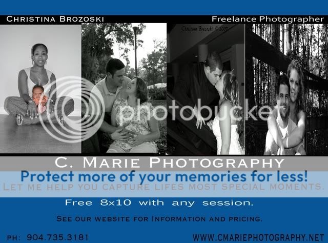
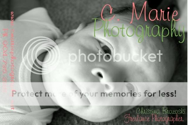
I use to work at a Ob/Gyn office and the docor is willing to let me place some buisness photo cards on the front desk. Would you be interested? or what turns you away?

coolthing.jpg
 
well, I wouldn't be interested, cause I don't have babies...

but, having photos on the card is certainly good, and what better place? I'd suggest changing the background a bit, so it's less busy and draws people's eyes more towards the pictures.

Great idea though.
 
Well, I hope you don't take this the wrong way, but the whole card looks kind of unprofessional to me. The background is really cute and I think you could go with it, but the pictures you've chosen don't go with it. They are too bright and colorful and I bet they would go better if you made them B&W or toned down the color a bunch to go along with the muted colors of the butterflies. Some sort of transition between the photos and the card would look nice too (a border maybe?) Maybe overlap them or something as right now the composition of the two photographs isn't really working. Also, do you have a better photo of a newborn? The one you have has his/her hand right in front of her face and the lighting isn't very appealing.
But, the text is the part that is really unappealing. It's all basically the same size and Freelance Photographer seems like it should be capitalized since everything is capitalized correctly. I'd get rid of "would you like" and just put "Photographs to remember the last few months and the new beginnings." or something even more succinct.
Get rid of "Please Contact" and just put your name and contact info and website.
Hope that helps:)
 
Every thòught helps and by no means am i offended as it being rude. I appriciate you taking time to point things out and as this being my first edit of it, i will be using some of your suggestions next go round.

Any one else?
 
I saw a photographer's card today that I really liked. It had a lot of blank space. It was a black card with light colored text. The lack of 'busy-ness' made it look real professional.
 
April Ramone brought up a lot of good points. Personally I have trouble with the baby pic. He looks dead.

Design is a tough field to tackle. Take your time and do tons of research and work on it. A good design (and marketing) will bring in clients. A poor design will turn them away and generally ruin your image.

Love & Bass
 
well i admit that im not the best in design but im trying my hand... here are a few more that i have worked on..please share any imput you may have or even the first thing to your mind when seeing that particular one.

i just realized i forgot S at the end of the moment.

1)
design5.jpg


2)
design4.jpg


3)
design3.jpg


4)
design2.jpg
 
The text seems to be flying all over the place. All you have to say is photographer or photography. People should get the point without catch phrases or deals. It is the images that have to grab the viewer.

Love & Bass
 
The text seems to be flying all over the place. All you have to say is photographer or photography. People should get the point without catch phrases or deals. It is the images that have to grab the viewer.

Love & Bass


keeping that in mind, i think this feels good to me, but again, would it be simple but effective?

designnew.jpg
 
I would consider using a simple card with no images or maybe one close up and so cute it really couldn't be critiqued (with transparency). I think images can be so subjective that some may make a decision just by looking at a business card instead of calling or visiting your site. Maybe that's what you want, but I would rather have them see all my work where there is a better chance they find something they love.
 
what about a card with no pictures and a small 6 x 4 or 7 x5 potfolio for them to flick through while waiting in the surgery. or would the doc permit some pics on the wall?
 
Agreed - keep the card much, much simpler. Employ the use of white space, clean fonts and the like. If your card looks professional, someone who is looking for photos will go to your website. But with the cards I see in this thread, I get a definite amateur vibe from. Not trying to be rude, just honest.

Hell, even do a google image search for some business cards and ape a format you like.
 
My suggestions would be very simple on the front and then consider one or two small pictures on the back of the card with a nice border on each. This way the front looks very professional and the back can show a couple examples of your work. Maybe one small picture in the top left corner on the front wouldn't hurt.
 
A poor design will turn them away and generally ruin your image.
I'm of the opinion that there isn't a 'poor' design, only different clients.
Your 'clean' might be 'bland' to someone else.
Your 'flashy' might be 'cheesy' to your neighbor.

Christina, first figure out who your potential clients are. It is hard to please everyone. Instead of spending top funds on market research or going with a 'this might work' design, the easiest solution is to start with you. You know more about you than anyone else. And there are many people on a similar wave length (regardless of nationality, race, language etc).
What would YOU like to see on a similar card when you visit an ObGyn? More text (if so, what font, size, colour etc), more images (collage, one big photo, b&w, color, selective color, sleeping baby, a nursing momma, nude pregnant mom etc?), mixture of both?
Make several designs, pin them all over your walls where you will come accross them when it's the last thing on your mind. Give it a few days. Now which one grabs your attention the most? Which one makes YOU say, "wow, this looks cool... I should check her website out!" ?
Go with that (of course with more tinkering, if needed).

I'd hit Barnes & Noble for inspiration.​
 
I'm of the opinion that there isn't a 'poor' design, only different clients.​

I don't agree. That's like saying there's no 'poor photography', just different viewers. Which I also don't ascribe to.

There are general rules that apply to good design, just like there are general rules which apply to good photography (exposure, composition, etc). These rules CAN be broken, but you have to understand them in order to break them and make them aesthetically pleasing, imo. Find what some of the general rules are for design and apply those to your marketing materials. I know we're in an artistic/creative field, but usually bad is just bad.
 

Most reactions

Back
Top