OP
OP
fjrabon
Been spending a lot of time on here!
- Joined
- Nov 3, 2011
- Messages
- 3,644
- Reaction score
- 754
- Location
- Atlanta, GA, USA
- Can others edit my Photos
- Photos OK to edit
I didn't like the color at the brighter exposure, I felt it made the flower go from subtle shades to just popped pink. I was going for the kodachrome underxposed look. I appreciate your feedback, but this is what I wanted. I wanted a more subtle look and not the typical bright popping flower with bright whites, high contrast and loads of saturation. I don't think every photo needs pure white in it and maximum tonal range. Many, if not most do, but that's not what I wanted here. Your edit is fine, but it's not what I wanted.^ Your whites are not white, your blacks are really black, and the photo is very flat, but if that's what you like, go with it.
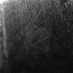
You are going for a dark, gloomy, sad vibe I hope...that's what I get from the photo anyway.


![[No title]](/data/xfmg/thumbnail/33/33024-f9a0cb6482030fec791845de1a21c82a.jpg?1619735837)
![[No title]](/data/xfmg/thumbnail/32/32164-d68fa2de02f9bef524bbd68aac2f12e4.jpg?1619735234)