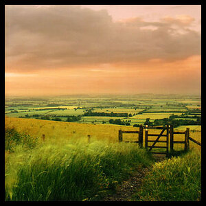
ok i am a graphic designer and an amature photographer... But i'll tell you right now that your website doesn't not look professional and I don't like it one bit. Why do you put the weather on that website? Sorry, but you didn't put any effort into it. On the other hand you have some great photography.
I see you are using "Office Live" therefore you are very limited on what you can do.
I too have a site using "Office Live" just untill I finish my main site that is paid for. Office live is crap, speaking from person useage.
Get a program to create a site, beware "office frontpage" is just as bad as "office live", I am creating one using Deamweaver. I will post when it is finished but might take awhile, not an expert in webpages but have put a few together in the past.
Your site looks cheap (honestly), clean it up to limit scrolling and long extentions of pages. Take a look at mine if you like, its not the best but have streamlined it as much as "Office Live" will allow. I also have weather but that is part of my business.
On the other hand your pictures look good, dont cheapen your work with the current layout... get professional about how you present as you do with your photography work.
I agree with the others. It is way way too busy on the home page and all the junk at the bottom makes it so cluttered. Repeat after me... Less is more... simple is goood. Nice photos though!
hi kirsten, how are you ? ...sorry for all the comments above, dont be heartbroken... its good that you got a few critiques - when I posted my site here, I hardly got any feedback at all !!
please dont feel horrid (like I am feeling right now) reading the posts, different people have different choices. you may just revive your site if you feel like and organize it somewhat (do PM me if you need help). but I found it fair enough.
I appreciate all the feedback negative or positive. I should have explained more when I posted the thread. Its just a site I use for my family and friends to go to see whats new and the weather is based on the 3 areas that I have family or currently live. Its also not just my site but mine and my boyfriend's that we used just to show some examples of my photography work, our computer business on the side (not full time) and my marketing. I do need to update it and re-organize since I started in banking full time and dont use the other things as much anymore. It originally started as just a place so everyone could see my pics instead of just emailing them all of the time. Now since I'm using it mainly for photography I guess I should put that first and let the rest be on the back pages. Thanks again - I'll try to update it soon.
Layout aside, I think the main problem is that "Computer, Marketing and Photography Support" doesn't really say anything. In addition, it's too wide reaching.
If I want a photographer, I'm going to hire a photographer. If I want marketing help, I'm going to hire a marketer. If I want computer help, I'm going to hire a computer person.
It's like, I'd never eat at a restaurant called "Bob's Pizza and Tire Rotation." Pick what you do, and custom your site to do that.
If you need 3 different sites, create 3 different sites.
As far as layout -- and I say this in the spirit of helpfulness, not rudeness -- this site shows a complete lack of marketing savvy... which is a huge problem since you're advertising your marketing services. It's like having a "proofreading/editing" website with 20 spelling mistakes. If you want me to hire you for marketing support, your website needs to show that you have some concept of what successful marketing is.
I'd sit down, figure out exactly what you want your site to be... then create it step by step.


![[No title]](/data/xfmg/thumbnail/38/38264-552eb428d8a704186dcc43400f417d0f.jpg?1619738548)