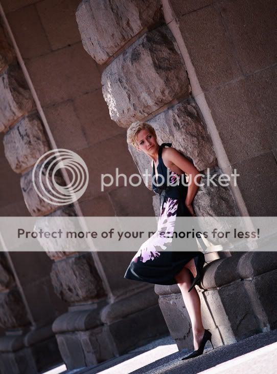
Of the three, I prefer the second one.
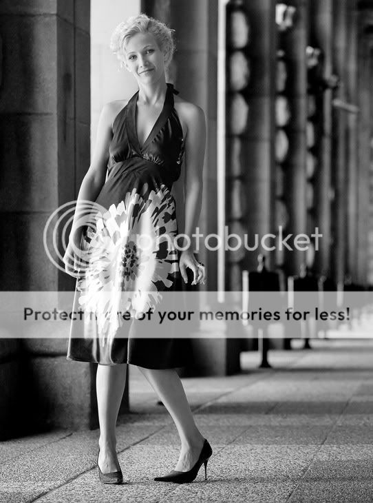
Something about the in-turn of the left foot in the first picture makes it a little awkward looking, to me.
I think what I like about the second one is that it's the least posed looking, in that she's not looking at the camera. I think you could put together a really great set with her if the shots looked a little less deliberate.
I have a few issues with these, mostly in composition.
#1. You should have paid closer attention to where she was standing in-frame and anticipated that the highlight portion of the dress could be distracting and easily steal the focus from the model. This is particularly problematic given her blonde hair set against the background highlight rather than mid-tone or shadow. If you are going to have that big a highlight on her dress you need to balance it out. Her face simply blends into the background too much. I also don't feel that the posturing works with the dress. The high "waist" accentuates the broadness of her hips, which becomes far worse when her thighs are pressed together like that. I think a wider stance would have helped compensate. It, of course, becomes even worse with that giant highlight pulling your eyes onto her hips. It's not that the shot is terrible, it's just that you missed a number of things in composing that I feel could have greatly improved the photo.
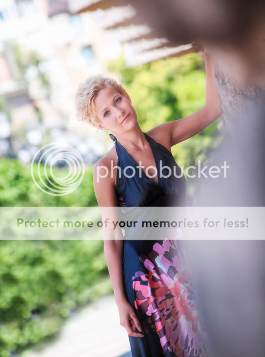
#2 and #3. I don't understand why you tilted the camera. I feel that #2 is a much better shot with a normal alignment. Tilting the frame like this makes the shot too obviously about your composition and not enough about the actual subject. I find the foreground to be quite distracting in #3.
To tell you the truth i agree with some of whats been said above. Picture number 2 is definitely my favorite of them all but the positioning of the girls legs could have been better.
Number 1 is my fav from these... Number 2 I think could use a tighter crop and maybe a B&W conversion.. 3, that thing is plain distracting at the front right of the image.. Other then that, well done..
Any chance of a re-shoot?
I really do think that with some slightly different decision making and either making it a distinctly posed or natural shoot you could come away with some really good pictures.
The subject is great and the idea is right on ... just needs a little fine tuning.
no chance for re shot
actually this was for magazine and the girl on the photos is a tv star (there are difficult to shoot sometimes :er
next time i will make fine tuning.


![[No title]](/data/xfmg/thumbnail/33/33351-cd8e1d901d113ee8f9312e19478885a7.jpg?1619735918)

![[No title]](/data/xfmg/thumbnail/31/31014-6b1a572624824b852f5adaf3594767af.jpg?1619734569)
![[No title]](/data/xfmg/thumbnail/42/42062-136a63ad7d0bd740e99ca1fc477f214c.jpg?1619739997)
![[No title]](/data/xfmg/thumbnail/31/31015-dc3b950337aa798fec947c782fff2e35.jpg?1619734570)