You caught us

DramaDork626

TPF Noob!
Joined
Jun 21, 2005
Messages
294
Reaction score
0
Location
NJ
Website
www.dramadork626.deviantart.com
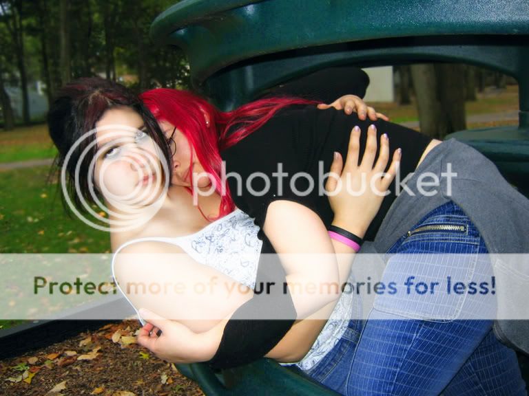
Canon, outdor, overcast day, flash
Ok first of all, for some reason, the image appears slightly darker in photoshop than it does here. So, some of the areas are appearing more BLOWN then they are...
However there was a little glow added to compliment the smootheness of the skin.
Lemme know what you think of the positioning and the composition.
fallout.jpg
 
ummm... it's a snapshot... it's not that big a pic honestly, sorry for the brutally honest part:D there's so much to be said i can't:D

lemme see if bw works better...yeah it really looks good in bw (i printed it and i've got the black cartridge in). so bw works but this way there are ust too many coolours.
 
So you are saying the picture has no artistic merit at all? Yah I know you are not supposed to talk back on here, but I am pretty sure it does have artistic merit. Also I wanted to know about the composition and positioning. That's why I specified.
 
The position looks uncomfortable for no apparent reason, they don't seem to be in motion or reacting to something off to the right. I personal;ly think that its too close. If you have taken the shot form further away and not had such a tight crop it would have worked better.

The hair positioning on both is not very good. The stray red lock should have been put with the rest of her hair. The dark haired girls left hair thingy (w/e its called, fringe parting thing) is in the way of the others eye too much, you can't really tell if the red haird girl is looking at us or not.

Also the models don't really look like they have been caught doing anything except sitting in a very odd position. Also its conceptually flawed as they look to be in a park, hardly the most private place. I think doing this inside woulkd be alot better.
 
DramaDork626 said:
So you are saying the picture has no artistic merit at all? Yah I know you are not supposed to talk back on here, but I am pretty sure it does have artistic merit. Also I wanted to know about the composition and positioning. That's why I specified.

we encourage friendly debate......always feel free to speak up or rebut!
 
It looks contrived.
Sorry.
I'm having a hard time finding the artistic merit in it.
There is just too much around you (and it is you in it, isn't it? You are the dark-haired one, aren't you?) that makes me wonder what on earth it might be, whether you have crawled into a huge waste paper bin and are now stumbling across each other or what? And I really, really don't like the direct light of the flash. To my mind, it does not enhance the softness of skin at all, it only makes the photo quite flat and does give it the appearance of a snapshot. Sorry about this, but I am with eydryan on this.
 
btw, you've got that lisa marie/elvis look going on......any kin? :)
 
DramaDork626 said:
So you are saying the picture has no artistic merit at all? Yah I know you are not supposed to talk back on here, but I am pretty sure it does have artistic merit. Also I wanted to know about the composition and positioning. That's why I specified.

Here is what I have noticed with your pictures, and no, this is not a bad thing. (I'll do my best to explain this understandably...I'm horrible at expressing what I mean into words)

I think that you judge the artisticness of things more by the content. You tend to take shots that have a bit of shock value, and/or make you think. This is a good thing. It is my opinion that your posts do stand out from others. Your pictures are remembered. But...Also in my opinion, people on this forum tend to critique while thinking about the rules and guidelines of photography; lighting, composition, etc, and maybe not so much about the actual content or subject. Does that make sense? Now...I think if you stuck with this same idea, but did a reshoot, you can make it work. Try and use natural light..the onboard flash tends to wash out skintones, and you usually want to try and get skin tones as close to natural as possible. One thing I do to help that, is I take a tissue and I have it rigged up, covering the flash, so light still gets through, but it diffuses it. Another thing to think about is composition. You don't want a busy background, that takes away from your subject. Look out for posts and tree limbs and things like that which might look like they are 'growing out of your head'. Also, follow the rule of thirds. I'm sure you have heard of this, but if you've never learned about it, here is a link that explains the basic idea. http://www.silverlight.co.uk/tutorials/compose_expose/thirds.html

Hope that helps a little. I'll let others chime in on posing/capturing the moment, as I can really think of how to critique it.
 
The "big thing" behind you is very distracting and the light is quite harsh making the scene look artificial.(?)

As with most of your ideas and themes I like the idea a lot. I think you could spend a bit more time thinking about what the shot will look like and how you'd make it even better!

It looks to me you have a very creative imagination and focus a lot on your shock factor. I can't wait to see your photos later on when you've mastered getting the shots you aiming for!:thumbup:
 
core_17 said:
Here is what I have noticed with your pictures, and no, this is not a bad thing. (I'll do my best to explain this understandably...I'm horrible at expressing what I mean into words)

I think that you judge the artisticness of things more by the content. You tend to take shots that have a bit of shock value, and/or make you think. This is a good thing. It is my opinion that your posts do stand out from others. Your pictures are remembered. But...Also in my opinion, people on this forum tend to critique while thinking about the rules and guidelines of photography; lighting, composition, etc, and maybe not so much about the actual content or subject. Does that make sense? Now...I think if you stuck with this same idea, but did a reshoot, you can make it work. Try and use natural light..the onboard flash tends to wash out skintones, and you usually want to try and get skin tones as close to natural as possible. One thing I do to help that, is I take a tissue and I have it rigged up, covering the flash, so light still gets through, but it diffuses it. Another thing to think about is composition. You don't want a busy background, that takes away from your subject. Look out for posts and tree limbs and things like that which might look like they are 'growing out of your head'. Also, follow the rule of thirds. I'm sure you have heard of this, but if you've never learned about it, here is a link that explains the basic idea. http://www.silverlight.co.uk/tutorials/compose_expose/thirds.html

Hope that helps a little. I'll let others chime in on posing/capturing the moment, as I can really think of how to critique it.


actually no, i dont merely judge by content, in my gallery I have some pictures with simple content but in artistic angles. But I submit the pictures on here that get the most views so I can make them better if possible. I mostly posted that one in my gallery for fun, but alot of people looked at it and added it to their favorites list so i wanted to figure out how to make it better.
 
DramaDork626 said:
actually no, i dont merely judge by content, in my gallery I have some pictures with simple content but in artistic angles. But I submit the pictures on here that get the most views so I can make them better if possible. I mostly posted that one in my gallery for fun, but alot of people looked at it and added it to their favorites list so i wanted to figure out how to make it better.

Just to clarify, I said it seems you judge more by content, not merely by content. And that was just my opinion/guess by what I've seen of your work.
 
I think everyone replying to this thread has been honest in what they see. :thumbup:


I'd love to see a re-shoot on the same theme if you're willing to try it? I think with the right setting this would work quite well.
 
Unfortunately I agree, it does have a 'snapshot' feel to it. The colors distract from what you're trying to portray, so definately try b&w. There is extra space past their heads on the right, while their legs are cut off on the left. Likewise their is extra space above which distracts, and below, they are again cut off.

I'm also seeing mixed messages in your subject, like they are in transition between two different things, so in between you can't tell what either thing is. So the end result is I'm lost as to what you're trying to capture here.

But one of the biggest things is the flash. Unless you're careful, flash can turn any artistic shot into a snapshot in a... flash (yes i know, i'm a dork) Since it was an overcast day there shouldn't be any harsh shadows on them so flash as a filler shouldn't be a porblem. Also it would probably be bright enough to take the shot without the flash. (if you look past them the grass near the sidewalk where the flash doesn't reach, it is quite bright, so you should've been able to get this without using the flash)

All that said, it has potential, you just need to go back and reshoot.
 
1. The position looks uncomfortable
2. I can't tell if the girl with the red hair is looking at me
3. Has that snapshot "quick" feel to it...
4. The slide on the top left that is lighted by the flash is distracting
5. Your manual blur in photoshop is uneven and distracting...
6. The levels are a bit uneven...they need to be smoothed out.

Anyway...that is my honest opinion on it...
 

Most reactions

Back
Top