Your Thoughts...

nathanlegiehn

TPF Noob!
Joined
Dec 24, 2009
Messages
77
Reaction score
0
Location
Toronto, ON
Can others edit my Photos
Photos NOT OK to edit
4264983270_21b02caf4b_b.jpg


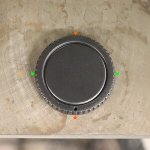
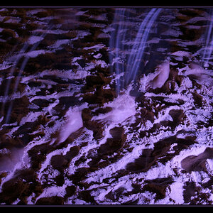
Please let me know what you think. If you would like to see more please click the flickr link in my signature. :D
 
Although you probably like the tree and mountains behind the building it really just looks dumb. Remember this, people looking at the pictures DON'T know what is outside of the frame so won't miss things that you will. The picture should either have a lot of the top cropped out or re shot, maybe from a different angle? Also the color of drab and ugly, so you might as well make it black and white.
 
What's with people being so rude on this forum?
Looks like a good photo to me!
I do like the mountains in the background, but personally, I may have given it a slight crop.
Also, the building seems to be on a bit of a slant? Not sure if it was intentional.
But other than that, it's a great photo!
Keep shootin'. ;)
 
The selective coloring is very weak since the colored subject only contributes a tiny portion to the overall photo.

It is a good example of why most times selective coloring doesn't work very well.

The black and white portion of the image lacks contrast and tonal depth. My guess it was simple desaturated, rather than converted which also makes it as weak as the tiny, selectively colored flag.

Compositionally the photo could be strengthened somewhat if about 1/3 is cropped off the top because the mountain in the background is not adding much beyond some distraction to the photo.
 
The trees and the mountains in the background give the photo depth which I like, but I do think it takes away from the gorgeous building in the foreground.

As far as the selectively colored flag, I would have to vote against it in this photo. The flag is so small that the eye struggles to figure out what it is. Then once the viewer figures out what it is, I would say that it just draws attention away from the rest of the photo.

Overall I think its a great photo, just needs a tiny bit of work. :thumbup:
 
The selective coloring is very weak since the colored subject only contributes a tiny portion to the overall photo.

It is a good example of why most times selective coloring doesn't work very well.

The black and white portion of the image lacks contrast and tonal depth. My guess it was simple desaturated, rather than converted which also makes it as weak as the tiny, selectively colored flag.

Compositionally the photo could be strengthened somewhat if about 1/3 is cropped off the top because the mountain in the background is not adding much beyond some distraction to the photo.

I would agree with Keith - I don't think you need to highlight the flag - just keep the whole photo in black and white.
 
carter713, It's poor form to hijack someone eles's thread, you should start your own.
 
I like it, but I seem to be in a minority. i don't think the building is slanted, it's just optic aberration from the sensor plane not being aligned with it - there is no way to avoid that. I like the overall feel, and I don't think the flag standing out is all that bad. Although it probably has more impact for a Canadian than for the rest of us...
Carter, it's not appropriate to jump on someone else's thread with your own pics, make your own thread. That said, looking at your first pic you REALLY need to clean your sensor.
 
Sounds good! thanks everyone for the criticisms, they are appreciated :)
 
Now that I really like! Great use of leading lines, gives an almost 'light at the end of the tunnel' feel to it.
 
thanks! theres also this one, ive been looking for some critique on. Thanks!
4246136411_bf00a6a37e_b.jpg
 

Most reactions

New Topics

Back
Top