Jayce
TPF Noob!
- Joined
- Apr 10, 2010
- Messages
- 87
- Reaction score
- 1
- Location
- Tampa, Florida
- Can others edit my Photos
- Photos NOT OK to edit
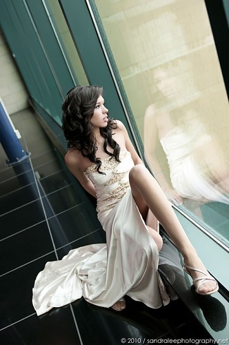
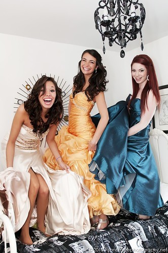
Sorry, I forgot to check back on this thread. For what it's worth, I am generally pretty progressive. I'm not easily offended, etc. I called the photos racy because, as someone else said, they aren't what you'd expect to see displayed in her family's home. There's no question that she looks gorgeous in them, and that the photos themselves are strong.
In my mind, senior portraits are meant to depict "happy", as opposed to "sexy", and these are very clearly created with sexy being the goal. There's a HUGE middle ground between ****ty studio background with a plastered smile and these. I definitely lean towards your style over the typical yearbook photo, but I think it could come down a couple notches, and still maintain the "modern" style.
In my mind, senior portraits are meant to depict "happy", as opposed to "sexy", and these are very clearly created with sexy being the goal. There's a HUGE middle ground between ****ty studio background with a plastered smile and these. I definitely lean towards your style over the typical yearbook photo, but I think it could come down a couple notches, and still maintain the "modern" style.


![[No title]](/data/xfmg/thumbnail/42/42040-7a66cabbeffd44783ea44a91ef4d0e70.jpg?1619739987)