1948 Chevy Truck Photoshoot

NateS

TPF Noob!
Joined
Sep 27, 2007
Messages
2,750
Reaction score
39
Location
Missouri
Can others edit my Photos
Photos NOT OK to edit
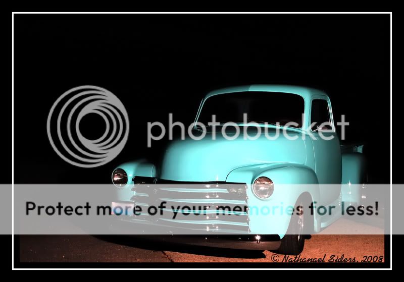
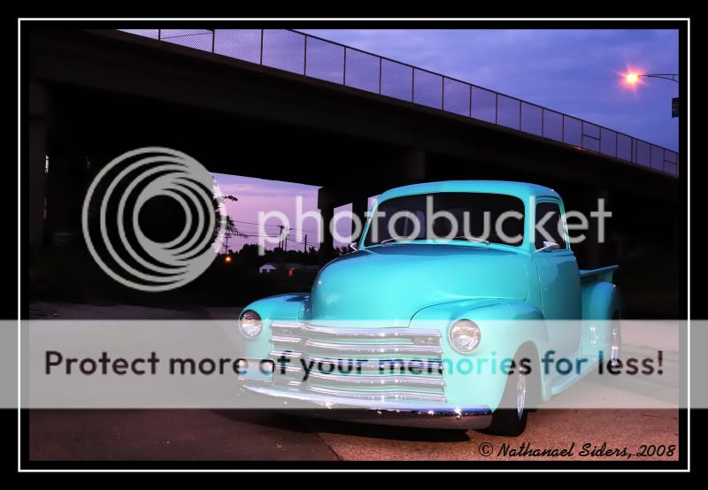
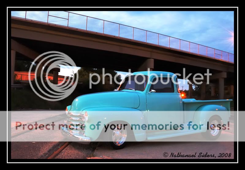
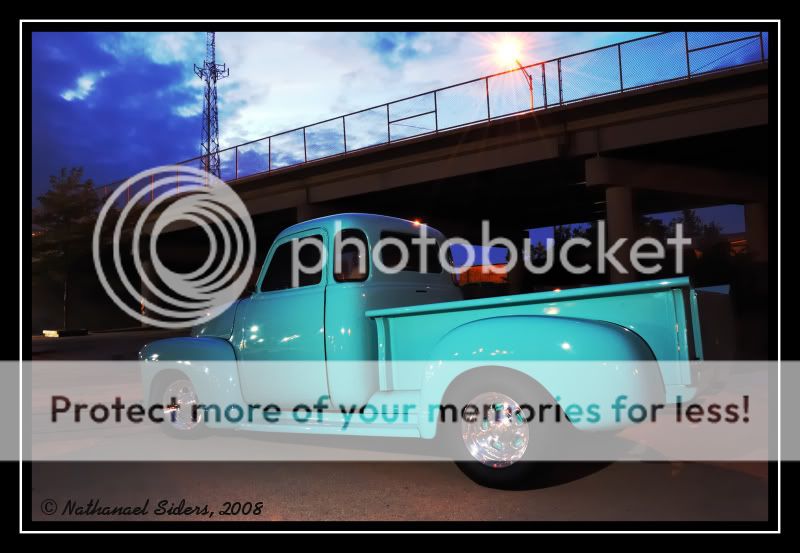
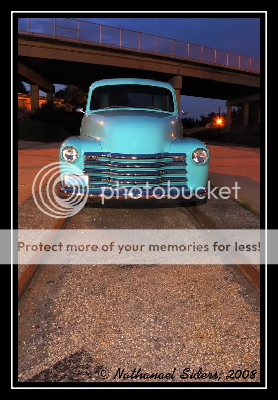
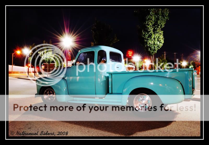
I think he said it was a 1948 at least. Anyway, this is my first automotive photoshoot since I've gotten serious into photography a year ago. I was happy with how they turned out and I really had a lot of fun. I'm really interested in hearing everybody's thoughts and look forward to some c&c.

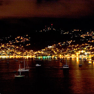
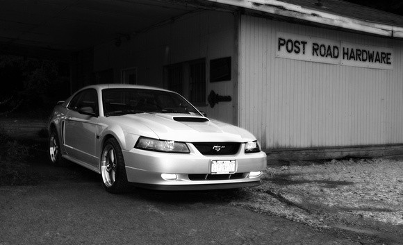
First are the night pictures which were my favorites

1
2008-08-09_44web-1.jpg


2
2008-08-09_46web-1.jpg


3
2008-08-09_59web-1.jpg


4
2008-08-09_66web-1.jpg


5
2008-08-09_68web-2.jpg


6
2008-08-09_73-1.jpg


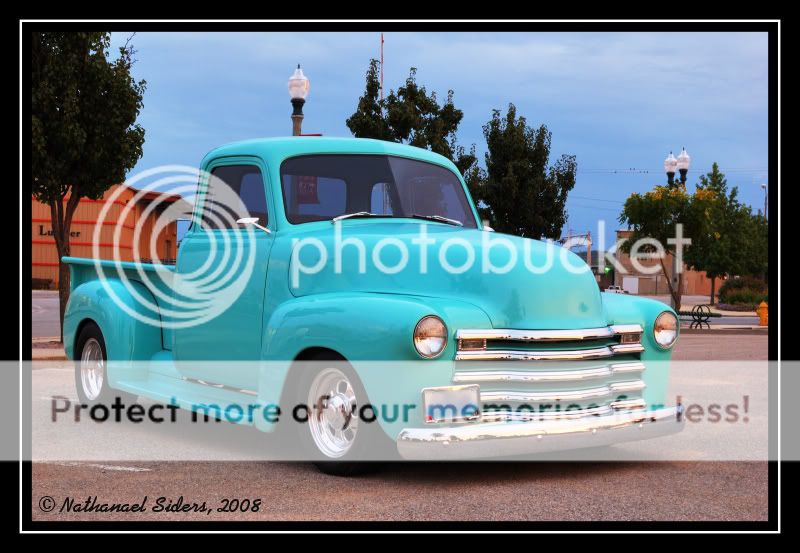
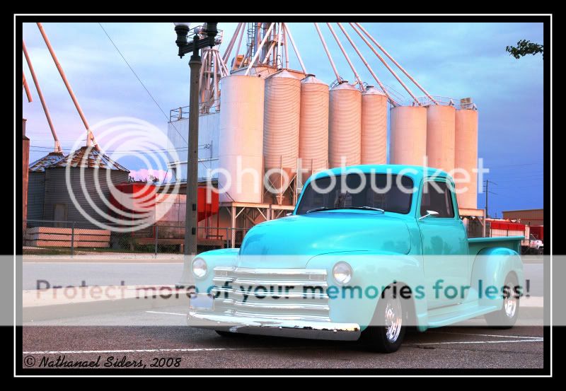
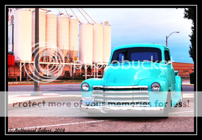
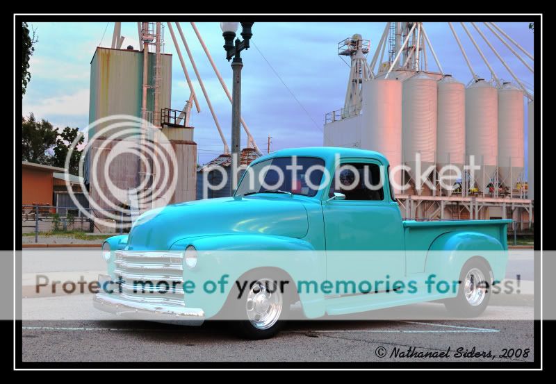
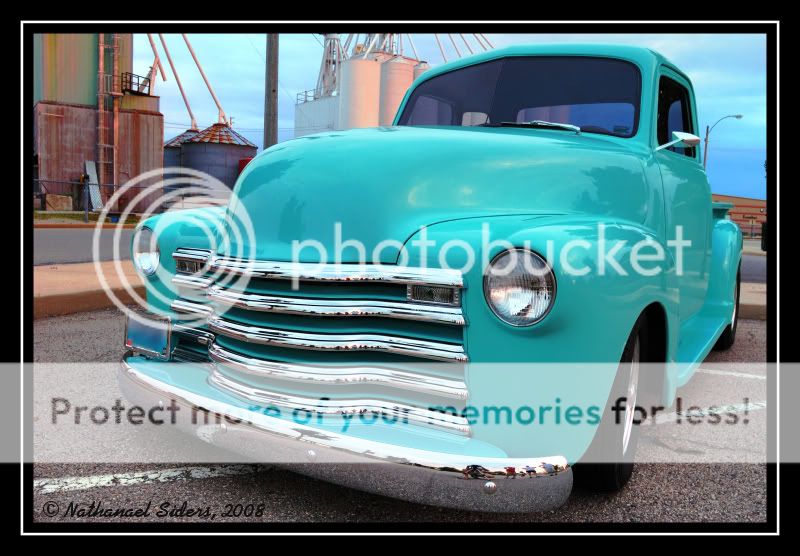
And here's the daytime shots which I thought turned out pretty nice as well.

7
2008-08-09_7web-1.jpg


8
2008-08-09_13web-1.jpg


9
2008-08-09_16web-1.jpg


10
2008-08-09_19web-2.jpg


11
2008-08-09_22web-1.jpg


Sorry for so many pictures, I just had a lot of "keepers" and had a hard time narrowing down. C&C welcomed and looked forward to.
 
Last edited:
Bump

Views - 52
Replies - 0
 
I find that with #3 & 5, but lights are in a bad spot. especially #3, right in the bed of the truck. I may have been temped to crop #1 a bit at the top also, just to get rid of that stree light. Otherwise, nice shots.
 
Defenatly #2 and #7
Good Work :thumbup:
 
i really like them!! my fave would have to be 2 and 7.
great work!!

Thanks. 2 and 7 seems to be alot of people's favorite that I've shown these to.

I find that with #3 & 5, but lights are in a bad spot. especially #3, right in the bed of the truck. I may have been temped to crop #1 a bit at the top also, just to get rid of that stree light. Otherwise, nice shots.

I agree with you about #3, but on number 5??? Number 5 the street light is way off to the side and in the extreme background. I'm not sure I see the problem with it and there was no way to avoid all the street lights....plus they add something (I thought).

I have no clue what you mean regarding #1 with the top.......there's not a single street light visible in #1. Anyway, thanks for the critiques and pointing out what I didn't notice in #3.

Defenatly #2 and #7
Good Work :thumbup:

Thank you much.
 
I like 2 and 3..I had tried my first car shoot the other day and I had a hard time trying to get what I was looking for as far as locations. Maybe you should go in a clone out some poles in some of the pics just to see if it makes them better. I think in #9 you can lose that light pole over the car.. and the power lines.
 
Yeah, I might try that.

Can anybody find any other things wrong? Lighting, etc...? Number 9 I'm going to go back and re-edit as I overdid it on accident.

I've gotten some crappy feedback that I personally don't agree with on a couple of automotive forums (from some "claimed" photogs), so I'd like to hear honest critique's and overall feelings about the photo's from the site I trust. I'm honestly a little discouraged from some of the negative feedback I've gotten elsewhere as I thought these turned out really nice. Please comment (both good and bad).
 
I shot this and I just did not like the photo...I did a blur layer and kept the car sharp I cloned out a ezpass tag in the windshield and I think I made a ok photo better.. Looking at this it would have been a good location for a truck like yours rather than a mustang lol.

p620770602-3.jpg
 
well I think for your first auto shoot these are not bad, the major problem with most of them is the background competing with the subject....also reflecting in the subject too.
1 the truck has blown out areas, you used flash which has darkened the background too much leaving a stark subject....also flash reflections.
2 this one is pretty good but too many reflections in the chrome and loss of detail around the front wheel area.
3 heaps of reflections, the light that flares where the bed meets the body and that clump of trees over the hood looks bad.
4 again reflections and uneven lighting with little detail in the dark areas.
5 poor choice of angle and too many bumper flares and the light in the background.
6 overpowering background, light flares, uneven lighting on the body and the truck is soft....
7 the perfect light, good angle and colour....however, the light post coming out of the roof, very bad and the other background stuff...and painted lines in the carpark.
8 again great light but the same problems as 7.
9 objects growing out of the truck and this one has the nice light but you've overprocessed it.
10 looks like you've reduced the contrast on this one but too much and the pole is growing out of the bonnet.
11 good angle, a little cramped at the front in the frame, again though objects growing out of the vehicle.
Sorry if this seems harsh but if you submitted these to a magazine they would be rejected, cars and trucks are not easy to get right and reflections are the enemy. Try choosing an uncluttered background or if unable use a long lens and compress the image to blur it out more. Also the lighting in 7 is the light you want but in a different enviroment....good luck with the next one.

No problem about the "harshness" and the detailed reply is hugely appreciated. With the night time pictures, I was going for the darker background versus the brighter truck and also wanted some streetlights in the background. It seems like many people find those decisions to be distracting more than pleasing.

Also, do you think a polarizer would have helped any with the reflections (especially in the chrome)? I'm just wondering if the reflections were so strong if a polarizer would have even helped.

The area we live in is really hard to find decent "backgrounds" for these types of pictures. Somewhere on a farm may have been nice, but this guy wasn't about to drive on unpaved roads. I see what you mean about the backgrounds which is frustrating since I spent a week trying to find a "spot" and ended up choosing this one.

I'm not planning on submitting these to any magazines (he might try reader's rides section or something), but these were merely shots for the owner and for possibly For Sale Signs.

Thanks again for the detailed reply....I'm seriously so frustrated now though (not your fault). Hopefully the owner of the truck is happy.....I'm getting a little worried now. He's coming by tonight to see them.
 
nate the owner will probably love them as most people are not as picky as magazine editors, they just see their pride and joy. However some builders have experience of shoots and know the difference.

A CPL would have made some improvement to the reflections but not all, flash for vehicles really need to be diffused for best effect....check out this link for lighting tips http://www.strobist.blogspot.com/ I think an industrial background for this truck would work well, it just needs to be less busy....walls, the sides of buildings etc work best. Glad you took my comments in the spirit they were intended :)

Thanks again, and I really do appreciate the sound advice. Other people were just saying, "bad lighting" and I wasn't seeing how.....nobody until you took the time to explain exactly what was wrong with the images.

I've checked out strobist a lot, but haven't noticed much about car photography....maybe I've just missed it but I'll look closer.

Believe it or not, industrial background is the look we were going for and a less busy background would have been nice. This was the only "industrial" area that I could find though, but I'll be keeping my eyes out for future attempts.


Edit: I've got a 33" white shoot through umbrella that I didn't use as I was afraid it wouldn't give me enough light. Now I'm wondering if it would have helped knock down the glare from the flash as the umbrella is much softer light than the stofen.
 

Most reactions

Back
Top