2 horizontal portraits up for some C&C.

dearlybeloved

No longer a newbie, moving up!
Joined
Dec 22, 2009
Messages
511
Reaction score
41
Location
Auburn, AL
Can others edit my Photos
Photos NOT OK to edit
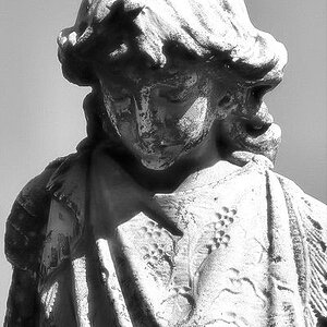
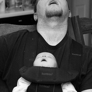
Trying to do some horizontal portraits of friends of mine and I was looking for some feedback on these. thanks!


1.
$DSC_6427.jpg

2.
$DSC_6611.jpg
 
I like #1... and her pose there makes the horizontal work fine IMO. The 2nd the horizontal is like making me dizzy or something and feels really distorted? The way his shoulders fall does not make him look masculine in the least to me.
 
I like them both.
I dig the natural wood backdrop/crazed model in the first, really works horizontally
The second seems a little dark... assuming you stopped it down purposefully for the sweet background, leaving the slightly distorted look. I get what you're going for.

Good stuff
 
Last edited:
Thanks guys! and yes, I stopped down and kicked some fill light so the background would come out exposed. It was 7pm and I wanted the fade in the sky. (i live in auburn, alabama. Auburn tigers are orange and blue.)
 
I'd say on #2, I would have gone for a CTO 1/4 to 1/2... to white balance the sun. The daylight temp of the flash isn't accurate to the ambient, so your subject is cold and dead looking.

perhaps that's what you wanted, that's up to you.

I personally would have matched the color temps, and see how it looked.
 
Love the crazy bird, very good. The man portrait is less convincing, I do not like it when the horizon line cuts across the face or the neck. I like the posture, it creates a character, but the background does not add much to it. Although the river and field lines on the left compliment the man nicely.
 
I like #1... and her pose there makes the horizontal work fine IMO. The 2nd the horizontal is like making me dizzy or something and feels really distorted? The way his shoulders fall does not make him look masculine in the least to me.
Masculinity is subjective, and how is it that a lack of masculinity would take away from the shot? Personally I see right through the whole macho facade that people are so obsessed with putting men into and am completely uninspired by it.

The first shot I like, however I feel like some of the details on her face are lacking sharpness. On the second shot I agree that the light from the strobe could be warmer. I also feel that this shot was sharpened too much in post.
 
#1 is just bizarre (in a good way) and I see real potential there as a high-contrast monochrome. #2, while technically fine, doesn't have the impact of the first. While you've done a good job on the background, I can't help thinking that a tight, square bust shot would actually be a better image.
 
Lighting on #1 needs better diffusion, that bright highlight on the forehead?

#2... shooting close at 16mm.. you have perspective distortion... and the background adds nothing to this. Vertical would be a better choice....
 
If you're gonna shoot a wide angle environmental portrait as in #2, there should be some context why the background is there. I feel a complete disconnect of why he is standing in the open field.

As far as the masculine / feminine pose debate, you got it right. A masculine pose would have the head tilt towards the lower shoulder.
 

Most reactions

Back
Top