2 Photo CC Please!

hsphotos

TPF Noob!
Joined
Jan 10, 2012
Messages
36
Reaction score
0
Location
Key West
Website
www.facebook.com
Can others edit my Photos
Photos OK to edit
I got a new lens (Nikkor 55-200mm) and I wanted to try it out!
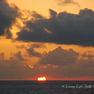
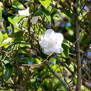
1.

DSC_0051 by Friskybinx, on Flickr
Exposure 0.006 sec (1/160)
Aperture f/5.6
Focal Length 200 mm
ISO Speed 200
Exposure Bias -1/3 EV
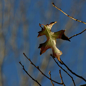
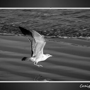
2.

DSC_0009 by Friskybinx, on Flickr
Exposure 0.017 sec (1/60)
Aperture f/4.5
Focal Length 102 mm
ISO Speed 800

Would love some CC on both of them! And yes, I do still have my tree up... lol.
 
I really like #1, the colors are striking. The one thing I would change is removing that little branch that is sticking out at the bottom of the frame near the center.
#2 doesn't do anything for me at all. Not sure what you were trying to achieve here. I would try and get more interesting shot.
 
Yeah, I cropped a few branches already but left just that tiny one there... why? I don't know. I was afraid to chop too much of the photo out. No editing was done to it, either.

As for the second one... I guess clarity? I know it's just a boring ornament, but I was hoping to get feedback on the technical aspects of it rather then it being interesting.
 
hsphotos said:
Yeah, I cropped a few branches already but left just that tiny one there... why? I don't know. I was afraid to chop too much of the photo out. No editing was done to it, either!

As for the second one... I guess clarity? I know it's just a boring ornament, but I was hoping to get feedback on the technical aspects of it rather then it being interesting.

I wouldn't crop anymore on that photo, if you have an editing software I would however remove that last little twig.

As for the technical side, I wouldn't be the best to help you there. I'll let the guru's have a crack at it.
 
Yes I have photoshop! I'll have to take care of that little guy...

Any other critiques??
 
I don't really like the first one all that much from a technical aspect. The darkness of the limbs cause them to blend in to the darkest part of the cloud. It breaks the continuity of the image. I also think that there is too much dead space. I think it would have looked nicer if you had included a little more height in the photo, in order to show more of the tree. I don't know what the scene looked like, so I'm not really sure if that was plausible, however.

The second one is OK. It's nicely exposed, focus is good, and the colors are nice, but the lighting is very flat and uninteresting. I think that this, coupled with the uninteresting subject make for a boring photo.
 
Great pointers, thank you!

I took this one, too:


DSC_0046 by Friskybinx, on Flickr

They were taken off of my apartment balcony, so I was pretty limited for angles and such. I know the tree isn't 100% in focus because the wind gusts here are insane tonight.
 
oooooh..the second sunset is much more dramatic. I would not have noticed the trees were out of focus. I see movement with the clouds in the upper edge. I would not mind seeing the tree silhouettes across the entire foreground. My eyes fall to the lower right corner, yet there is nothing much more interesting there other than color that is seen elsewhere. Yet, when I cropped that edge by moving the image all the way to the right in the screen, it does crowd the trees a bit. So,I think your image does not need to be cropped further as I first thought. Can you bring out more foreground detail by lightening the image?

BTW the snowman image is too dark for me. I want to see that hat!
 
In order to get more tree I would have had to be hanging off my railing and I don't really feel my railing is safe enough for that LOL.
 

Most reactions

Back
Top