2 puppies

Osmer_Toby

TPF Noob!
Joined
Jun 4, 2003
Messages
1,767
Reaction score
5
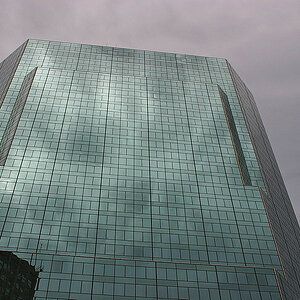
i used this in an ad- there was a bunch of text in upper right corner.
without text, i'm thinkin it looks too contrived.
what do you think? also please critique any other aspect...

deuce-n-puppy2.jpg
 
Soooo cute! You really caught the moment in that one. :D

I think what distracts me more than the blank spot it the lighting. The bow is pretty bright, as is her hairline, but her eyes and mouth are lost in shadow. On the puppy, there's a hot-spot on the forehead but the muzzle is a little dark. I'd try playing around with some dodging and burning first. It might be worth cropping in after that, but I'd like to get more of a sense of balance before deciding.

It looks like the light is coming from fairly high up, like a ceiling lamp just about directly overhead. A reflecter in front of her and to the left some would probably have worked well here.
 
I do see what you mean about looking contrived. I think it is because she doesn't seem to be relating to the puppy to much, she isn't showing enthusiasm on her face - and the crop is so tight that we can't see what she's doing with the rest of her body - I hope that makes sense. BTW - I agree with Mark about the lighting, in fact it was my first though. All that being said - I still think it is an adorable shot.
 
ya, i bounced the light off the ceiling, hence the hotspots on top. i think you're both right re: dodging. also burning in the muzzle...

this woulda been way cool with a softbox...

thanx you guys!
 

Most reactions

Back
Top